Table of Contents
This guide provides a clear overview of web development, including Gradient Background with CSS, Syntax of Linear Gradient. Use it to understand the topic, compare the available options, and make a more informed decision.
Gradient Background with CSS
A CSS gradient now transitions smoothly using 2 or more specified colors. Gradient CSS offers better control and performance than using an image file of a gradient that you can create with tools like Adobe Illustrator. Use the CSS background-image property to declare the gradient as the background.
There are 3 types of gradients available: linear (created with linear-gradient()), radial (created with radial-gradient()) and conic (generated with conic-gradient()). You can also create repeating gradients with repeating-linear-gradient(), repeating-radial-gradient(), and repeating-conic-gradient().
The MDN Docs defines the above functions as follows:
- linear-gradient() creates an image consisting of a progressive transition between two or more colors along a straight line. Its result is an object with a special data type of tag.
- radial-gradient() creates an image containing a continuous transition between two or more colors radiating from an origin. Its shape can be circular or elliptical. The result of this function is an object of data type.
- conic-gradient() creates an image containing a gradient with a color transition around a central point. Examples of conic gradients include pie charts and color wheels. The result of the conic-gradient() function is an object of data type.
- repeating-linear-gradient() creates an image containing a repeating linear gradient. It's similar to gradient/linear-gradient() and takes the same arguments, but it repeats color stops endlessly in all directions to cover its entire container. The result of this function is an object of data type.
- repeating-radial-gradient() creates an image containing repeating gradients, radiating from an origin. It's like gradient/radial-gradient() and takes the same arguments, but it repeats color stops endlessly in all directions to cover the entire container, similar to gradient/repeating-linear-gradient(). The result of this function is an object of data type.
- repeating-conic-gradient() creates an image containing a repeating gradient with a color transition around a central point.
Following is the official syntax of each gradient style:
Syntax of Linear Gradient
linear-gradient( [ | to ]? , ) = [to left | to right] || [to top | to bottom]Syntax of Radial Gradient
radial-gradient( [ || ]? [ at ]? , );Syntax of Conic Gradient
conic-gradient( [ from ]? [ at ]?, )Here are some awesome gradient background templates , created with the CSS background-image property, that can elevate the UI of the web to the next level.
Beautiful Gradient Background Template in CSS
Dusty Grass

Use the following CSS to create the gradient above:
background-image: linear-gradient(120deg, #d4fc79 0%, #96e6a1 100%);Sand to Blue

To create the gradient above, use the following CSS code:
background-image: linear-gradient(to right, #DECBA4, #3E5151);Kye Meh

Use the following CSS code to create the above linear gradient background:
background-image: linear-gradient(to right, #8360c3, #2ebf91);Amin

CSS:
background-image: linear-gradient(to right, #8e2de2, #4a00e0);Relaxing Red
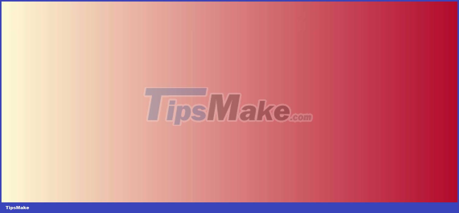
With just one line of CSS code, you can add a beautiful, eye-catching gradient background to the web:
background-image: linear-gradient(to right, #fffbd5, #b20a2c);Sublime Light

Try using this CSS to create a gradient background. It's easy to use and adds a bit of style to your site:
background-image: linear-gradient(to right, #fc5c7d, #6a82fb);Megatron
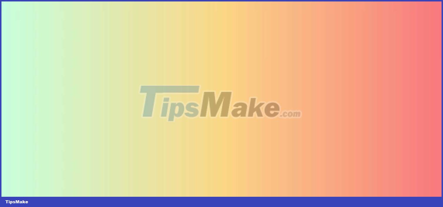
Use the following CSS to create a 3-color gradient:
background-image: linear-gradient(to right, #c6ffdd, #fbd786, #f7797d);Blue Raspberry

Use the following CSS to create a simple linear gradient bluish background:
background-image: linear-gradient(to right, #00b4db, #0083b0);Premium Dark

CSS Code:
background-image: linear-gradient(to right, #434343 0%, black 100%);Crystalline

CSS Code:
background-image: linear-gradient(-20deg, #00cdac 0%, #8ddad5 100%);Lawrencium

Use the following CSS to create the gradient above. You can also use this code to create gradients with different colors:
background-image: linear-gradient(to right, #0f0c29, #302b63, #24243e);Ohhappiness

CSS Code:
background-image: linear-gradient(to right, #00b09b, #96c93d);The Strain

CSS Code:
background-image: linear-gradient(to right, #870000, #190a05);Yellow Mango

CSS code to create radial gradient background:
background-image: radial-gradient(circle farthest-side, #fceabb, #f8b500);Juicy Grass

CSS Code:
background-image: radial-gradient( circle 759px at -6.7% 50%, rgba(80,131,73,1) 0%, rgba(140,209,131,1) 26.2%, rgba(178,231,170,1) 50.6%, rgba(144,213,135,1) 74.1%, rgba(75,118,69,1) 100.3% );You can use the gradient above with some other elements for the website such as background, border, icon, button, text, underlining, list bullet. to take web design to the next level. Hope the article has a suitable template for you.
Conclusion
Understanding Web Development makes it easier to compare options, avoid common mistakes, and apply the information in this guide more effectively. Review the relevant requirements before making changes or choosing a solution.
FAQ
What is Web Development?
There are 3 types of gradients available: linear (created with linear-gradient()), radial (created with radial-gradient()) and conic (generated with conic-gradient()).
Why is Web Development important?
Understanding Web Development helps you evaluate features, compatibility, performance, and potential limitations before you choose a product or follow a procedure.
What should you consider when using or choosing Web Development?
Consider your specific goal, compatibility requirements, available features, cost, security, and the practical recommendations described in this guide.
Related Articles
 Gradient - Color Linear Transformation in CSS9 minutes read
 Apply Gradient Effects to Background Colors in PowerPoint3 minutes read
 Summary of PowerPoint Templates, Beautiful Slide Templates2 minutes read
 Instructions for Creating Gradient Effects in Word4 minutes read
 Beautiful Background for Photoshop2 minutes read
 Beautiful Landscape Background, Beautiful Landscape3 minutes read
Reader Comments 0
Sign in with email or Google to join the discussion.