Google Wallet Material 3 redesign interface
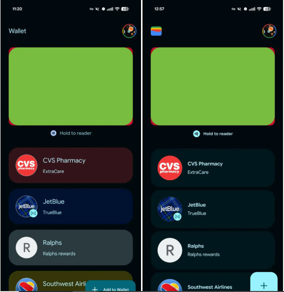
The Google Wallet app is getting a Material 3 Expressive design update that focuses on personalization, easy-to-read information, and smoother interactions, including a refreshed home page and more dynamic tap-to-pay animations.
The Google Wallet app is getting a Material 3 Expressive design update that focuses on personalization, easy-to-read information, and smoother interactions, including a refreshed home page and more dynamic tap-to-pay animations.
On the home page, the Wallet app name in the top left corner is replaced by the app's icon, while a square-shaped floating button (FAB) replaces the rectangular "Add to Wallet" button.
Previously, the cards below the payment section were designed according to the card theme. However, with this new design, Dynamic Color has been used to match the overall look of the card. At the bottom, the Archive Card button is designed in a border frame.

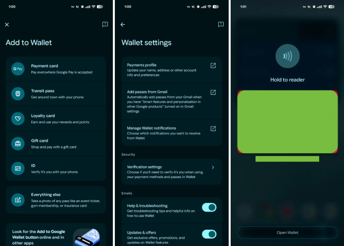
When you open a credit or debit card, previous transactions are grouped into separate containers, making information clearer and easier to manage. This improved grouping also applies to the Add to Wallet menu and the Settings page.
The in-app card payment interface has been refreshed with more vivid and crisp animations, including NFC waves, a white loading ring, and a green tick. The new Pixel devices also get an overlay when opening Wallet by double-pressing the power button, also refreshed with Material 3 Expressive design.

Overall, this is a simple modernization that is rolling out to users. It will start in June and then Google will bring this new design to everyone.
- Instructions for using Google Wallet for beginners
- Google accidentally reveals upcoming Android Material redesign
- Gmail started updating the new Google Material Theme interface on both iOS and Android
- Google Docs, Sheets and Slides update the new Material interface
- Experience the Material Design 2 interface for Chrome, you can activate it
- Google updates the Material guide for programmers


 7 best tools to check SD card speed and capacity
  The best memory card format software for Android phones
  How to perform graphical stress test on Linux
  How to renew an ATM card when the ATM card expires
  The real difference between SD Card and SSD card
  Find the name of your network card manufacturer