Table of Contents
The built-in Photos app can create polished color styles without a third-party editor. The 15 recipes below are starting points rather than universal presets: lighting, skin tones, and camera exposure differ from one image to another, so apply the values and then fine-tune the result.
Photos editing is nondestructive. You can return to Edit later and choose Revert to restore the original.
How to apply an editing recipe
- Open a photo in Photos and tap Edit.
- Select Adjust, then swipe through the individual controls.
- Enter each value approximately by moving its slider. Tap an adjustment icon to compare it with and without that change.
- Use Filters only when a recipe names one, and adjust the filter intensity rather than assuming full strength.
- Crop or straighten the image last, then tap Done.
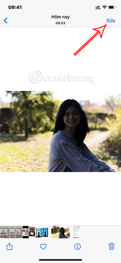
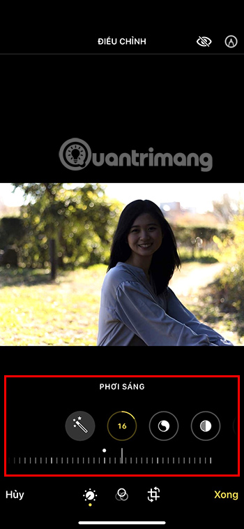
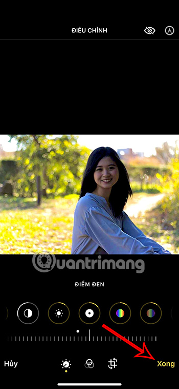
What the main controls change
- Exposure moves the overall image lighter or darker.
- Brilliance balances detail and contrast across highlights and shadows.
- Highlights targets the brightest areas; Shadows targets darker areas.
- Contrast changes the separation between light and dark tones, while Black Point controls the depth of the darkest tones.
- Saturation changes all colors; Vibrance emphasizes less-saturated colors more selectively.
- Warmth shifts between blue and yellow; Tint shifts between green and magenta.
- Sharpness, Definition, and Noise Reduction affect fine detail. Use them carefully to avoid halos or waxy textures.
The original formulas used translated labels such as “bright area,” “dark area,” “freshness,” and “humidity.” They are shown here with the corresponding English Photos labels: Highlights, Shadows, Vibrance, and Warmth.
Color-style recipes
1. Muted brown
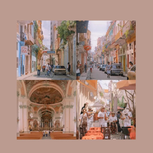
| Photos adjustment | Starting value |
|---|---|
| Filter: Vivid | 50 intensity |
| Exposure | -35 |
| Highlights | +20 |
| Shadows | +70 |
| Contrast | -40 |
| Brilliance | +80 |
| Black Point | -20 |
| Saturation | +23 |
Use this as a warm, lifted look for scenes with wood, brick, or neutral clothing. Reduce Saturation if skin becomes too orange.
2. Airy blue
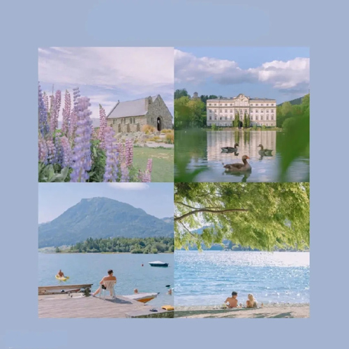
| Photos adjustment | Starting value |
|---|---|
| Filter: Vivid | 10 intensity |
| Exposure | +20 |
| Brilliance | +90 |
| Highlights | -55 |
| Shadows | +55 |
| Contrast | -20 |
| Brightness | +13 |
| Saturation | +5 |
| Vibrance | +10 |
Lower Highlights further if the sky loses detail. For portraits, reduce Brilliance if faces look unnaturally flat.
3. Light brown
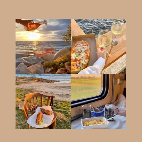
| Photos adjustment | Starting value |
|---|---|
| Exposure | -30 |
| Brilliance | +32 |
| Highlights | -70 |
| Shadows | +45 |
| Contrast | -40 |
| Brightness | +77 |
| Black Point | +40 |
| Saturation | -5 |
| Vibrance | +30 |
4. Deep blue
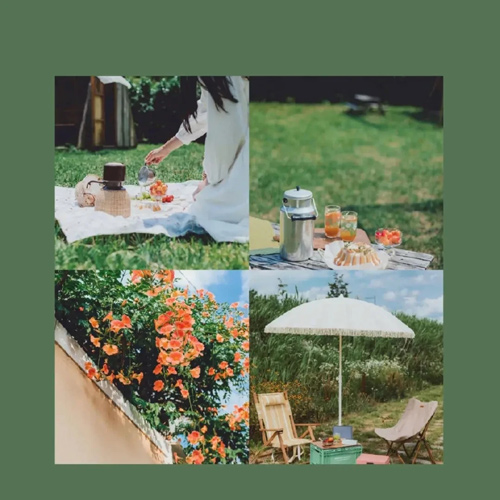
| Photos adjustment | Starting value |
|---|---|
| Brilliance | +60 |
| Highlights | -85 |
| Shadows | +30 |
| Contrast | -10 |
| Saturation | -17 |
| Vibrance | +30 |
| Warmth | -17 |
| Tint | -35 |
This cool treatment suits water, glass, and overcast scenes. Raise Warmth toward zero if people look too blue.
5. Golden orange
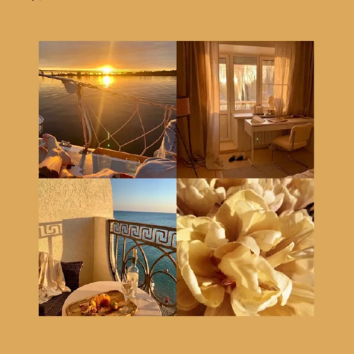
| Photos adjustment | Starting value |
|---|---|
| Brilliance | +50 |
| Highlights | -100 |
| Contrast | -25 |
| Brightness | +15 |
| Saturation | +10 |
| Tint | +30 |
This works best when the source already contains warm sunrise or late-afternoon light. A recipe cannot create realistic directional golden light if it was not present in the original scene.
6. Soft purple
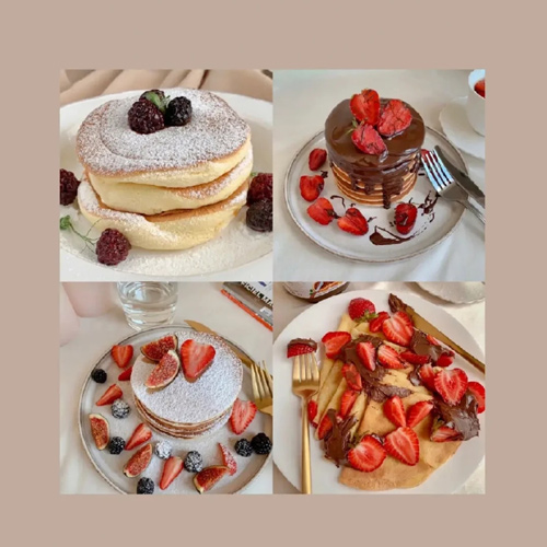
| Photos adjustment | Starting value |
|---|---|
| Exposure | +6 |
| Brilliance | +50 |
| Highlights | -5 |
| Shadows | +10 |
| Contrast | +5 |
| Vibrance | +10 |
| Warmth | +7 |
| Sharpness | +23 |
7. Warm brown
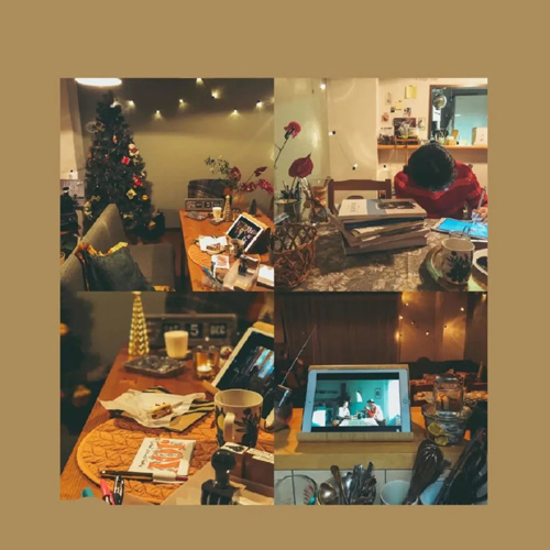
| Photos adjustment | Starting value |
|---|---|
| Warmth | +100 |
| Exposure | -20 |
| Vibrance | +42 |
| Highlights | -40 |
| Shadows | +45 |
| Contrast | -45 |
| Brightness | +25 |
| Saturation | -40 |
Warmth at +100 is an extreme choice. Pull it back until whites remain believable and skin tones retain detail.
8. Earth tones
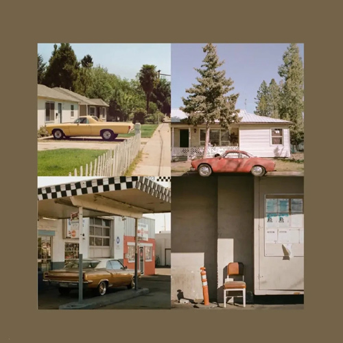
| Photos adjustment | Starting value |
|---|---|
| Exposure | -40 |
| Brilliance | +40 |
| Highlights | -20 |
| Shadows | -20 |
| Contrast | +45 |
| Brightness | +50 |
| Black Point | -60 |
| Saturation | -25 |
| Vibrance | +20 |
| Warmth | +60 |
| Tint | -45 |
9. Bright picnic blue
| Photos adjustment | Starting value |
|---|---|
| Exposure | +100 |
| Highlights | -26 |
| Shadows | +16 |
| Contrast | -23 |
| Saturation | +50 |
| Sharpness | +10 |
Because +100 Exposure can clip bright areas, begin lower and increase only until the subject is clear. This recipe is best for an underexposed source, not an already bright image.
Six additional looks
10. Soft faded detail
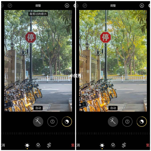
| Photos adjustment | Starting value |
|---|---|
| Exposure | +5 |
| Brilliance | +60 |
| Highlights | -40 |
| Shadows | +70 |
| Contrast | -50 |
| Black Point | +5 |
| Saturation | -20 |
| Vibrance | +20 |
| Tint | -15 |
| Sharpness | +30 |
| Noise Reduction | +20 |
11. Warm pastel
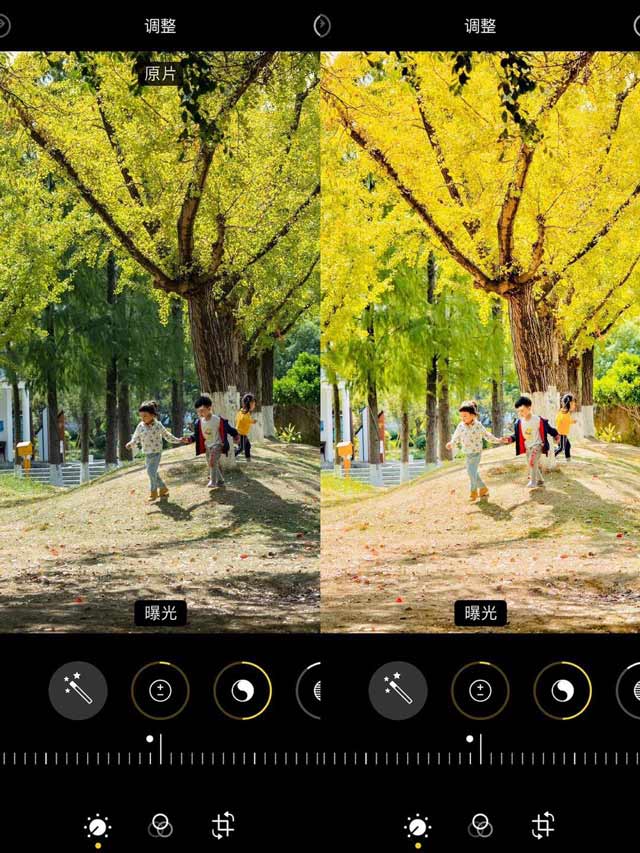
| Photos adjustment | Starting value |
|---|---|
| Exposure | +5 |
| Brilliance | +50 |
| Highlights | -10 |
| Shadows | +50 |
| Contrast | -35 |
| Brightness | +15 |
| Black Point | +15 |
| Saturation | -20 |
| Vibrance | +20 |
| Warmth | +40 |
| Tint | +30 |
| Sharpness | +30 |
12. Cool vivid detail
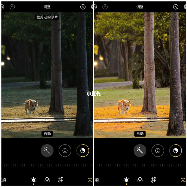
| Photos adjustment | Starting value |
|---|---|
| Brilliance | +55 |
| Highlights | -100 |
| Shadows | +15 |
| Contrast | -30 |
| Black Point | +15 |
| Saturation | -20 |
| Vibrance | +70 |
| Warmth | +25 |
| Tint | +35 |
| Sharpness | +30 |
13. Soft matte
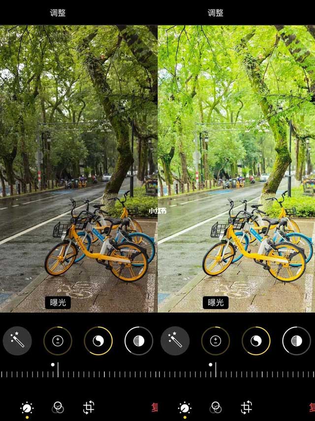
| Photos adjustment | Starting value |
|---|---|
| Exposure | +5 |
| Brilliance | +60 |
| Highlights | -40 |
| Shadows | +70 |
| Contrast | -50 |
| Black Point | +5 |
| Saturation | -20 |
| Vibrance | +20 |
| Tint | -15 |
| Definition | -10 |
| Sharpness | +30 |
| Noise Reduction | +20 |
14. Bright warm color
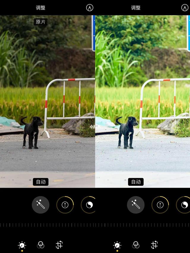
| Photos adjustment | Starting value |
|---|---|
| Exposure | +25 |
| Brilliance | +35 |
| Highlights | +15 |
| Shadows | +40 |
| Contrast | -40 |
| Brightness | +50 |
| Saturation | +20 |
| Vibrance | +30 |
| Warmth | +10 |
| Tint | -40 |
| Sharpness | +30 |
15. Cool low-key
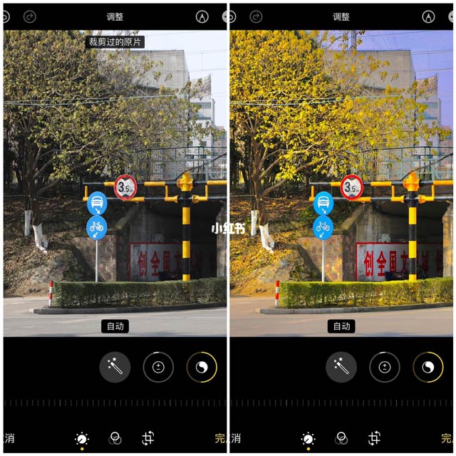
| Photos adjustment | Starting value |
|---|---|
| Brilliance | +70 |
| Highlights | -75 |
| Shadows | +20 |
| Contrast | -30 |
| Brightness | -40 |
| Black Point | +20 |
| Saturation | -20 |
| Vibrance | +10 |
| Warmth | +55 |
| Definition | -10 |
| Sharpness | +30 |
How to adapt any recipe
- Set Exposure and Brilliance first so the subject is readable.
- Recover bright detail with Highlights and open dark detail with Shadows.
- Use Contrast and Black Point to restore depth after lifting shadows.
- Adjust Warmth and Tint while watching whites and skin tones.
- Add Saturation or Vibrance last, then use only enough sharpening to reveal natural detail.
Compare the edit with the original several times. If the first thing you notice is the processing rather than the subject, reduce the strongest adjustment.
Related Articles
 Trend of Editing Photos on iPhone to Look 'Attractive': Complete Overview6 minutes read
 Top Free Photo Editing App on iPhone7 minutes read
 Instructions for Automatic Photo Editing on iPhone2 minutes read
 How to Mass Edit Photos on iPhone?5 minutes read
 Please Download the Famous Photo Editing Application Pixomatic Photo4 minutes read
 minutes read
Reader Comments 0
Sign in with email or Google to join the discussion.