What is Safe Zone on Instagram?
If you've ever tried viewing an Instagram Reel or Story but couldn't understand its full meaning because some related content was hidden behind text or buttons, you're not the only one.
This can feel extremely frustrating, leaving you with no other choice but to swipe away. To avoid this, creators should incorporate Safe Zone when creating Reels and Stories for Instagram. If you're unfamiliar with Safe Zones, check out the following tutorial to familiarize yourself with the concept and ensure the main content remains visible.
What is Safe Zone on Instagram?
The term Safe Zone on Instagram is used to identify specific areas on a Reel or Story where content is less likely to be garbled or skipped when viewed on various devices.
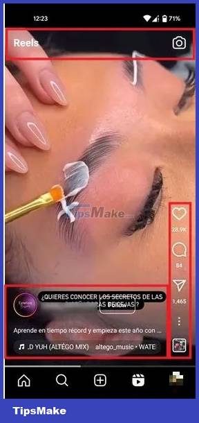
Safe Zones serve as a guiding principle for creators to strategically place key content elements – including text, images, and other visuals – to ensure optimal visibility across multiple screen sizes and resolutions.
By complying with Safe Zone, creators can enhance the viewer experience, ensuring that content is fully visible, leaving no key elements hidden or obscured. Instagram makes it easier to apply all of this when creating Reels and Stories by conveniently marking Safe Zones using lines and grid patterns.
Use Safe Zone for Instagram Stories
Instagram Stories uses a 9:16 vertical aspect ratio with a resolution of 1920 x 1080 pixels. For this type of content, Safe Zone covers a significant area of the screen, has a resolution of up to 1080 x 1420 pixels, and is slightly larger than the area designed for Reels.
Note: When it comes to ads, Meta recommends leaving approximately 14% (250 pixels) of space at the top and 20% (340 pixels) at the bottom free of text, icons, or other major elements to avoid covering them. However, we can also extrapolate this guidance to 'regular' Stories.
To start viewing Safe Zone, you need to create a new Story. Upload or take a photo/video with the Instagram camera – just like you would when creating any Story – then start placing additional elements, such as stickers or text.
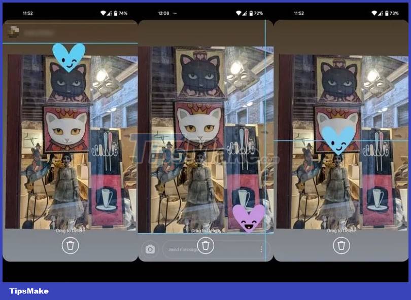
Drag the element on the screen with your finger. If it exceeds the Safe Zone limit, Instagram will indicate this by displaying a line. For example, when trying to place a sticker too high or too low on the Story screen.
The app offers additional support, allowing you to center elements you may want to add to your Story.
Use Safe Zone for Instagram Reels
Like Stories, Reels also takes advantage of the 9:16 vertical aspect ratio, with a resolution of 1920 x 1080 pixels. However, in this case, the Safe Zone area is a bit more limited.
Note: For ads, Instagram recommends leaving the same 14% free space at the top and 40% at the bottom.
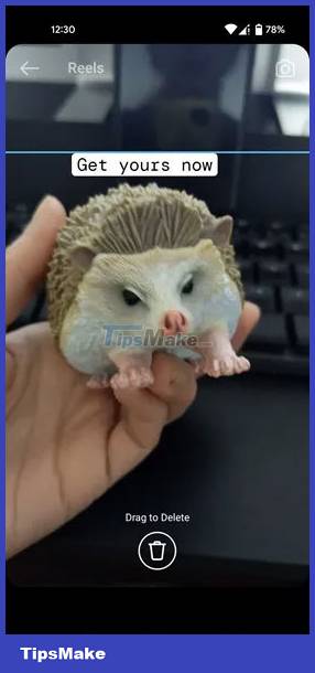
To do that, you must pay attention, especially when placing text. There's a sizable space at the bottom where Instagram automatically places account information, captions, and details about any audio used (if any). It's important to make sure your text doesn't overlap this area, otherwise viewers won't be able to read it.
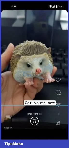
In the lower right corner, Instagram adds like, comment, and share icons. While you can add elements to it, it's not recommended because they could still hide the text or visual elements you want to showcase or confuse the viewer.

Different formats
Another aspect to consider is that Instagram cuts Reels differently, depending on where they show up in the app. For example, profile grid, feed or Reels in full screen mode.
Instagram automatically posts Reels to both your profile grid and a separate Reels grid, which is why you need to choose a cover photo for each short clip you create. By default, Instagram creates a cover photo for you, but you should set one up manually.
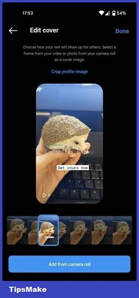
You can choose a snapshot from the video or upload a more suitable image that you want as a cover photo. In the main profile view, these thumbnails will display as 1:1 squares. This can cut out text or elements if you're not careful. We recommend choosing images with text as centered as possible to accommodate various cropping styles. Reels grid displays videos in vertical thumbnails, so you won't have any problems here.
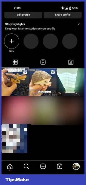
Some slight differences in how the Reel appears are also visible, depending on the device you are using to view the Reel.
To make sure your Reels look good on any device, try to focus on the main subject when recording your video, then place important elements and text in the middle.
Use the Safe Zone template
While following Instagram's Safe Zone recommendations is relatively simple, it may be easier if you use the Safe Zone template. You won't have to worry about lining up your elements perfectly because they're already placed in the optimal position for you.
To get started, check out the Reels template library on Instagram. Also, try a third-party app, like Canva (Android, iOS) or Mojo (Android, iOS) for more templates.
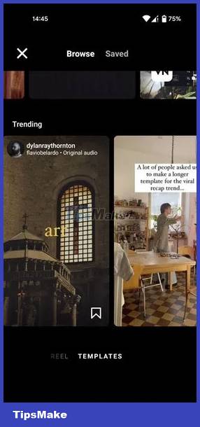
Additionally, if you already have a clip that you want to use as a Reel, make sure that important elements of your video are still visible. Add a Reel overlay to see how the Reel will appear after you post it.
You can use the online tool Flixier to upload your video and add Reels overlay on top of it. You can also add text, filters, etc. but you should only use this tool for simulation purposes.
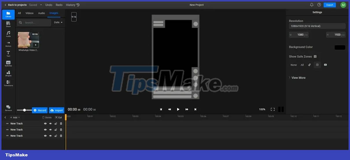
Once you verify that everything looks as you expect, recreate the Reel in the Instagram app. Although you can export an edited video in Flixier, it will have a watermark.
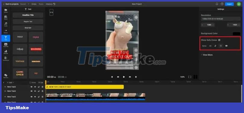
How to create your own Safe Zone Instagram template
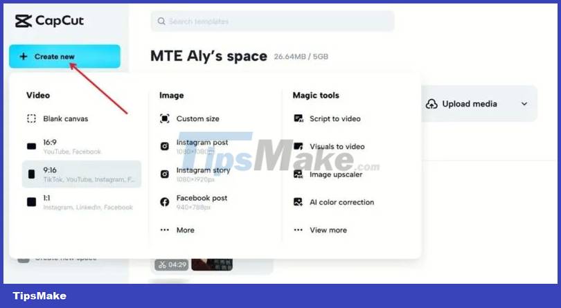
If you want to create your own Instagram template with Safe Zone in mind, consider exploring CapCut. You will need to create an account and workspace where you will save your templates for later use. This example is creating a Reel template using CapCut.
Click the Create new button and select the 9:16 option for Instagram, TikTok or Facebook.
Upload your video to the platform.
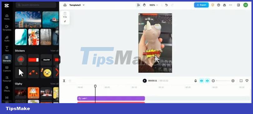
Using the menu on the left, add additional elements, such as stickers, GIFs, or text. They will be added as separate bars at the top of your video feed at the bottom.
Tap the TikTok button in the upper left corner. TikTok overlay will be applied to your work. Since TikTok and Instagram Reels have similar configuration buttons, this overlay will help you visualize what your Reels will look like when posted. To keep things safe, move any text or elements slightly above the TikTok name placeholder.
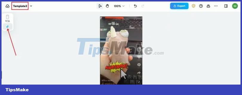
Make sure you save your project so you can easily find it again when you need to use the template.
To do so, go back to CapCut, go to your space and click on your template to open it.
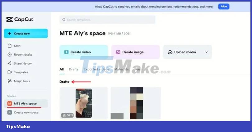
Click another video from the library to add it to your video feed next to the original video you'll need to delete. Click on it and then click on the trash can icon in the menu above.
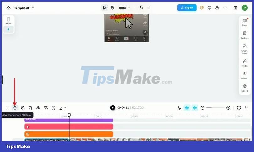
Now, expand the effect bars so they cover the length of the existing video. You just reused your template.
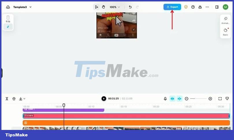
Click the Export button in the upper right corner and select Download to save to your device (without watermark), then upload to Instagram.


 How to download multiple photos on 1 Instagram post
  How to create Instagram Stories from your voice and photos
  How to delete audio when posting videos to Instagram
  How to verify Instagram account (add a green tick next to the name)
  How to watch live video on Instagram in the browser
  How to add featured Instagram