Table of Contents
Bootstrap's col-md-* classes set column widths from the medium breakpoint, which starts at 768px. When an element has only a medium column class, it takes the full row below 768px and becomes a grid column at 768px and wider.
How the medium breakpoint behaves
Bootstrap is mobile first: each breakpoint uses a minimum-width rule and remains active at larger widths unless a later class overrides it. The default prefixes around the medium tier are:
| Viewport width | Prefix | Example |
|---|---|---|
| Below 576px | .col- | .col-6 |
| 576px and wider | .col-sm- | .col-sm-4 |
| 768px and wider | .col-md- | .col-md-6 |
| 992px and wider | .col-lg- | .col-lg-8 |
The full grid also includes xl at 1200px and xxl at 1400px. See the Bootstrap grid documentation for the current defaults and customization options.
Create two equal columns from 768px
The grid is divided into 12 template columns. Two elements with col-md-6 each take six units, so they become equal halves at the medium breakpoint:
<div class="container">
  <div class="row g-4">
    <section class="col-md-6">
      <div class="p-4 border rounded">
        Main information
      </div>
    </section>
    <aside class="col-md-6">
      <div class="p-4 bg-light border rounded">
        Related details
      </div>
    </aside>
  </div>
</div>
Below 768px, the sections stack vertically because no smaller column width is defined. At 768px and above, they share the row 50%/50%. The behavior continues through large, extra-large, and extra-extra-large viewports unless you add another responsive class.

Use 25/75 on small screens and 50/50 on medium screens
Combine classes when the proportions should change at multiple breakpoints:
<div class="container">
  <div class="row g-3">
    <aside class="col-sm-3 col-md-6">
      <div class="p-3 bg-primary text-white">First column</div>
    </aside>
    <main class="col-sm-9 col-md-6">
      <div class="p-3 bg-secondary text-white">Second column</div>
    </main>
  </div>
</div>| Width | First column | Second column |
|---|---|---|
| Below 576px | 100% | 100% |
| 576px to 767.98px | 25% | 75% |
| 768px and wider | 50% | 50% |
The small classes take effect first. At 768px, the medium classes replace those widths. A later col-lg-* pair could change the proportions again from 992px.
Create equal-width medium columns automatically
Use col-md without a number when all participating columns should have equal width from 768px. Bootstrap counts the columns and distributes the row evenly:
<div class="container text-center">
  <div class="row g-3">
    <div class="col-md"><div class="p-3 border">1 of 4</div></div>
    <div class="col-md"><div class="p-3 border">2 of 4</div></div>
    <div class="col-md"><div class="p-3 border">3 of 4</div></div>
    <div class="col-md"><div class="p-3 border">4 of 4</div></div>
  </div>
</div>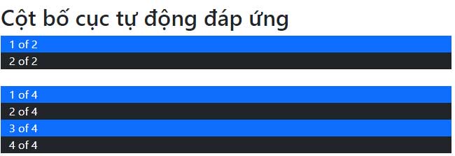
These four columns stack vertically below 768px. If they should stay side by side at every width, use plain col. If they should form a 2-by-2 arrangement on smaller screens, combine col-6 col-md.
Use row-cols for repeating content
For a list of similar cards, set the desired number of columns on the row instead of repeating a numbered class on every item:
<div class="row row-cols-1 row-cols-sm-2 row-cols-md-3 g-4">
  <article class="col">Card 1</article>
  <article class="col">Card 2</article>
  <article class="col">Card 3</article>
  <article class="col">Card 4</article>
  <article class="col">Card 5</article>
  <article class="col">Card 6</article>
</div>
This layout shows one card per row by default, two from 576px, and three from 768px. It is often clearer for galleries and product cards than assigning a width to every item.
Common medium-grid mistakes
- Missing row wrapper: place grid columns directly inside a
row. - Missing viewport meta tag: include
<meta name="viewport" content="width=device-width, initial-scale=1">. - Expecting
mdto end at 991px: it continues upward until another class overrides it. - Confusing visual device names with hardware: Bootstrap responds to CSS viewport width, not the product category of the device.
- Forcing every span to total exactly 12: a row may use fewer units, but exceeding the available space can wrap columns.
Test the layout in browser developer tools at widths just below and above 768px. If you are deciding whether Bootstrap suits the project, compare it with other CSS frameworks. A good HTML editor can also help catch misspelled responsive classes.
Related Articles
 Lesson 42: Large Grid in Bootstrap 54 minutes read
 Lesson 38: Grid Systems from Stacked to Horizontal in Bootstrap 54 minutes read
 Lesson 40: Small Grid in Bootstrap 54 minutes read
 Lesson 3: Grid System in Bootstrap 511 minutes read
 Lesson 39: Ultra-Small Grid Styles in Bootstrap 54 minutes read
 Lesson 30: Flexing in Bootstrap 59 minutes read
Reader Comments 0
Sign in with email or Google to join the discussion.