Table of Contents
Bootstrap's col-sm-* classes create grid columns from the small breakpoint, which begins at 576px. Below 576px, elements with only small-breakpoint classes stack at full width. At 576px and above, their numbered spans determine how much of the 12-column row they occupy.
What the small breakpoint means
Bootstrap breakpoints use minimum-width media queries. A col-sm-4 rule therefore applies at the small, medium, large, extra-large, and extra-extra-large tiers unless a later responsive class overrides it.
| Viewport | Grid behavior for col-sm-* |
|---|---|
| Below 576px | Columns stack at full width |
| 576px and wider | Specified small-grid widths apply |
The breakpoint responds to the CSS viewport, not whether a device is marketed as a phone or tablet. Check the official Bootstrap grid documentation for all six default tiers.
Create a 25/75 small-screen grid
Bootstrap divides each row into 12 template columns. Three units equal 25% and nine units equal 75%, so the required pair is col-sm-3 and col-sm-9:
<div class="container">
  <div class="row g-3">
    <aside class="col-sm-3">
      <div class="p-3 bg-light border rounded">
        Navigation
      </div>
    </aside>
    <main class="col-sm-9">
      <div class="p-3 border rounded">
        Main content
      </div>
    </main>
  </div>
</div>
Resize the browser across 576px. Below that point, the aside appears above the main content. At and above 576px, both elements share a row in a 25%/75% ratio.

Choose other common proportions
Numbered grid classes represent how many of the 12 available units a column spans:
| Proportion | First column | Second column |
|---|---|---|
| 25% / 75% | col-sm-3 | col-sm-9 |
| 33.3% / 66.7% | col-sm-4 | col-sm-8 |
| 50% / 50% | col-sm-6 | col-sm-6 |
This example creates a one-third/two-thirds layout from 576px:
<div class="container">
  <div class="row g-3">
    <div class="col-sm-4">
      <div class="p-3 bg-primary text-white">One third</div>
    </div>
    <div class="col-sm-8">
      <div class="p-3 bg-secondary text-white">Two thirds</div>
    </div>
  </div>
</div>
For equal halves, replace the two column classes with col-sm-6. A row may use fewer than 12 units, but when the active spans exceed the available space, later columns wrap to a new line.

Create automatic equal-width columns
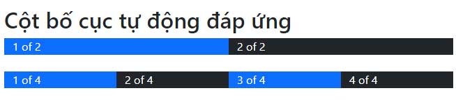
Use col-sm without a number when each column should receive an equal share from the small breakpoint. Bootstrap calculates the width based on how many columns are present:
<div class="container text-center">
  <div class="row g-3">
    <div class="col-sm"><div class="p-3 border">1 of 4</div></div>
    <div class="col-sm"><div class="p-3 border">2 of 4</div></div>
    <div class="col-sm"><div class="p-3 border">3 of 4</div></div>
    <div class="col-sm"><div class="p-3 border">4 of 4</div></div>
  </div>
</div>
All four columns stack vertically below 576px and become equal quarters from 576px. If equal columns should remain side by side at every viewport width, use plain col instead.
Change the layout again at wider breakpoints
Small classes do not stop at 767px. Add medium or large classes when the design should change later:
<div class="row g-3">
  <aside class="col-sm-4 col-lg-3">Filters</aside>
  <main class="col-sm-8 col-lg-9">Results</main>
</div>
This pair stacks below 576px, uses 33.3%/66.7% from 576px, and changes to 25%/75% from 992px. Read the classes from left to right as progressively wider layout rules.
Test the result
- Include
<meta name="viewport" content="width=device-width, initial-scale=1">in the page head. - Place columns directly inside a
row, with the row inside a container. - Use
g-*,gx-*, orgy-*classes to control gutters instead of adding arbitrary margins to columns. - Test just below and above 576px, then check larger breakpoints for unintended widths.
- Inspect the active CSS in browser developer tools if a column does not behave as expected.
If you are comparing layout systems, this overview of popular CSS frameworks provides useful context. These HTML editors can also make it easier to spot malformed markup and misspelled classes.
Related Articles
 Lesson 42: Large Grid in Bootstrap 54 minutes read
 Lesson 38: Grid Systems from Stacked to Horizontal in Bootstrap 54 minutes read
 Lesson 41: Grid Medium in Bootstrap 54 minutes read
 Lesson 39: Ultra-Small Grid Styles in Bootstrap 54 minutes read
 Lesson 3: Grid System in Bootstrap 511 minutes read
 Lesson 24: Tooltips in Bootstrap 53 minutes read
Reader Comments 0
Sign in with email or Google to join the discussion.