Table of Contents
Bootstrap 5 styles the browser's built-in form validation states. Add HTML constraints such as required, type="email", and minlength; provide feedback elements; then add was-validated after a submit attempt. This gives users specific guidance without showing every field as invalid when the page first loads.
How Bootstrap validation classes differ
| Class | Purpose |
|---|---|
needs-validation | A convenient hook for selecting forms that use custom validation handling |
was-validated | Activates Bootstrap styles based on the browser's :valid and :invalid states |
is-valid | Explicitly marks one control as valid, often after server-side validation |
is-invalid | Explicitly marks one control as invalid, often after server-side validation |
valid-feedback | Displays a message associated with a valid control |
invalid-feedback | Displays a message associated with an invalid control |
The needs-validation class does not validate the form by itself. HTML validation rules determine validity, and JavaScript decides when to reveal Bootstrap's custom state. The Bootstrap validation documentation covers the supported approaches.
Create the validated form
This example validates a username, email address, password, and terms checkbox. The form uses novalidate to suppress the browser's default tooltip bubbles while retaining the Constraint Validation API used by checkValidity().
<form class="row g-3 needs-validation" action="/register"
  method="post" novalidate>

  <div class="col-md-6">
    <label class="form-label" for="username">Username</label>
    <input class="form-control" id="username" name="username"
      type="text" minlength="3" maxlength="30"
      autocomplete="username"
      aria-describedby="usernameHelp usernameError" required>
    <div class="form-text" id="usernameHelp">
      Use 3 to 30 characters.
    </div>
    <div class="invalid-feedback" id="usernameError">
      Enter a username with at least 3 characters.
    </div>
  </div>

  <div class="col-md-6">
    <label class="form-label" for="email">Email address</label>
    <input class="form-control" id="email" name="email"
      type="email" autocomplete="email"
      aria-describedby="emailError" required>
    <div class="invalid-feedback" id="emailError">
      Enter a valid email address.
    </div>
  </div>

  <div class="col-12">
    <label class="form-label" for="password">Password</label>
    <input class="form-control" id="password" name="password"
      type="password" minlength="8" autocomplete="new-password"
      aria-describedby="passwordHelp passwordError" required>
    <div class="form-text" id="passwordHelp">
      Use at least 8 characters.
    </div>
    <div class="invalid-feedback" id="passwordError">
      Enter a password with at least 8 characters.
    </div>
  </div>

  <div class="col-12">
    <div class="form-check">
      <input class="form-check-input" id="terms" name="terms"
        type="checkbox" aria-describedby="termsError" required>
      <label class="form-check-label" for="terms">
        I agree to the terms
      </label>
      <div class="invalid-feedback" id="termsError">
        Accept the terms before continuing.
      </div>
    </div>
  </div>

  <div class="col-12">
    <button class="btn btn-primary" type="submit">
      Create account
    </button>
  </div>
</form>
Visible labels identify every control. The aria-describedby attributes connect help and error text to their fields, while autocomplete values help browsers and password managers understand the expected information.
Add submit-time validation
Place this script after the form or load it with defer. It blocks an invalid submission and adds was-validated so Bootstrap displays the relevant feedback.
(() => {
  const forms = document.querySelectorAll('.needs-validation');

  [...forms].forEach((form) => {
    form.addEventListener('submit', (event) => {
      if (!form.checkValidity()) {
        event.preventDefault();
        event.stopPropagation();

        const firstInvalid = form.querySelector(':invalid');
        firstInvalid?.focus();
      }

      form.classList.add('was-validated');
    });
  });
})();
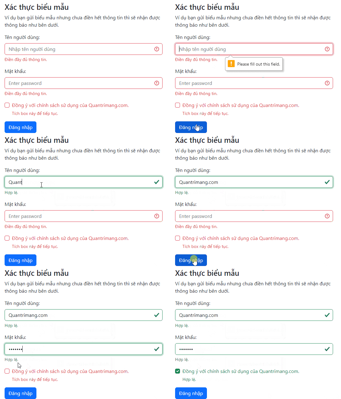
The browser evaluates the constraints already present in the HTML. For example, an empty required field is invalid, a malformed value fails type="email", and a short password fails minlength="8".
Use native browser feedback instead
If the browser's own validation messages are acceptable, remove novalidate and the custom submit script. The browser will prevent invalid submission and display localized messages. Bootstrap's custom feedback offers more consistent presentation, but native feedback requires less code.
Do not add was-validated to the initial HTML merely to make the colors appear. Doing so can mark untouched required fields red as soon as the page loads, which creates noise before the user has attempted the form.
Show validation returned by the server
When the server rejects one field, apply is-invalid only to that control and render a clear message beside it:
<label class="form-label" for="accountEmail">Email address</label>
<input class="form-control is-invalid" id="accountEmail"
  name="email" type="email" value="member@example.com"
  aria-describedby="accountEmailError">
<div class="invalid-feedback" id="accountEmailError">
  An account already uses this email address.
</div>
Use is-valid sparingly. A green border on every accepted field can distract from the fields that actually need attention.
Client-side checks are not a security boundary
Browser validation improves the experience by catching simple mistakes early, but requests can bypass or modify the page. Validate, normalize, and authorize all submitted data on the server as well. The MDN form validation guide explains the distinction between client-side and server-side checks.
Validation also does not prove that an email address exists, that a username is available, or that a password is safe to store. Those tasks require application logic, and passwords must be handled by the authentication system rather than printed or logged by the page.
Validation checklist
- Use the correct input type and HTML constraints for each field.
- Give every control a visible label.
- Explain the requirement before or next to the field, not only after failure.
- Use text and structure in addition to red or green color.
- Move focus to the first invalid control after an unsuccessful submission.
- Preserve the user's accepted values when the server returns an error.
- Test with a keyboard and at narrow viewport widths.
- Repeat every important validation rule on the server.
Bootstrap provides the presentation layer; the underlying form still depends on sound HTML. These HTML editing tools can help inspect field attributes, while this comparison of CSS frameworks provides context when choosing a UI toolkit.
Related Articles
 Lesson 42: Large Grid in Bootstrap 54 minutes read
 Form Validation in JavaScript1 minutes read
 Lesson 38: Grid Systems from Stacked to Horizontal in Bootstrap 54 minutes read
 Lesson 30: Flexing in Bootstrap 59 minutes read
 Lesson 36: Form Floating Label in Bootstrap 53 minutes read
 Lesson 15: Pagination in Bootstrap 54 minutes read
Reader Comments 0
Sign in with email or Google to join the discussion.