Table of Contents
Bootstrap 5 provides utility classes for applying theme colors to text and backgrounds. Use text-* classes for foreground color, bg-* classes for background color, and the opacity utilities when you need a transparent variation. Because a background utility does not automatically guarantee readable text, always check the foreground and background combination together.
The examples below use Bootstrap's default theme names. A project can change the actual color values through Sass or CSS variables, so treat names such as primary and success as semantic roles rather than fixed shades. For broader context, see this comparison of popular CSS frameworks.
Bootstrap 5 text color classes
The core contextual text utilities are text-primary, text-secondary, text-success, text-danger, text-warning, text-info, text-light, and text-dark. Bootstrap also provides text-body, text-black, and text-white.
<p class="text-primary">Primary text</p>
<p class="text-success">Successful operation</p>
<p class="text-danger">Unable to save the file</p>
<p class="text-warning bg-dark">Warning that needs attention</p>
<p class="text-info bg-dark">Additional information</p>
<p class="text-body">Normal body text</p>
Bootstrap 5.3 also includes text-*-emphasis classes, such as text-primary-emphasis and text-danger-emphasis. These use the corresponding emphasis colors and can adapt to Bootstrap's color modes. For secondary copy, prefer text-body-secondary or text-body-tertiary in a Bootstrap 5.3 project. The older text-muted utility is deprecated as of Bootstrap 5.3.
Adjust text opacity
Combine a text color with text-opacity-25, text-opacity-50, text-opacity-75, or text-opacity-100 to control its alpha value:
<p class="text-primary">100% opacity</p>
<p class="text-primary text-opacity-75">75% opacity</p>
<p class="text-primary text-opacity-50">50% opacity</p>
<p class="text-primary text-opacity-25">25% opacity</p>
The classes text-black-50 and text-white-50 may still appear in older examples, but Bootstrap has deprecated them in favor of the general opacity utilities. Reduced opacity also reduces contrast, so it is better suited to decorative or secondary text than to instructions, labels, or essential information.
Bootstrap 5 background color classes
Background utilities follow the same contextual naming pattern: bg-primary, bg-secondary, bg-success, bg-danger, bg-warning, bg-info, bg-light, and bg-dark. Bootstrap also provides bg-white, bg-black, bg-body, and related body-background utilities.
A background class sets the background color only. Add a suitable text class yourself. For example, dark text normally works better on warning and light backgrounds, while white text can work on darker theme backgrounds:
<div class="bg-primary text-white p-3">Primary panel</div>
<div class="bg-success text-white p-3">Success panel</div>
<div class="bg-warning text-dark p-3">Warning panel</div>
<div class="bg-danger text-white p-3">Danger panel</div>
<div class="bg-light text-dark p-3">Light panel</div>
<div class="bg-dark text-white p-3">Dark panel</div>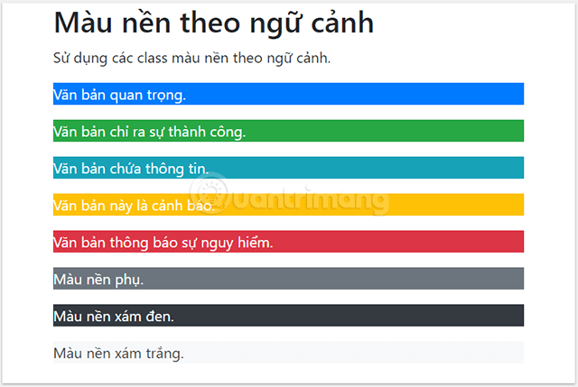
The p-3 class in the example adds padding; it does not affect color. Utility classes are designed to be combined, which makes them useful for quick prototypes and small interface adjustments. You can experiment with the markup in one of these HTML editors for Windows.
Subtle backgrounds in Bootstrap 5.3
Bootstrap 5.3 adds bg-*-subtle utilities, including bg-primary-subtle, bg-success-subtle, and bg-danger-subtle. They are useful for softly tinted panels and can respond to Bootstrap's light and dark color modes. Pair them with a matching emphasis text class:
<div class="bg-success-subtle text-success-emphasis p-3">
  The changes were saved.
</div>

<div class="bg-danger-subtle text-danger-emphasis p-3">
  The upload failed.
</div>
Adjust background opacity
Use bg-opacity-10, bg-opacity-25, bg-opacity-50, bg-opacity-75, or bg-opacity-100 with a compatible background utility:
<div class="bg-success text-white p-3">Full opacity</div>
<div class="bg-success bg-opacity-75 text-white p-3">75% opacity</div>
<div class="bg-success bg-opacity-50 text-dark p-3">50% opacity</div>
<div class="bg-success bg-opacity-25 text-dark p-3">25% opacity</div>
<div class="bg-success bg-opacity-10 text-dark p-3">10% opacity</div>
Notice that the text color changes in the lower-opacity examples. As the background becomes lighter, the original foreground may no longer provide enough contrast. Test the final rendered combination rather than assuming a class name guarantees readability.
Add a background gradient
The bg-gradient utility adds Bootstrap's predefined semi-transparent gradient over a compatible background:
<div class="bg-primary bg-gradient text-white p-3">
  Primary background with a gradient
</div>
This is a restrained overlay, not a full gradient builder. For a custom direction or multiple color stops, write a project-specific CSS background-image.
Color links without outdated hover assumptions
Text utilities can be applied to links, but a general text-* class does not define a complete interactive state on its own. Bootstrap 5.3 provides link utilities such as link-primary, link-danger, and opacity or underline helpers that are intended for links.
<a href="/account" class="link-primary">Open your account</a>
<a href="/delete" class="link-danger">Delete this item</a>
Always retain a visible focus style for keyboard users. A color change on hover alone is not enough because touch and keyboard users may never see it.
Accessibility and maintenance tips
- Do not convey meaning with color alone. Add clear text, an icon with an accessible name, or another visual cue.
- Check contrast in the real theme. Custom Sass values, opacity, gradients, and dark mode can all change the result.
- Use semantic names consistently. Reserve
success,warning, anddangerfor the same kinds of states throughout the interface. - Avoid forcing utility classes everywhere. Repeated combinations may be easier to maintain as a reusable component class.
- Test interaction states. Links, buttons, form controls, and alerts need readable hover, focus, active, and disabled states.
For the current class list and version notes, consult Bootstrap's official documentation for text colors and background utilities.
Related Articles
 Lesson 42: Large Grid in Bootstrap 54 minutes read
 Lesson 38: Grid Systems from Stacked to Horizontal in Bootstrap 54 minutes read
 Lesson 30: Flexing in Bootstrap 59 minutes read
 Lesson 15: Pagination in Bootstrap 54 minutes read
 Lesson 4: Typography in Bootstrap 512 minutes read
 Lesson 29: Utilities in Bootstrap 59 minutes read
Reader Comments 0
Sign in with email or Google to join the discussion.