Lesson 39: Ultra-Small Grid Styles in Bootstrap 5
In previous Bootstrap 5 lessons, we learned about basic grid systems. In this lesson, let's delve deeper into ultra-fine grid types!.
In previous Bootstrap 5 lessons , we learned about the basic grid systems . In this lesson, let's delve deeper into the ultra-fine grid types in Bootstrap !
Example of a micro-grid table
For example, on a simple layout with two columns, you want to scale it 25%/75% across all devices. Add the following class to both columns:
. .The basic code is as follows:
Lorem ipsum.
Sed ut perspiciatis.
For example, on the website TipsMake.com:
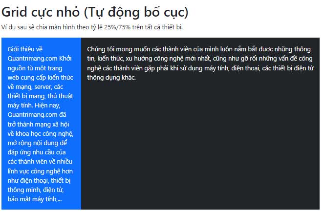
Bootstrap Example Ultra-small grid (Automatic layout)
The following example will split the screen at a 25%/75% ratio across all devices.
Giới thiệu về TipsMake.com.com Khởi nguồn từ một trang web cung cấp kiến thức về mạng, server, các thiết bị mạng, thủ thuật máy tính. Hiện nay, TipsMake.com.com đã trở thành mạng xã hội về khoa học công nghệ, mở rộng nội dung để đáp ứng nhu cầu của các thành viên về nhiều lĩnh vực công nghệ hơn như điện thoại, thiết bị thông minh, điện tử, bảo mật máy tính,. Chúng tôi mong muốn các thành viên của mình luôn nắm bắt được những thông tin, kiến thức, xu hướng công nghệ mới nhất, cũng như gỡ rối những vấn đề công nghệ các thành viên gặp phải khi sử dụng máy tính, điện thoại, các thiết bị điện tử thông dụng khác.
Note: Ensure the number of added columns is a maximum of 12 or fewer. You don't need to use all 12 available columns.
For a 33.3%/66.6% split, you would use .col-4and .col-8. If splitting 50%/50%, you would use .col-6and .col-6.
Sample code:
Lorem ipsum.
Sed ut perspiciatis.
Lorem ipsum.
Sed ut perspiciatis.
Examples on the web:
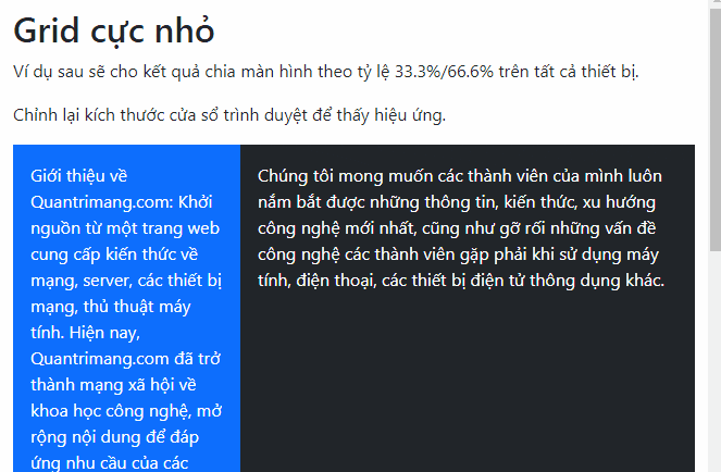
Bootstrap Example Ultra-small grid
The following example will show a split-screen ratio of 33.3%/66.6% across all devices.
Adjust the browser window size to see the effect.
Giới thiệu về TipsMake.com.com: Khởi nguồn từ một trang web cung cấp kiến thức về mạng, server, các thiết bị mạng, thủ thuật máy tính. Hiện nay, TipsMake.com.com đã trở thành mạng xã hội về khoa học công nghệ, mở rộng nội dung để đáp ứng nhu cầu của các thành viên về nhiều lĩnh vực công nghệ hơn như điện thoại, thiết bị thông minh, điện tử, bảo mật máy tính,. Chúng tôi mong muốn các thành viên của mình luôn nắm bắt được những thông tin, kiến thức, xu hướng công nghệ mới nhất, cũng như gỡ rối những vấn đề công nghệ các thành viên gặp phải khi sử dụng máy tính, điện thoại, các thiết bị điện tử thông dụng khác.
The following example shows 50/50 screen split on all devices.
Giới thiệu về TipsMake.com.com: Khởi nguồn từ một trang web cung cấp kiến thức về mạng, server, các thiết bị mạng, thủ thuật máy tính. Hiện nay, TipsMake.com.com đã trở thành mạng xã hội về khoa học công nghệ, mở rộng nội dung để đáp ứng nhu cầu của các thành viên về nhiều lĩnh vực công nghệ hơn như điện thoại, thiết bị thông minh, điện tử, bảo mật máy tính,. Chúng tôi mong muốn các thành viên của mình luôn nắm bắt được những thông tin, kiến thức, xu hướng công nghệ mới nhất, cũng như gỡ rối những vấn đề công nghệ các thành viên gặp phải khi sử dụng máy tính, điện thoại, các thiết bị điện tử thông dụng khác.
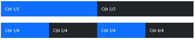
Automatic layout column
In Bootstrap 5, you have an easy way to create columns of equal width for all devices. Just remove the numbers .col*and use the class .colon only specific numbers of the col elements. Bootstrap will determine the number of columns present, and each column will have the same width.
1 of 2 2 of 2 1 of 4 2 of 4 3 of 4 4 of 4 Examples on the web:
 Bootstrap Example Cột 1/2 Cột 2/2
 Cột 1/4 Cột 2/4 Cột 3/4 Cột 4/4
Above are some examples of microgrids in Bootstrap 5. Hopefully, this article has helped you better understand grids when using Bootstrap.
 Samuel Daniel