JavaScript code to create a scatter plot with custom markers.
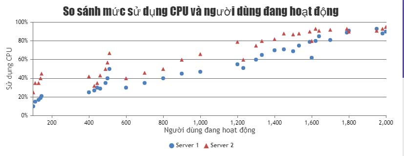
The example below illustrates a multi-series scatter plot created using JavaScript, where you'll see the markup style for the second series is changed to a triangle..
You can change the markup style used to display data points in a scatter plot. Changing the markup style makes it easier for viewers to distinguish between the series/data points on the chart/graph.
The example below illustrates a multi-series scatter plot created using JavaScript , where you'll see the markup style for the second series changed to a triangle. The article also provides the source code for editing in your browser or saving to your machine for local execution.
Source : CanvasJS
Customize charts
You can change the style or size of the markers in a scatter plot using markerType& markerSize. Some other common customization options are markerColor, markerBorderColor, markerBorderThicknessetc.