JavaScript code to create a scatter plot/point chart
Below is an example of a scatter plot/point chart created using JavaScript, along with the HTML source code that you can edit in your browser or save to your computer to run locally..
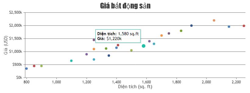
A scatter plot presents data as a series of points with coordinate axes defined by the x and y values of the data points. This type of plot is also known as a point plot. It is useful when you want to understand how the density of data points is distributed as the x and y coordinates change.
With this chart, you can interact with it, add animations, zoom in on the data, rotate it, and export the file as an image. Below is an example of a scatter plot/point chart created using JavaScript, along with the HTML source code that you can edit in your browser or save to your computer to run locally.
Source : CanvasJS
Customize charts
Like other chart templates in this section, you can change the properties as you wish to get results that suit your needs. For example:
- markerType: Marker type
- markerSize: Marker size
- Color: Color
- markerBorderColor: Border color of the marker
- fillOpacity: The degree of opacity when filling data.
- And much more.