Table of Contents
A secondary axis lets one chart display series with different units or very different numeric ranges. In CanvasJS, the primary Y-axis is configured with axisY, the secondary Y-axis with axisY2, and a data series is attached to the second scale with axisYType: "secondary".
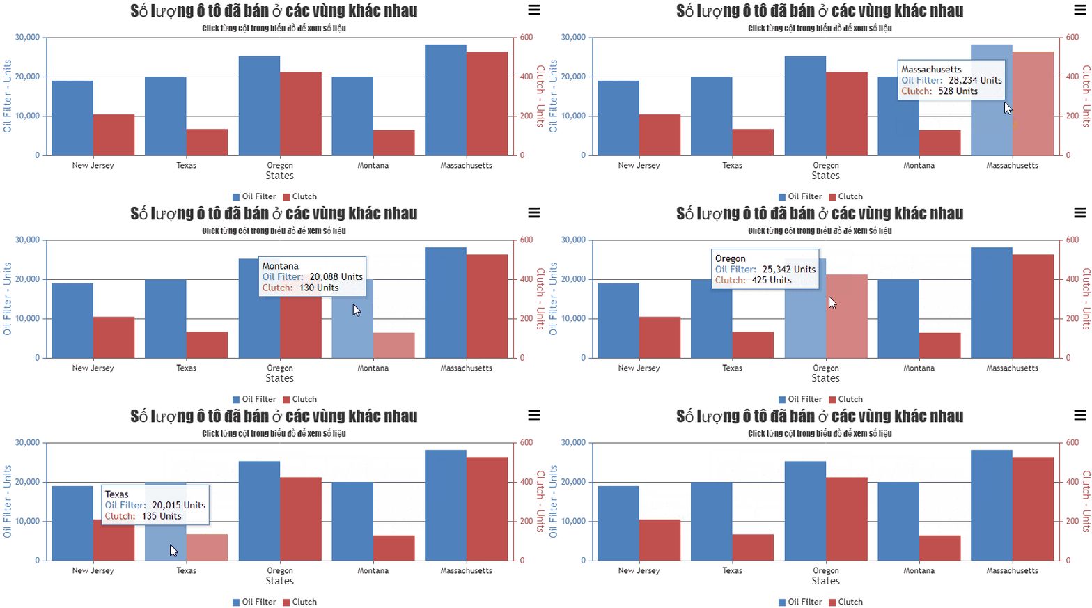
Complete secondary-axis chart example
This demonstration plots monthly orders as columns on the left axis and conversion rate as a line on the right axis. The units are different, so both axes are labeled explicitly.
<!doctype html>
<html lang="en">
<head>
  <meta charset="utf-8">
  <meta name="viewport"
        content="width=device-width, initial-scale=1">
  <title>Chart with a secondary axis</title>
  <script src="https://cdn.canvasjs.com/canvasjs.min.js"></script>
</head>
<body>
  <div id="chartContainer"
       style="height: 380px; width: 100%;"></div>

  <script>
    window.addEventListener("DOMContentLoaded", function () {
      const chart = new CanvasJS.Chart("chartContainer", {
        animationEnabled: true,
        title: {
          text: "Orders and conversion rate"
        },
        axisX: {
          title: "Month"
        },
        axisY: {
          title: "Orders",
          includeZero: true,
          lineColor: "#2563eb",
          tickColor: "#2563eb",
          labelFontColor: "#1e40af",
          titleFontColor: "#1e40af"
        },
        axisY2: {
          title: "Conversion rate",
          suffix: "%",
          includeZero: true,
          lineColor: "#dc2626",
          tickColor: "#dc2626",
          labelFontColor: "#991b1b",
          titleFontColor: "#991b1b"
        },
        toolTip: {
          shared: true
        },
        data: [
          {
            type: "column",
            name: "Orders",
            showInLegend: true,
            color: "#2563eb",
            dataPoints: [
              { label: "Jan", y: 120 },
              { label: "Feb", y: 138 },
              { label: "Mar", y: 149 },
              { label: "Apr", y: 142 },
              { label: "May", y: 166 },
              { label: "Jun", y: 181 }
            ]
          },
          {
            type: "line",
            name: "Conversion rate",
            showInLegend: true,
            axisYType: "secondary",
            color: "#dc2626",
            lineThickness: 3,
            markerSize: 7,
            yValueFormatString: "0.0'%'",
            dataPoints: [
              { label: "Jan", y: 2.8 },
              { label: "Feb", y: 3.1 },
              { label: "Mar", y: 3.0 },
              { label: "Apr", y: 3.4 },
              { label: "May", y: 3.6 },
              { label: "Jun", y: 3.9 }
            ]
          }
        ]
      });

      chart.render();
    });
  </script>
</body>
</html>
Attach a series to the secondary axis
CanvasJS plots every data series against the primary Y-axis by default. Add this property to the series that should use axisY2:
axisYType: "secondary"The left and right scales are independent. Configure their titles, suffixes, intervals, and colors separately so readers can match each series to the correct axis.
Primary and secondary X-axes
The same pattern is available for the horizontal axis. axisX configures the primary X-axis, axisX2 configures the secondary one, and axisXType: "secondary" assigns a series to it. Most time-series comparisons should share one X-axis; add another only when the horizontal variables genuinely differ.
Multiple axes on the same side
For more than one primary Y-axis, CanvasJS allows axisY to be an array of axis objects. A series then selects an entry using axisYIndex:
axisY: [
  { title: "First scale" },
  { title: "Second scale" }
]

/* Inside a data-series object */
axisYIndex: 1
axisYIndex is different from axisYType. The type chooses the primary or secondary side; the index chooses an axis within an array on that side.
Avoid misleading dual-axis charts
Two scales can make unrelated trends appear strongly connected because each axis can be adjusted independently. Use a secondary axis only when the comparison answers a clear question.
- Label both axes with full units.
- Match series and axis colors without relying on color alone.
- Show a legend and shared tooltip.
- Avoid manually selecting axis limits merely to make the lines align.
- State whether either series was normalized or transformed.
- Consider two aligned charts when the dual-axis version is difficult to interpret.
Troubleshooting
- If both series use the left scale, confirm the second series contains
axisYType: "secondary". - If the right axis appears but has no data, verify that the secondary series contains numeric
yvalues. - If categories do not align, use the same ordered labels or dates in both series.
- If the chart is blank, check the library load, container ID, container height, and browser console.
CanvasJS is a third-party library, so check its current licensing before production use. The official CanvasJS secondary-axis example documents the relevant properties.
For alternative presentation methods, compare these data-visualization tools. These code-sample websites can help you test smaller JavaScript chart examples.
Related Articles
 Javascript Code to Create OHLC and Line Chart Combo Chart Template2 minutes read
 Javascript Code to Create Bubble Chart with Custom Marker2 minutes read
 Code of Chart/Bar Graph with Error Combination2 minutes read
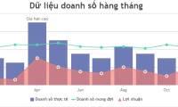 JavaScript Code to Create a Chart/graph Combining Lines, Areas, and Columns3 minutes read
 Javascript Code to Generate Dynamic Line Graphs/Charts2 minutes read
 Javascript Code to Create Dynamic Charts/Graphs2 minutes read
Reader Comments 0
Sign in with email or Google to join the discussion.