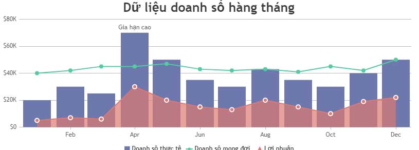
JavaScript code to create a chart/graph combining lines, areas, and columns.
The example below illustrates a combined column, line, and area chart created using JavaScript. It also contains source code that you can edit in your browser or save to your computer to run locally..
You can create combinations of any charts that share the same X and Y axis orientation. Creating combinations of different charts/graphs is similar to designing multi-series charts. You just need to add the data series and define the chart type.
The example below illustrates a combined column, line, and area chart created using JavaScript . It also contains the source code, which you can edit in your browser or save to your computer to run locally.
Source : CanvasJS
Customize charts
Any number in a data series can be plotted in a graph by adding a new data series array. You can also enable annotations in multi-series graphs by opening showInLegend.
Other common customization options include legendText(comment content), indexLabel(index labels), color(colors), etc.