JavaScript code to create a combined area and line chart.
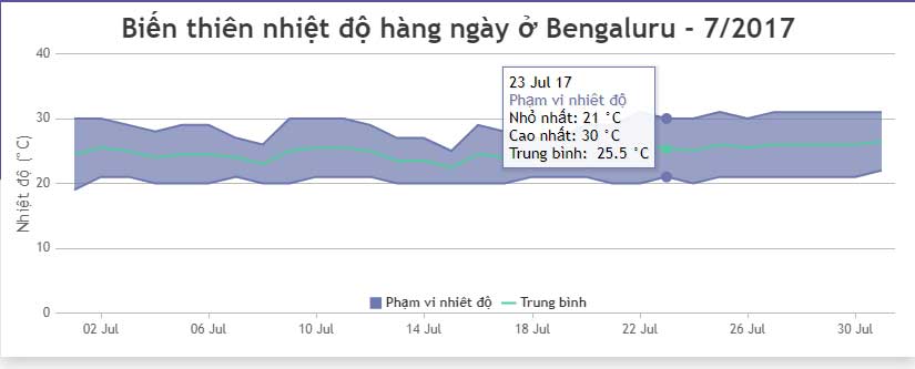
The example below illustrates daily temperature variation along with its average value by combining a range-based and line plot created using JavaScript..
You can combine area and line charts just like adding other data series. These charts are interactive, responsive, and support animation and image export.
The example below illustrates daily temperature variation along with its average value by combining a range-based histogram and a line graph created using JavaScript . The article also provides the source code for you to edit in your browser or save to your computer to run locally.
Source : CanvasJS
Customize charts
Like any other chart type, you can fine-tune this combined chart/graph type by changing its properties, for example:
indexLabelAdd data/index labels.indexLabelFontColor: Index label font colorindexLabelBackgroundColor: Background color of index labels- .