 Home
Home
 Wifi Tips
 Fix Computer
 Windows 10
 Windows 11
 Artificial Intelligence
 Space Science
 Strange story
Instructions for creating websites with Dreamweaver CC part 7
In the seventh part of this series, learn how to use CSS media queries to change the layout from two columns to a column when viewed on a phone and tablet browser.
- Create a website with Dreamweaver CC part 7 - Complete the second page, create a web page to suit your tablet and desktop
- Style for the second page
- Edit the font in the activation link
- Insert images from a local source
- Add a media query to style web pages for tablets and desktops
- Style the navigation menu for a two-column layout
- Use the absolute positioning feature to place text on an image
- Float a column next to another column
- Move text around the image
- Đặt thẻ meta viewport
In the seventh part of this series, learn how to use CSS media queries to change the layout from two columns to a column when viewed on a phone and tablet browser.
Note : Downloads include Creative Cloud Libraries and project files for this tutorial series. You can continue to build on your start file in part 1 or navigate to the relevant directory to use the start file for each section.
- Instructions for creating websites with Dreamweaver CC part 1
- Instructions for creating websites with Dreamweaver CC part 2
- Instructions for creating websites with Dreamweaver CC part 3
- Instructions for creating websites with Dreamweaver CC part 4
- Instructions for creating websites with Dreamweaver CC part 5
- Instructions for creating websites with Dreamweaver CC part 6
Welcome to part 7 of this series on how to build a simple and responsive website for Dreamweaver CC 2015. You are now approaching the final steps. All that's left is to complete the second page, and then adjust the one-column layout of the Bayside Beat website into a two-column design suitable for tablets and desktops.

You can distribute a different layout for larger screens, using the CSS media queries. Testing the media query provides different styling rules for the browser, depending on certain criteria, such as the minimum or maximum width of the view. To make things simpler, you will only create two media queries, one to display the page in a two-column layout when the screen is at least 700px wide and one to add text around some images when the screen is wide. minimum 900px. At the end of this section, the homepage will look like the following figure.

In this section, you will learn how to avoid problems with absolute positioning. But first, you need to do some work with the second page, not yet typed.
Style for the second page
The great thing about using an external stylesheet is that the styles are immediately applied to every page associated with it. After linking the stylesheet to the sights.html, you need to update the navigation menu on the second page.
1. Open the sights.html point in the Document window by double-clicking the Files panel .
2. Switch to CSS Designer, click the plus (+) button in the upper left corner of the Sources and select Attach Existing CSS File .
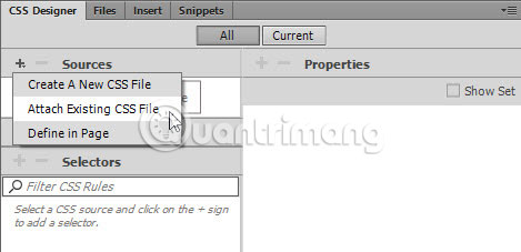
3. Click the Browse button in the dialog box that opens and navigate to the responsive.css in the Styles folder . Click OK (Windows) or Open (Mac), and then click OK to close the first dialog box.
Attaching the stylesheet immediately changes the look of the page. Dreamweaver also discovered that these types use Adobe Edge Web Font and insert code to download.
4. Navigation menu still looks like an unordered list. In the DOM panel, select an unordered list (nested within the header and nav elements). Edit the ul element by double-clicking and entering # navlinks.displayed in the right field. The code hint will appear for both ID and class.
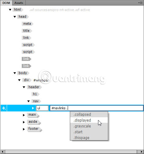
Navigation menu is redesigned and positioned absolutely on the first heading and the next paragraphs. If Live View is wider than 1000px, don't worry about the semi-transparent background overflowing from the wrapper
on the right. It will not appear in the two column layout.
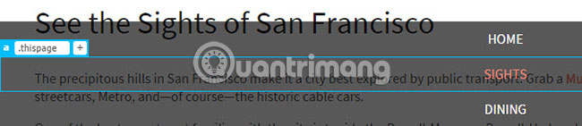
5. Expand the element ul in the DOM panel, then expand the second li element and select the nested element. You can check if you have selected the correct element, because the SIGHTS link will also be selected in Live View.
Double-click an element in the DOM panel and assign the class.thispage for it.
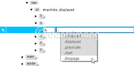
When you press Enter / Return to confirm the edit, the layer is also displayed in Element Display and the second link changes color.
6. To complete the navigation menu, you need to add activation link and JavaScript file. There are several ways to do this, but because you're working in the DOM dashboard, keep doing so.
Create the index.html page that works in the Document window , right-click on the #menulink h2 in the DOM panel and select Copy from the context menu.
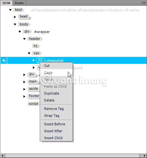
7. Go back to sights.html, select the nav element in the DOM panel, right-click and select Paste as Child .
Caution : If you click Paste instead of Paste as Child , the activation link will be inserted as sibling (brother element) of the nav element (in other words, at the same level of HTML hierarchy), so it will be under ul in the DOM panel. However, it will appear in the correct position in Live View because the unordered list is absolutely positioned and deleted from the normal document stream.
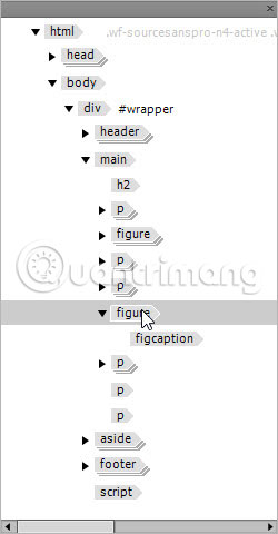
Check the DOM panel to make sure that #menulink is correctly nested inside the nav element above the unordered list as shown in the image below.
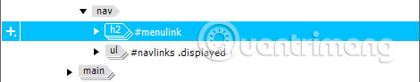
If #menulink h2 is below the unordered list, undo by pressing Ctrl + Z (Windows) or Cmd + Z (Mac). Then, select the nav element again , right-click and select Paste as Child .
8. Go back to index.html, right-click the script element at the bottom of the DOM control panel and select Copy from the context menu.
9. Go back to sights.html, right-click on the footer element in the DOM panel and select Paste from the context menu.
This time, you need to select Paste, instead of Paste as Child . The script should be behind the footer and not be nested inside.
When the script is attached, the navigation menu is hidden in the same way as in index.html. If the Document window is more than 1000px wide, attaching a script can cause the wrapper to move left in Live View. If that happens, just press F5 to refresh the page.
10. Save the sights.html.
Instead of copying the unfinished version of the navigation menu in section 3 and updating it here, it would be better to complete it first. In fact, web development rarely happens smoothly. You or your customers may have new ideas or requests, so it's important to know how to copy elements to other pages. This is also a challenge in ensuring the elements are correctly integrated. This page will continue to work even if the script is nested in the footer, but incorrectly nested code will often cause problems. Troubleshooting will be much easier if the code is well organized.
Edit the font in the activation link
In the previous section, you converted between index.html and sights.html several times. If your eyes are sharp, you'll notice the difference between the activation link in the two pages. The text portion of MENU in index.html is lighter in weight than the sights.html.
This has happened because the font for the body part declared is source-sans-pro with the font-weight of 400 (normal) . When you create this styling rule in Part 4, Dreamweaver initially sets font-weight to 200 (light) . Therefore, the Adobe Edge Web Font script loads in index.html to download both weights. But when you attach the stylesheet to sights.html, Dreamweaver only sees source-sans-pro with normal font-weight. To fix this, you need to make adjustments to different weight usage types.
1. With sights.html as the active page in the Document window , select #menulink a in Selectors of CSS Designer.
2. If necessary, uncheck Show Set in Properties, click on the icon

to ignore text properties and set the font family to source-sans-pro. This updates the script in the section , responsible for downloading Edge Web Fonts.
3. Switch to index.html and select the styling rule for #hero p in Selectors of CSS Designer. This indicates that font-weight is 600. Because it is heavier than normal font-weight, browsers (including Live View) synthesize fonts that are semi-bold, but this is not your thing. really want. Set the font family to this rule to source-sans-pro . The text in the paragraph is now much sharper.
4. You have made changes to some files, so choose File> Save All .
5. Dreamweaver will ask if you want to update Web Fonts in the sights.html .
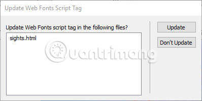
6. Click Update, then click Close to dismiss the update report dialog box that was performed. Dreamweaver automatically saves the file (s) it has updated.
Usually, the only time you need to specify a style-based font family is different from the body part when you want to use a different font. However, in this case, you are using the Web Font Edge to be downloaded from Adobe servers. To keep the download size to a minimum, Dreamweaver only fetches the currently used weights. Although semi-bold (600) is only used in index.html, additional font-weight will be stored in the browser cache when accessing sights.html, so there is no possibility of causing additional burden. However, if you are using multiple web fonts (this is not a good idea), you should think more about whether to download fonts that will not be used.
Insert images from a local source
In part 5, you inserted the image into the elements
directly from Bayside CC Library. However, this does not happen often. You will work with more locally stored images. In this section, you will add two images to sights.html using different methods. This process is very similar to part 5, so the instructions are kept to a minimum.
1. In the CC Libraries panel, right-click the image labeled alcatraz and select Unlinked Download from the context menu.
2. In the dialog box that appears, change the image format to JPEG and re-sample the image to 400 x 266 .
3. Repeat the previous two steps to download the image labeled cable_car2. Since you have determined Images is the default image folder in Part 1, both images are extracted from the CC Library and downloaded to the Images folder in the Bayside Responsive website.
4. In sights.html, select the first paragraph (starting with "The precipitous hills ." ) in Live View.
5. In the HTML section of the Insert control panel , select Figure to insert the element
in . Select After from Position Assist Dialog .
6. With element
still selected, use one of the following methods to insert cable_car2.jpg:
Click Image in the HTML section of the Insert control panel .
Select Insert> Image .
Use the keyboard shortcut Ctrl + Alt + I (Windows) or Cmd + Opt + I (Mac).
7. Select Nest from Position Assist Dialog and select cable_car2.jpg from the dialog box that opens.
8. Use Quick Property Inspector to delete the width and height from the image. Delete placeholder text for the element
and replace the placeholder text for the caption with 'The front seat of a car cable affords a great view of the city' .
9. Insert element
with between the third and the fourth paragraph.
10. Although you cannot drag and drop images locally from the Files panel , but in the Assets control panel, there are. The Assets control panel is attached to the DOM by default in the Design workspace .
Open the control panel by clicking its tab and make sure the Images icon is selected in the upper left.
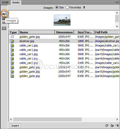
If necessary, reresh the table content by clicking on the circular arrow in the lower right corner. You can also increase the size of the preview pane by dragging its bottom edge down.
11. Select alcatraz.jpg in the file name list or in the preview pane and drag it to Live View. As you did in part 5, drag the image until you see a green line directly above the element
pause and move the mouse pointer until the icon appear. Then continue dragging in the floating DOM panel and release the mouse when the mouse pointer is above the figure element. This nested the image inside the element.
12. Use Quick Property Inspector to delete the width and height of the image. Delete placeholder text for the element
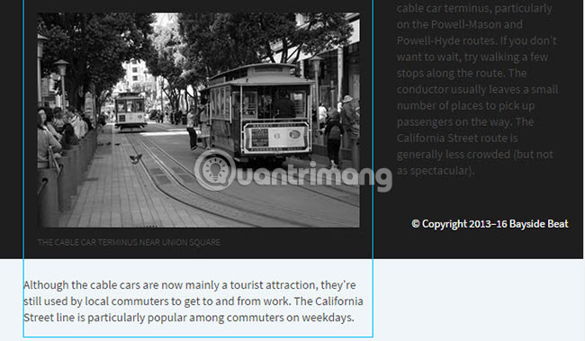
and replace the caption with the content 'Alcatraz — former exclusive residence for notorious criminals' .
13. Select the image of Methraz and use the Element Display to apply the grayscale layer to it (don't forget the initial dot indicating you have specified a class).
14. Save sights.html.
Add a media query to style web pages for tablets and desktops
Media queries are a relatively new feature in CSS, but they are supported by all modern browsers. The only notable exceptions are Internet Explorer 8 and earlier, but they are no longer officially supported by Microsoft, so the number of users of such old browsers is declining rapidly. The big advantage of media queries is that they allow you to serve different CSS sets for multiple browsers, depending on certain features, such as screen width, orientation, pixel density, and so on. For simplicity, you will only create two media queries, both based on the minimum width of the screen.
1. You don't need CC Libraries control panel anymore, so drag its tab next to the Snippets table in the table group on the right. Move it to the top of the control panel group until a blue line appears. Then release the mouse to attach it to the other control panels.
2. Drag Live View scrubber until the Document window is about 700px wide . The exact size, or index.html or sights.html as the active document, is not important.
3. Click the icon

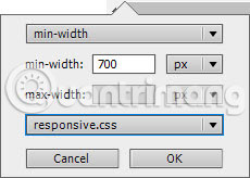
in the ruler tool at the top of the Document window to open the pop-up control panel where you place the media query.
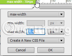
4. Change the top drop-down menu to the minimum width, set the minimum width field value to 700px and select the responsive.css from the last drop-down menu. Check if your settings are the same as in the image below and click OK.
5. The Visual Media Queries bar at the top of the Document window is currently purple. Click this bar to make the Document window exactly 700px wide.
6. In CSS Designer, make sure the All button is selected at the top. Select the responsive.css in Sources and expand the @Media pane . The media queries are currently listed here. When you select it, the Selector frame is empty.
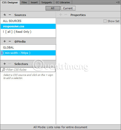
7. Click on GLOBAL in the @Media frame . All of the selectors you created in sections 4 through 6 are listed here. These styles will be applied by all browsers, regardless of the screen width. You use the media query to only change the values you want to override when the screen is at least 700px wide.
8. Save all changes by selecting File> Save All Related Files .
The real value of the Visual Media Queries bar becomes clear when you work with multiple media queries. The top row displays queries of maximum width in the form of green bars, the middle row shows queries that have both the minimum and maximum in the form of bars with green cyan (aqua), lower rows showing the minimum width queries in the form of purple bars. Clicking on the appropriate bar will resize the Document window, allowing you to see the effects of different stylesheets. Check online documentation for more details on Visual Media Queries (reference link: https://helpx.adobe.com/ca/dreamweaver/using/visual-media-queries.html#main-pars_header_5).
Style the navigation menu for a two-column layout
The navigation menu will be displayed all the time in a two-column layout. Now, the article assumes that you know how to create selectors and styling rules, so these instructions will be relatively brief.
1. Make sure the Document window is at least 700px wide. It doesn't matter whether index.html or sights.html is an active file. Click anywhere in the navigation activation link in Live View to select it.
2. In CSS Designer, make sure the All button is selected, select the responsive.css in the Sources pane and (min-width: 700px) in the @Media pane . The Selector frame must be empty.
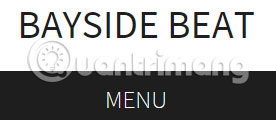
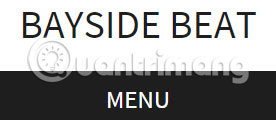
3. Click the plus (+) button in the Selectors pane and create a selector for #menulink. In the layout of the Properties pane , set the display property to none. The menu activation links will disappear.
4. Drag Live View scrubber to the left to make the page smaller than 700px. The activation link reappears. Drag in the opposite direction, the link is hidden as soon as the page is 700px wide.
5. Make sure the media query is still selected in the @Media pane (this also applies to all subsequent changes), create a selector for #navlinks, set the following attributes and values:
max-width: 1000px position: static background-color: transparent
Changing the position attribute to static means that the list of unordered navigation links is no longer positioned absolute and is displayed in the normal position in the page, forcing the rest of the content to drop-down. down. You cannot see the links because the collapsed class has been flexibly applied by JavaScript in menu.js.
6. Create a selector for # navlinks.collapsed (there is no space around the dot) and set the opacity attribute to 1 . The menu reappears, but only displays this page link because the background color is set transparently in the previous step. Can't see the link in white on a white background!
7. Fix links by creating a selector for #navlinks a , set the following attributes and values:
width: 20% margin-bottom: 20px padding-top: 15px padding-bottom: 15px float: left (Đây là icon đầu tiên cho thuộc tính này) color: #1E1E1E
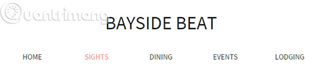
The navigation menu now looks like the image below.
There are 5 links in the navigation menu, so set each link's width to 20% and evenly drop them to the left on the page. Setting the max-width attribute to 1000px in step 5 will prevent them from spilling out of the wrapper
.
The float attribute is currently the most reliable way to align block level elements horizontally. Although links are usually not at the block level, the display attribute is set to block according to the types created in sections 4.
Use the absolute positioning feature to place text on an image
In Part 5, you styled the paragraph in the image of the Golden Gate Bridge with a semi-pink font in bold with the bottom border. For a two-column layout, you'll use the absolute positioning feature to place it on the image and style it in a different color from the border on all sides. You will also learn how to avoid a common error with absolute positioning.
1. If necessary, switch to index.html and click on the purple bar in the Visual Visual Queries bar to set the width of the Document window to 700px.
If the ruler tool at the top of the page seems to be placed incorrectly, close index.html and reopen it. JavaScript controls navigation menu on wide screen below 700px sometimes changing the measurement.
2. In Live View, select the section under the image of the Golden Gate Bridge. Make sure that the responsive.css and media query are still selected in the CSS Designer, create a #hero p selector, set the following attributes and values:
width: 36% padding-top: 20px padding-left: 25px padding-right: 25px position: absolute
When you set position to absolute, the heading "Riding the Cable Cars" and the following text will move up behind the paragraph you are styling. Absolute positioning will remove an element from the normal document flow and place it on a layer before other elements.
3. Use the visual tool right below the position attribute to move the paragraph into position on the Golden Gate Bridge image by placing the offset (offset) on the top and right.
This is a good opportunity to use the scrubbing technique described in section 5. After selecting px as the unit of measurement, place your cursor over or just below the value until the pointer turns into a double-headed arrow. , and then drag right to increase the value or to the left to reduce the value.
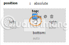
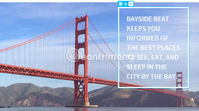
4. Set the color to white and set the border to all edges 5px wide and solid. The figure below shows how the passage will now be positioned on the Golden Gate Bridge.
5. Double-click the gray area next to Live View to make it fill the full width of the Document window. Depending on the size of the screen, the results will vary from bad to very bad.
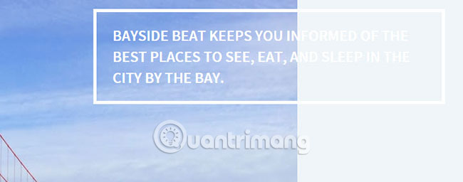
Most people's initial reaction is to assume that their absolute positioning element has moved. But no, the offset values at the top and right are still the same. The problem is that offset is calculated from the containing block of the positioning element. It is nested inside hero
. But is that probably its containing block?
That's a natural assumption, but CSS's technical guidelines say that containing the block of a positioning element must also be located. When there are no such elements, the page will become containing blocks. Therefore, the width of 36% is related to the page, not the hero
and offset is calculated from the top and the right of the page.
6. Fix this problem very easily. Create a new selector for the #hero and set the position attribute to relative. This makes
father, containing blocks for the absolute position and offset, no longer calculated from the top and right of the page.
7 Adjust the position of the paragraph by selecting the #hero p selector and resetting the top attribute to approximately 90px . At full width, the hero image will look like this:
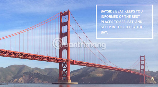
8. Save all changes by selecting File> Save All Related Files .
Setting the element's position attribute to relative allows it to be offset against the normal position in the page without affecting the surrounding elements. In this case, no offset is assigned to the hero
, so it does not move. However, for hero
As a positioned element, it acts as a containing block for the absolute positioning segment. This may seem strange, but that's how absolute positioning works.
Using absolute positioning in conjunction with positioning is relatively useful for individual tasks, such as positioning text on an image like this, but it is rarely a wise choice for dad decorate a complete website. Need to be flexible in this regard.
Float a column next to another column
Previously, you used the float attribute to align horizontal navigation links. Using the same attribute is currently the most reliable way to create a two-column layout. When an element is floated left or right, it will move to that side and allow the following elements to move up with the free space. In order for float elements, they must have a specified width or maximum width.
1. With the selected responsive.css and media query in CSS Designer, create a selector for main and set its width attribute to 60%.
2. Create a selector for aside and set its width attribute to 28%. Also set the left margin to 0px. This is necessary to override the 4% level that it inherited from previous styles.
The element inherits 4% margin on both sides and the element still has a 4% ratio on the right. Therefore, the combined width of the two elements and their horizontal margins increase exactly 100%.
3. Create a group selector for main, aside . Set the following attributes and values:
margin-top: 30px margin-bottom: 30px float: left font-size: 0.875em
As soon as you set the float attribute, everything looks horrible because the majority of the background turns black.
This is completely normal. Float elements are removed from the main thread of the document in a similar way to the absolute positioning elements. The element has also moved up with its element and background filled in the space left blank by the float element. Fixing is very easy.
Create a selector for the footer and set the clear attribute to left. Everything will be back in place.
There is another technique called flexbox that can be used for two-column layout. Flexbox is supported by all modern browsers. Unfortunately, many browsers are still using older versions of flexbox properties, making it difficult to cross-deploy between browsers.
Move text around the image
The original purpose of the float attribute is to move the text around the image. So, complete the design by creating a second media query and moving the text around the images in the sights.html, when the browser view is greater than 900px.
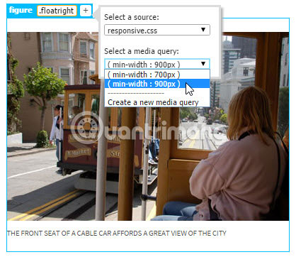
1. Switch to sights.html and use Live View scrubber to change the Live View size to about 900px.
2. Click on the icon

in the ruler tool and create a media query for min-width: 900px in the responsive.css.

3. Nhấp vào bên phải 900px trong thanh Visual Media Queries để đặt lại độ rộng của Live View thành 900px.
4. Chọn hình ảnh cáp treo ở sights.html và nhấn mũi tên lên một lần để chọn phần tử
cha của nó. Nhấp vào nút cộng (+) trong Element Display. Nhập .floatright vào trường có thể chỉnh sửa và nhấn Tab hoặc Enter / Return để gán lớp. Trong bảng điều khiển pop-up, đảm bảo rằng responsive.css đã được chọn, sau đó chọn media query min-width: 900px từ menu drop-down thứ hai.
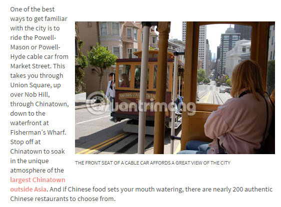
5. Trong CSS Designer, chọn media query min-width: 900px trong ngăn @Media, sau đó chọn .floatright trong ngăn Selectors. Đặt các thuộc tính và giá trị sau cho lớp:
float: right margin-right: 0px margin-left: 10px
Điều này di chuyển văn bản trong đoạn văn sau xung quanh phần bên trái của hình ảnh và chú thích.
Nếu hình ảnh không di chuyển sang bên phải, điều đó có thể là bạn đã áp dụng lớp cho chính hình ảnh đó chứ không phải là phần tử
cha của nó.
6. Lặp lại các bước 4 và 5 với hình ảnh Alcatraz, lần này tạo ra một lớp có tên là .floatleft với các giá trị sau:
float: left margin-right: 10px margin-left: 0px
7. Lưu lại mọi thay đổi bằng cách chọn File > Save All Related Files .
Đặt thẻ meta viewport
Thiết kế đáp ứng của bạn đã hoàn tất. Chỉ còn một bước cuối cùng trước khi sản phẩm bạn tạo có thể được hiển thị một cách chính xác trên thiết bị di động.
Trong danh mục HTML của bảng điều khiển Insert, chọn Viewport.
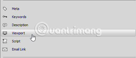
Bạn cần phải làm điều này trong cả sights.html và index.html (hay bất kỳ trang mang tính đáp ứng nào khác). Điều này là do điện thoại di động tự động chia tỷ lệ các trang và bỏ qua các media query mà không có nó.
Bạn đã tốn rất nhiều nỗ lực để đạt được điều này, nhưng trong quá trình đó, bạn cũng học được rất nhiều điều, không chỉ về cách sử dụng Dreamweaver CC 2015, mà còn về tình trạng thiết kế web hiện tại. Nếu bạn thấy một số kỹ thuật quá khó, hãy quay lại những phần trước một lần nữa. Không khó để học những điều cơ bản về HTML và CSS, nhưng thiết kế web ngày càng trở nên tinh vi. Đừng kỳ vọng sẽ trở thành một chuyên gia ngay lập tức. Xây dựng một trang web là thiết kế, nhưng là bằng code. Dreamweaver viết hầu hết các code cho bạn, nhưng bạn cần biết các thuộc tính và giá trị CSS nào bạn cần để đạt được hiệu quả mong muốn.
Nếu bạn cần trợ giúp về các vấn đề liên quan đến bố cục và thiết kế, hãy upload trang vấn đề của bạn lên một website và gửi câu hỏi trong Diễn đàn hỗ trợ Dreamweaver chính (link tham khảo: https://forums.adobe.com/community/dreamweaver). Hãy bao gồm URL và mô tả ngắn gọn về vấn đề trong bài viết của bạn. Bạn có thể thấy một số người sẽ giúp đỡ bạn.
Bạn sẽ học được cách upload các trang web và nhiều asset khác của mình lên một máy chủ web trực tiếp trong phần cuối cùng của loạt bài hướng dẫn này, phần 8: Xuất bản trang web.
 Kareem Winters
- Instructions for creating websites with Dreamweaver CC - Part 6: Create links and navigation menus
- Instructions for creating a website using Dreamweaver CC - Part 4: Changing fonts and creating basic styles
- Instructions for creating websites with Dreamweaver CC part 5
- Instructions for creating a website with Dreamweaver CC - Part 2: Adding and formatting text
- Instructions for creating a website using Dreamweaver CC - Part 8: Publishing a website
- Design website with Adobe Dreamweaver CS5 software - Part 1
- Design website with Adobe Dreamweaver CS5 software - Part 2
- Shortcut Dreamweaver
- 4 tools to help build a website for beginners
- Instructions for creating a website using Dreamweaver CC - Part 8: Publishing a website
- Instructions for creating websites with Dreamweaver CC part 5
- Instructions for creating websites with Dreamweaver CC part 3
- Instructions for creating websites with Dreamweaver CC part 1
- Instructions for creating a website for beginners
- Anyone can create a small and simple website with these 10 websites


 What is HTML? Basic HTML structure
 How to Build a Calculator with HTML
 How to Insert Lines in HTML
 How to Run HTML Files on Visual Studio Code
 What is CSS? Introduction to CSS
 3 best paid HTML editing tools 2023
-
 Application
-
Web Email
-
Website - Blog
-
Web browser
-
Support Download - Upload
-
Software conversion
-
Social Network
-
Simulator software
-
Online payment
-
Office information
-
Music Software
-
Map and Positioning
-
Installation - Uninstall
-
Graphic design
-
Free - Discount
-
Email reader
-
Edit video
-
Edit photo
-
Compress and Decompress
-
Chat, Text, Call
-
Archive - Share
-
-
System
-
Mac OS X
-
Hardware
-
Game
-
Tech info
-
Technology
-
Science
-
Life
-
Electric
-
Program
-
Mobile
 Application
 Web Email
 Website - Blog
 Web browser
 Support Download - Upload
 Software conversion
 Social Network
 Simulator software
 Online payment
 Office information
 Music Software
 Map and Positioning
 Installation - Uninstall
 Graphic design
 Free - Discount
 Email reader
 Edit video
 Edit photo
 Compress and Decompress
 Chat, Text, Call
 Archive - Share
 System
 Mac OS X
 Hardware
 Game
Game Tech info
 Technology
 Science
 Life
Life Electric
 Program
 Mobile