How to design a beautiful landing page
This article will share tips when designing a landing page and give you a collection of landing page examples to get inspired.
Table of Contents
There were hundreds of articles written about the landing page. The basics of landing pages that everyone knows these are the pages that visitors come after clicking on ads or advertising links and they play an important marketing role by turning potential customers into customers. Really for a business. However, when designing a landing page yourself, you will notice that there are more complex issues than you think. That's why today, this article will share tips when designing a landing page and give you a collection of landing page examples to get inspired.
According to the scholarly classification in Wikipedia, landing pages are in two main categories: Reference and Transactional . If it is a crawl landing page, then the page must display attractive information and be relevant to the visitor (text, multimedia). Sales landing pages are pages that target sales immediately or at least capture potential customers.
As you can see, all landing pages meet the criteria: They must make choices and motivate customers to make purchases. This is also the main role of landing page pages.
What needs to be clearly grasped before putting any landing page into action, is what the visitor's behavior is, is it appropriate for your goals or not. Then, design a CTA (Call-to-Actions) with the " Signup now to our newsletter 'notification (Sign up now to receive our newsletter .) In general, the main recipe is to make your landing page possible. show clear preferences and be as attractive as possible.
Some tips when designing a landing page
- Instructions for creating a website for beginners
Here are some helpful tips to start designing a landing page:
1. Use AIDA principles
This is a series of events that we expect to happen when potential customers access the displayed products or the advertised service. Mostly, the steps are:
- Awareness - attracting attention from visitors
- Interests - can be awakened by highlighting benefits for customers
- Desire - give customers the idea that they want products or services
- Action - customers make the purchase process
2. Don't cause too much distractions.
The idea is very simple. If the landing page has almost no navigation options, except the CTA button, visitors will try to exit the page. Don't think that if you don't provide any navigation, they won't find a way to leave the page. They will still do so, even by turning off the browser. And of course guests will not return again.
3. Make the things customers are looking for appear in the blink of an eye
Normally, the landing page must attract the visitor's attention for the first 3 seconds since the visit. If visitors can't see what they're looking for on the page right away or don't care what they're seeing, it's likely they'll leave your site.
4. Don't create unrealistic expectations
Landing page must be consistent with suggestions provided by native ads or vice versa. Visitors must find on the landing page what they are promised to see in the clicked ad.
As mentioned above, now let's see some B2B landing page (Business to Business) and B2C (Business to Customer) that are beautifully designed and effective, then analyze the strengths and weaknesses that cannot be avoid them. Notice the following in the examples given: communication indicators, branding and reliability, content effectiveness, call to action.
Some beautiful landing pages
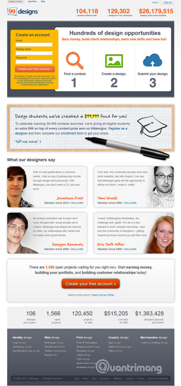
99designs.com
This is a targeted landing page aimed at designers and students. 99Designs also has a landing page for businesses that need to design. For this, it is very effective in authenticating and actually meeting the visitors' wishes with reliable metrics and indicators (number of members, earnings). Pay attention to the bright red color of the CTA button - usually this should not be chosen, but in this particular case, it is acceptable because it matches the color of the logo.
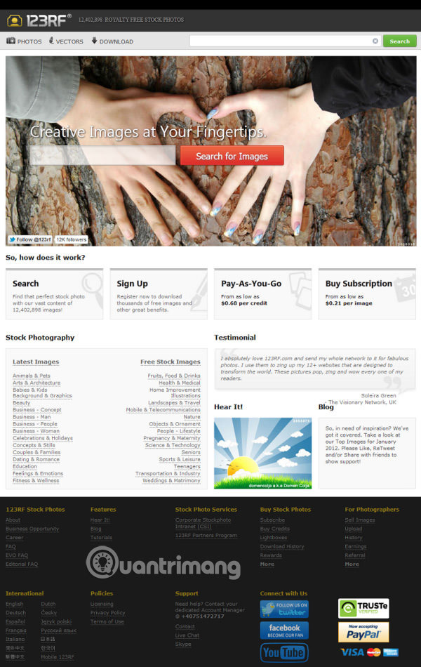
123RF.com
123RF makes a clear statement of purpose in this landing page with an image slider and four columns in the middle. Visitors will understand immediately what the service is and how they can use it (Search, Register, Pay when you buy and Register to purchase). This page has a light gray background and click on the image. Perhaps the list of categories in Stock photography should improve a bit because it is currently crammed with so many things. And the CTA button is a bit hard to click.
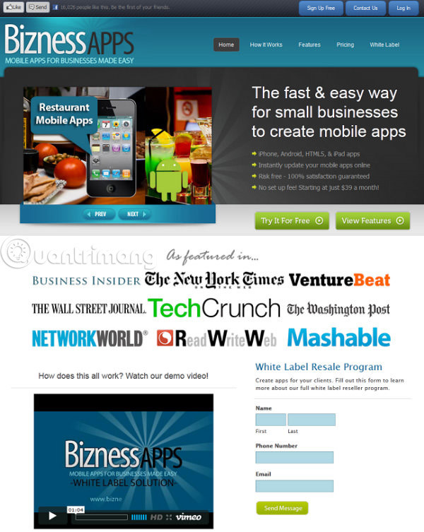
BiznessApps.com
Strong call-to-action, emphasis slogans and impressive validation lists - these are suitable combinations for a landing page and BiznessApps has all of these elements. In addition, it includes a minimum amount of text and uses introductory videos because of the fact that people prefer to watch short videos rather than reading words. Form is a factor that this page should improve. Normally, you should provide guests with some information before giving them something. For example, you should exchange information with previous visitors, then the " Send message " button may come with " Get your free stuff now! "
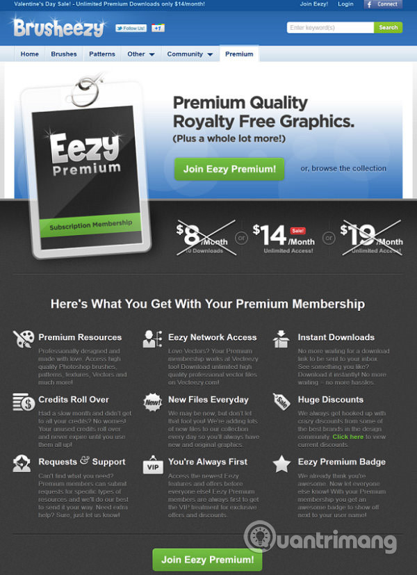
Brusheezy.com
This landing page looks very neat with a prominent icon and title. Pay attention to the two action calls, at the top and bottom - this is a simple method to make the message to customers uninterrupted. Highlighting customer benefits instead of product features is another plus of this landing page.
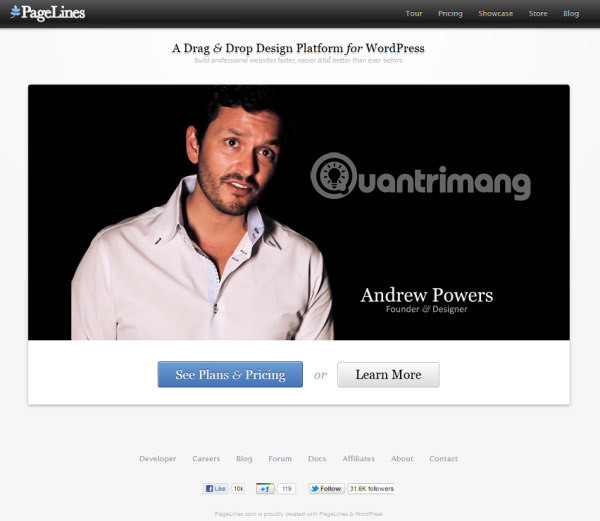
PageLines.com
Minimalization is an important concept here. This page does not tell you everything immediately, but wants you to explore for yourself. However, the auto-video feature can be a minus point for this page because many people don't like it and want to avoid it. In addition, no immediate CTA is also a limitation for this site.
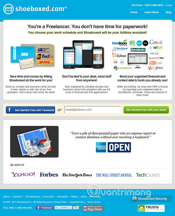
Shoeboxed.com
The description lines for each part are an example of using language to describe. You understand the message in just a second, because normally you'll notice the first line immediately and go to the CTA button too. If you are still hesitant, have a strong testimonial attached confirmation, help you trust your choices are correct.
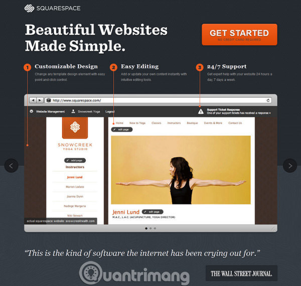
SquareSpace.com
This is a professional search landing page with a bold slogan, CTA buttons that prevent visitors from clicking and confirming. This is an extremely successful combination. A big plus is that the context used is placed in the middle of the page, with a screenshot of the page layout and instructions illustrated. The three-part structure of this page is also a notable strength.
See more:
- 5 simple steps to creating a professional landing page without knowing the code
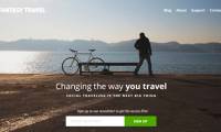
- How to design a website in Photoshop (Part 2): Create a Landing page for travel websites
- Website design tutorial in Photoshop (Part 3): Create professional website layout
Was this article helpful?
Your feedback helps us improve.
Related Articles
 What is landing page in SEO?3 minutes read
 How to design a website in Photoshop (Part 2): Create a Landing page for travel websites11 minutes read
 5 simple steps to creating a professional landing page without knowing the code9 minutes read
 Top 7 best landing page builders8 minutes read
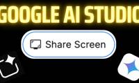 How Google AI Studio's Screen Share Feature Revolutionizes Landing Page Optimization?4 minutes read
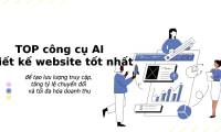 TOP best AI tools for website design9 minutes read
Reader Comments 0
Sign in with email or Google to join the discussion.