Table of Contents
Canva Sheets can turn a selected data table into a chart without requiring you to rebuild the data elsewhere. The process is straightforward: select the table, choose a chart type, insert it into the sheet, and then adjust its appearance.
Create a chart from Canva Sheets data
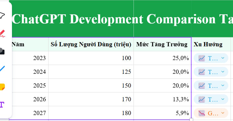
Step 1: Select the data. Open an existing Canva Sheets spreadsheet or create a table, then select the complete data range you want the chart to use. Include any row or column headings that should appear as labels.
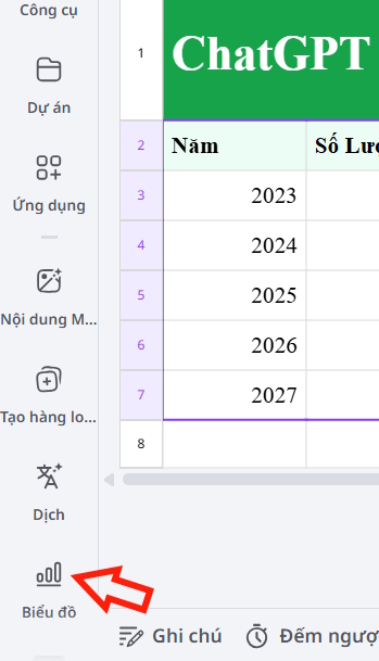
Step 2: Open the chart tools. In the left sidebar, select Charts.
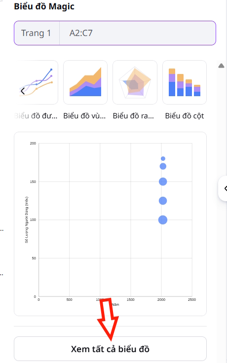
Step 3: Choose a chart type. Canva suggests charts that suit the selected data. Select View all charts to compare the available formats, then choose one that makes the values easy to understand.
For example, a bar or column chart works well for comparing categories, while a line chart is usually clearer for changes over time.
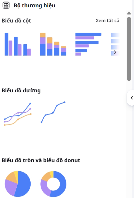
Use Magic Chart
If you prefer an AI-assisted suggestion, open Actions and select Magic Chart. Canva will generate a chart from the selected table.
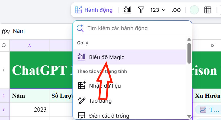
You can add the result to a new worksheet or insert it into the current worksheet. Check the labels and values after insertion to make sure Canva interpreted the selected range correctly.
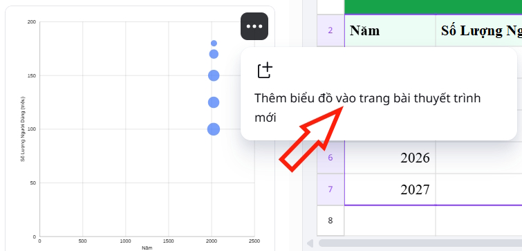
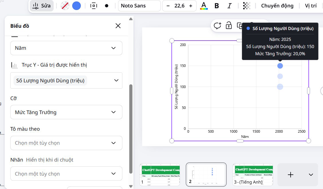
Edit the finished chart
Step 4: Customize the chart. Select the inserted chart to open its editing controls in the left sidebar. Use these settings to change the chart style, colors, labels, or other available display options. Keep the design simple enough that readers can identify the main comparison at a glance.
Related Articles
 How to Create Data Sheets in Canva3 minutes read
 How to Use AI to Create Functions and Formulas in Canva Sheets5 minutes read
 How to Create a Budget Spreadsheet in Google Sheets3 minutes read
 How to Create a Google Sheets Stacked Bar Chart: Step-by-Step Guide3 minutes read
 How to Create a Stacked Bar Chart in Google Sheets: Step-by-Step Guide3 minutes read
 Guide to Translating Canva Sheets Data Tables3 minutes read
Reader Comments 0
Sign in with email or Google to join the discussion.