How to calculate the percentage change in Pivot Table in Excel
Although the main function of a PivotTable is to summarize large data, you can use them to calculate the percentage change between values.
Table of Contents
Pivot Table is an excellent reporting tool built into Excel. Although the main function of this table is to summarize large data, you can use them to calculate the percentage change between values. This article will show you how to calculate the percentage change in Pivot Table.
- Use Pivot Table in the Google Docs Spreadsheet
- Use VBA in Excel to create and repair PivotTable
- 8 convenient tools in Excel you may not know yet
Here is an example of the sheet we will use in the lesson.

This is an example of a company's revenue table, including the order date, customer name, salesperson, total sales and some other data.
First, we will format the value range as a table in Excel and then create the Pivot Table to display the percentage change.
Format ranges in table form
If the range of data has not been formatted as a table, you should do this. Data formatted into tables will be more convenient in the form of a worksheet cell, especially when using PivotTable.
To format the range as a table, select the cell range and click Insert> Table .

Check if the range is correct, check the My table has header box if there is a title in the first line of the range, then click OK .
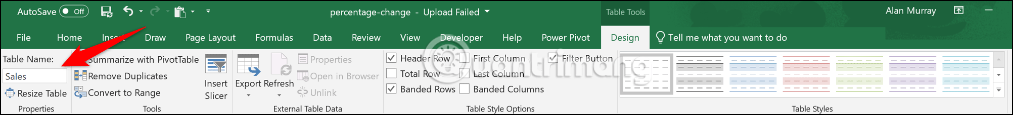
Now, the range is formatted like a table. Naming tables will make it easier to reference when creating PivotTable, charts, and formulas. Click the Design tab in Table Tools and enter a name in the box in the Ribbon. This table here is named Sales .
Create a PivotTable to display the percentage change
Now, let's start with creating a PivotTable. From the new table, click I nsert> PivotTable . The Create PivotTable window will appear, it will automatically detect your table, but you can select the table or range you want to use for the PivotTable in this step.

Group of days by month
Then we will drag the date field we want to group into the row area of the PivotTable. In this example, the field named Order Date .
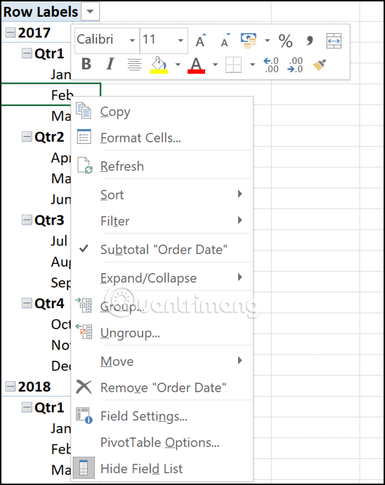
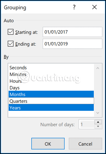
From Excel 2016 onwards, the date value will automatically be grouped by year, quarter and month. If you are using an older version or want to change the group type, right-click a cell that contains date data and then select the Group command.
Select the group you want to use, in this example select Years and Months.
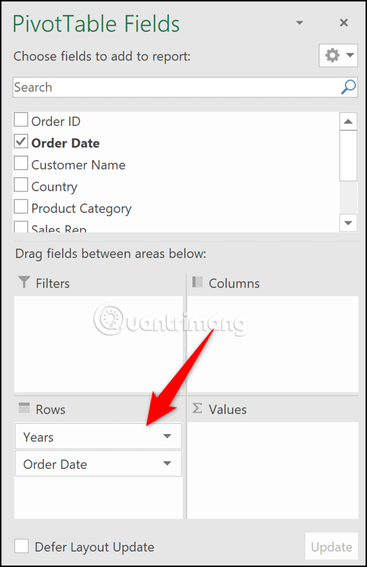
Now we will use the Year and Month fields to analyze. The months are still named Order Date .
Add value fields to the PivotTable
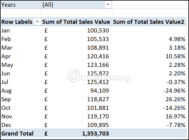
Move Year from Rows to Filter , this helps users filter the PivotTable by year instead of shuffling the PivotTable with too much information. Drag the field containing the values (total sales in this example) you want to calculate and show the change in Values twice.
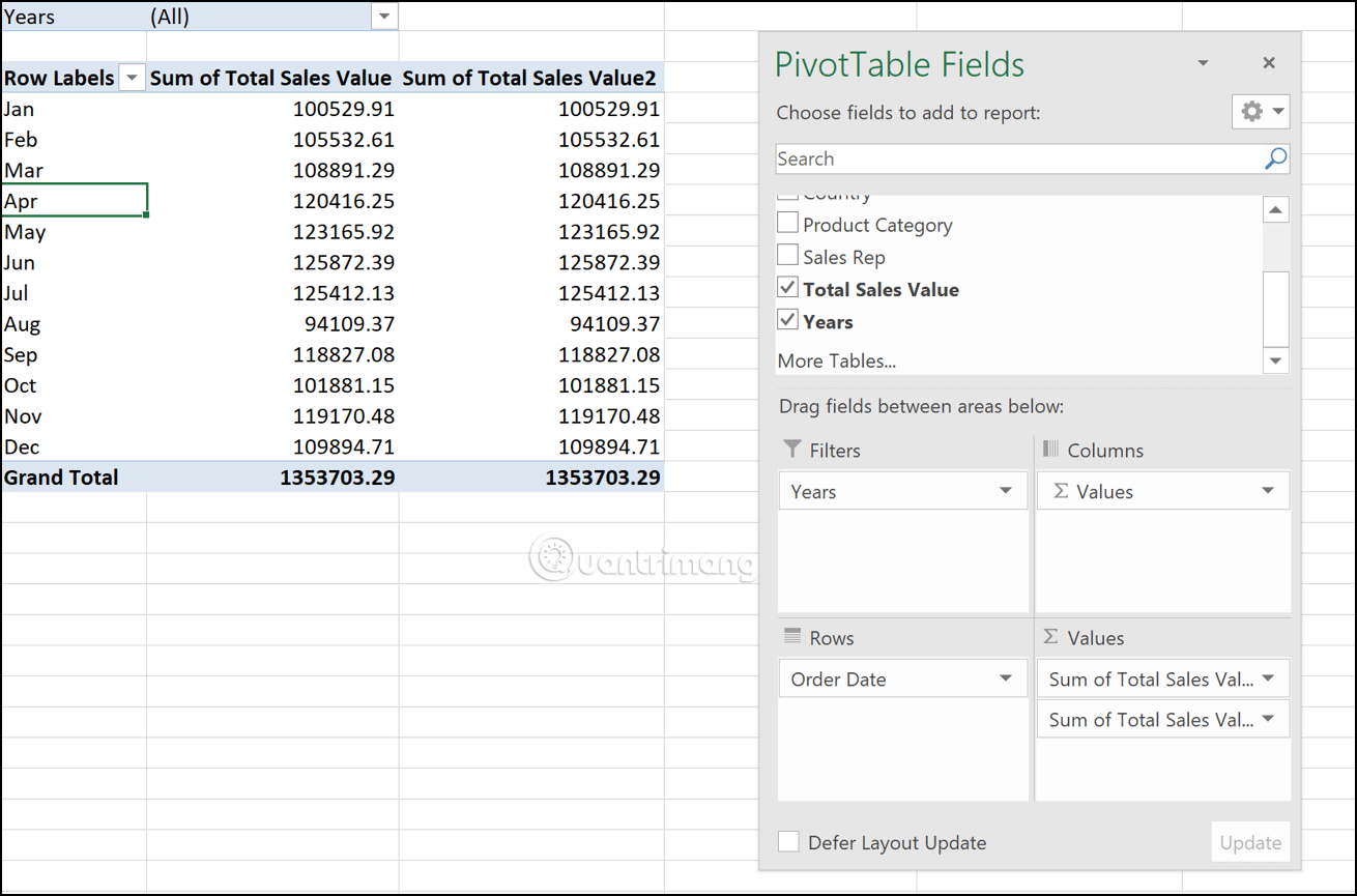
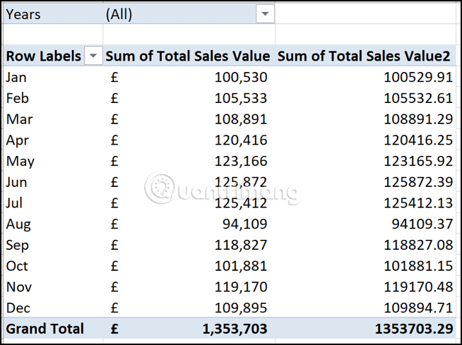
Both value fields will be defaulted to sum and currently not formatted. We will keep the values in the first column in the sum form and need to reformat them. Right-click on the number in the first column, select Number Formatting from the shortcut menu. Select Accounting format with decimal 0 from the Format Cells dialog box.
The PivotTable now looks like this:
Create a percentage change column
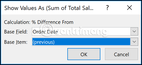
Right-click on a value in the second column, point to Show Values and then click on the option % Difference from .
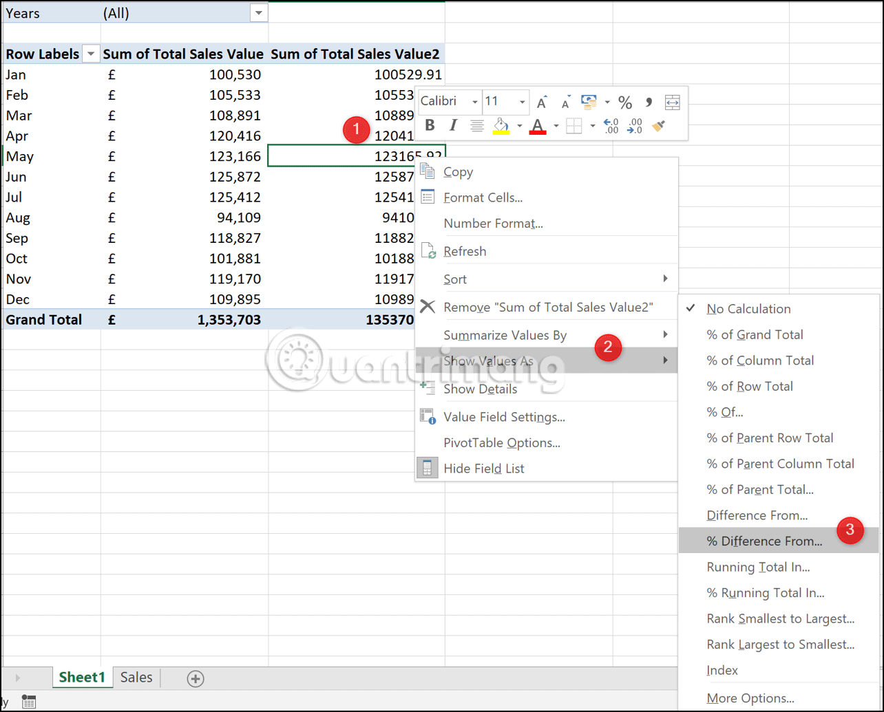
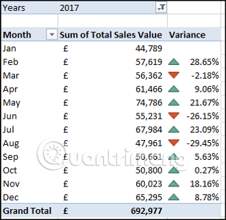
Select (Previous) in Base Item , so that the current month value is always compared with the previous months (in the Order Date field).
The PivotTable table now displays both the value and the percentage change.
Click on the Row Labels container and type Month as the title for that column, then click the title box for the second value column and type Variance .

Add up and down arrows
To edit this PivotTable, we will add some red and blue arrows to show the increase or decrease in sales.
Click on any value in the second column and click on Home> Conditional Formatting> New Rule . In the Edit Formatting Rule window, follow the steps below.
Step 1 . Select All cells showing 'Variance' values for Order Date .
Step 2 . Select Icon Sets from the Format Style list.
Step 3 . Select red, blue and amber triangles from the Icon Style list.
Step 4 . In the Type column, change the Percentage option to Number to change the Value column to 0.
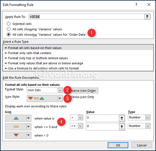
Click OK and conditional formatting is applied to PivotTable.
PivotTable is an incredible tool and is one of the simplest ways to display percentage change over time for values.
I wish you all success!
Was this article helpful?
Your feedback helps us improve.
Related Articles
 The easiest way to calculate the percentage (%)6 minutes read
 How to Add Columns in a Pivot Table5 minutes read
 How to calculate percentage, format percentage in Excel3 minutes read
 How to Add a Column in a Pivot Table5 minutes read
 Calculation of percentages in Excel4 minutes read
 2 Excel Functions You Need to Know Before Struggling with Pivot Tables7 minutes read
Reader Comments 0
Sign in with email or Google to join the discussion.