How does color affect websites?
Have you ever wondered why websites are eating or using red tones, or furniture pages use white-black or brown wood? All have its reasons, but web developers don't have to like what color to use..
Have you ever wondered why websites are eating or using red tones, or furniture pages use white-black or brown wood? All have its reasons, but web developers don't have to like what color to use.
These websites help you make money from photos
And to choose colors for websites in particular as well as software in general, developers must rely on psychological aspects, ie, analyze how our colors will receive, and what color What does it mean, and all of this will have a lot of impact on the user interest and efficiency.
According to Kissmetric, when we look at a certain color, the eye sends a signal to the hypothalamus of the brain. From here, the signal will be further processed before pushing back to the pituitary and thyroid gland, then stimulating the body to produce hormones that affect our mood, emotions and behavior. Science has also shown that using colors can lead to positive, negative or very negative emotions.
According to Kissmetric, people only need 90 seconds to make a conclusion or a thought after they visit a website. In addition, '62% to 90% of this interaction is determined only by the color of the page '. In short, colors play an extremely important role in creating a first impression for users.
What does color mean?
For each of us, every color has its own meaning. Of course, this meaning is also influenced by personal preferences, working environment, customs and habits as well as memories of each person. You can look at the table below to see how each color works with different user objects (relative). Social and demographic factors, such as gender, age, also show influences on how colors are perceived.
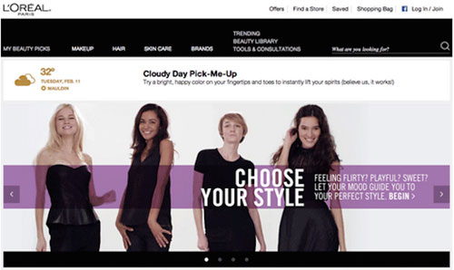
For example, if you are designing a website for women, purple is more likely to be accepted by many female users, but the male brothers do not like it. As you can see in the picture below capture the website of L'Oreal Paris cosmetics company, in which the top and bottom of the page use black to refer to luxury and give users the feeling that this is a real product. High-end products, not a cheap one. In addition, people also use white letters to express the modernity, while the purple below emphasizes the superiority and attracts the attention of female users. All of these color picks are very suitable for a cosmetic company like L'Oreal.
But it is not always necessary to use such color schemes. As you can see on the website below, only the top part is made in pink, the main content is still mostly black and white but emphasized by many beautiful images. This is also an interesting way of designing websites that many developers are applying.
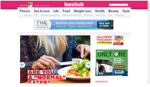
Why is it pink? Pink is a ' stereotypical ' color that many people choose when making software for women, but it does not say much about health, so the Women's Heath site's purpose cannot be conveyed. full to your main customer.
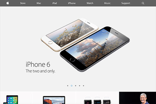
Let's take a look at the last example: the Apple website. Leading across the page is gray with different shades of professionalism, combined with black or white to enhance the premium, which is consistent with Apple's main target audience and operational philosophy. of the company. If you consider Apple products such as MacBook, iPhone, iMac . these are their colors, so it creates unity and a strong brand identity.
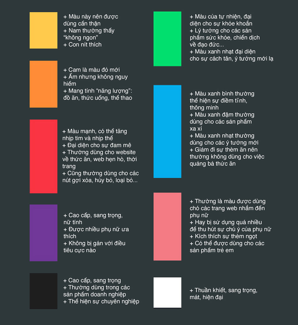
The following is the general meaning of common colors
Choose a color scheme
It's unlikely you'll create a website with just one, two colors, unless you follow the monochrome design at the purest level. Therefore, choosing a set of colors, as well as the main color scheme, is essential, you should not choose some random colors and hope that they will get along. It rarely happens.
Often people will start by selecting a primary color ( primary color ). This is the color used for many things on the web, from the navigation that you often see on the side of the website, the links will appear in the page, sometimes both buttons and font colors for the title. Then people opted for secondary colors and accent colors , which will be used for buttons, input boxes, which are generally things that require direct interaction with users. The designers also consider the background color to avoid boredom instead of using the default white color.
There are 3 basic methods to choose a color set:
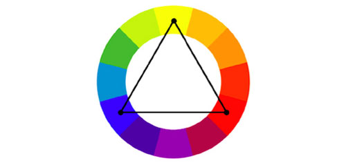
# 1: Triadic (trinity)
Triadic focuses on the brilliance of colors and complementary colors, and this is the simplest, most balanced method of the three mentioned in this article. If Triadic is applied, developers will use one wheel with 12 colors, and you can choose any of the three colors for the background color, content and accent color as long as they form an isosceles triangle. .
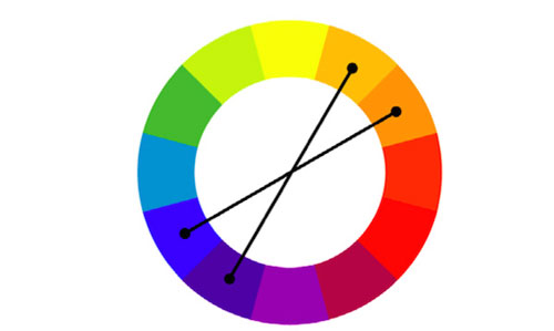
# 2: Combine
This method is a bit more complicated and maybe the developer will have to test it several times before choosing the most suitable color combination. It sounds a bit painful, but if done well, the results will be very high. Here we continue to use 12-color wheels like Triadic, but now people will choose 2 color pairs. The first pair can take any, the second pair must choose the color next to it as shown below. The meaning of this choice is to provide contrast ( two opposite colors ) but there is still an addition in it ( two adjacent colors ).
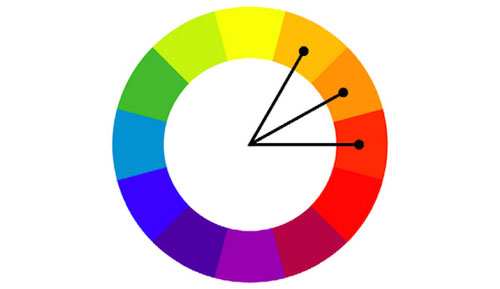
# 3: Analogous similarity
This last method only focuses on complementarity, no longer talking about contrast. Therefore, on the color circle, people choose 3 colors adjacent to each other. Of course, choosing hot or cold colors, green or red, depends on the main customers who will use the website and the content of that website. Analogous needs to be used carefully with a lot of time and effort to invest, otherwise it is easy to lead to a " true " color when someone visits your website.
For example, with the website below:
- Background color: black represents professionalism, seriousness and it looks like something is ' business '. Obviously, considering that this is a website that supports users to write programming code, professionalism is extremely necessary. And the feeling of ' business ' mentioned above suggests that people learning to program with this website is not a fun thing but a thing that affects the career and employment of users.
- Button color : in the picture below, there are 2 types of buttons. The orange button pointing to the registration page is highlighted, looking at it and wanting to click right away. Meanwhile, the secondary button with video playback function is simply white framed, suggesting that this is something less important than the orange button next to it.
- Font color ( content in general ): white shows the contrast but still suitable for the whole website. In addition, the icons are intentionally arranged at the edge of the site to encourage users to scroll down to see more.

In general, the above CodeMentor website has a good color scheme - white with black, but the color is still there to not be boring, while emphasizing the full feeling that the web wants to give to My main user statue.
Colors should be avoided
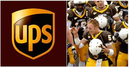
It is usually brown, suggesting nature when used in design, but it is also the color most hated by men. But not always. You can see the UPS shipping service website, they use the main brown tones, the brown logo but still suitable because they show their credibility, suggesting to users that ' if you use my service Your goods will be delivered properly and on time . "
As for women, they often do not like orange so if you are designing a website for women, you should pay attention to this. Of course, these things are only relative, it also depends on how you color, what is the main purpose of your website as well as what your customers have in particular that can make them like a color. Is it normal to be hated?
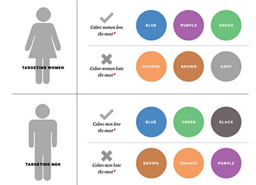
The picture below will list some of the colors like / hate depending on the gender of the user
These tools help you choose good colors for your software / website
Here is the suggestion of the DesignModo page:
- Adobe Color CC - reliable tool for all Adobe users
- Palletion - simple color picker for web design beginners
- Flat UI Color Picker - choose beautiful color combinations that match the flat design style
- MudCub Color Sphere - many different themes for you to choose, available HEX code to enter the website code
- Check My Colors - check if your background color and font color are sufficiently contrasted so that people with color blindness can still see it
- Material Pallet - choose the color combination according to the Material Design style of Google
Conclusion
Color is an extremely important ingredient to consider when designing, and it also affects the way users look at your brand or product. In other words, the color used must match the notion that you want to convey to the user, the nature of the brand, who the user is, and most importantly, it must be applied in a coherent way. Best on all your websites, applications, even on logos. If so, the user will fully appreciate your message.