Google Chrome has a new logo after 8 years
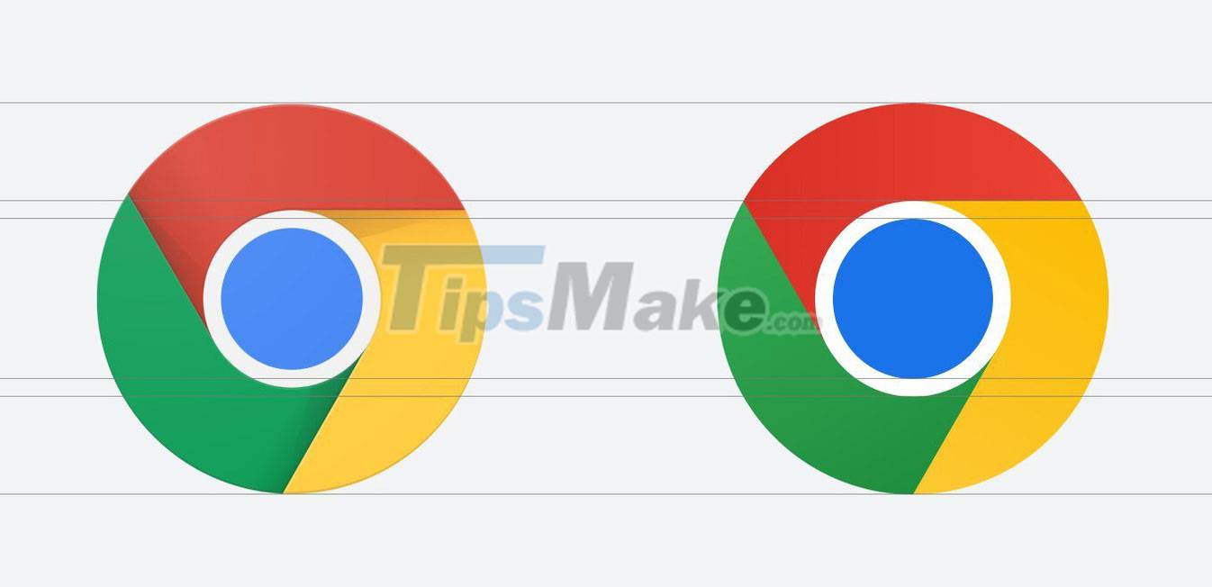
Google has re-branded the Chrome web browser after 8 years. At first glance, Chrome's new logo seems to be no different from the old logo with a circular design with 4 distinctive colors that appeared from the 2008 logo version.

Google Chrome logo from 2008 to present.
But when you look closely, you will see that Chrome's new logo has more vibrant colors, the logo becomes flatter by removing the shadow effect in the border between the red, yellow and blue areas, and the middle circle. The center of the logo is also tweaked to be larger than the old version. These changes are not many, but they are enough to make Chrome's logo simpler, more modern and more noticeable.
Elvin Hu, graphic designer for Google Chrome, said that placing 2 fixed colors such as blue and red next to each other creates annoying bright colors, so the Google design team prevented any bright patches from being exposed. created using more subtle gradients - something we can't see with the naked eye - to make the logo more accessible.

The circle is larger than the old version.

The new logo has faded colors thanks to the gradient color effect.
Currently, only Chrome Canary (developer version) is allowed to use Chrome's new logo, and it will be a few months before general users can see this change.
However, on different operating systems, the new appearance of the Chrome logo will display differently. For example, the Chrome icon on Windows 10 and 11 operating systems will have a lighter color, while on ChromeOS it will not have the gradient and more vibrant color effect to synchronize with other operating system icons. Meanwhile, the new Chrome icon will display in 3D, with a white border around it and a drop shadow effect at the bottom on Apple's macOS operating system.
Looking back at the appearance of the Google Chrome logo from 2008 to now, it can be seen that it has been designed to become more and more flat and simple to become more attractive, modern and close. This is also a trend in logo design applied by many famous brands.


 Instructions on how to remove logos from AI videos using Magic Eraser
  AI Logo Maker, AI Design: Hexa
  Gemini Updates New Icons on Android and iPhone
  Mazda will change its logo after 28 years
  6 Simple Steps to Design a Logo Using Photoshop
  5 Best Free, Professional Logo Design Software