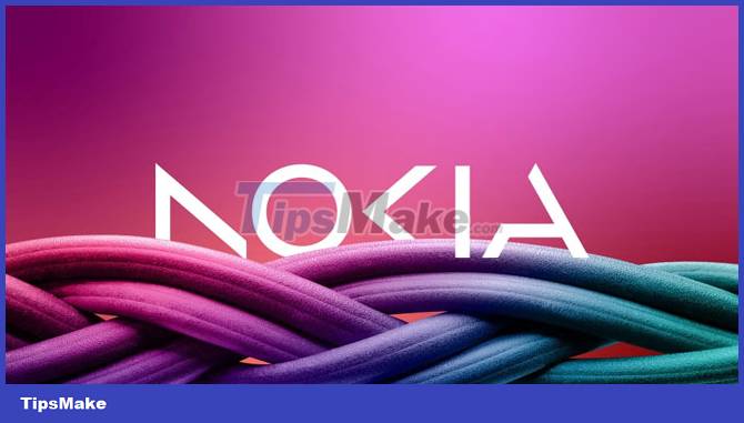
Nokia changed its logo after nearly 60 years
Nokia launched a new logo after nearly 60 years to emphasize to users that the Finnish company is no longer making phones, aiming for strong growth in the future.

Nokia's new logo consists of 5 simple flat images forming the word NOKIA on many different background colors depending on the purpose of use, no longer constrained by the "legendary" blue color of the old icon.
CEO Pekka Lundmark said that one of the reasons the company changed its logo is that many people still think Nokia is making phones. Therefore, the company's logo change aims to emphasize the current business area, focusing on networking and industrial digitization.
Changing the logo is the first stage in the development strategy that Nokia CEO launched from 2020.
In the coming time, Nokia will come up with an appropriate strategy when shifting its focus to providing 5G equipment for factories and data centers, competing with Microsoft and Amazon.
Nokia's phone manufacturing division was acquired by Microsoft in 2014. But unfortunately, Microsoft closed this business a short time later, causing the Nokia brand to "disappear" from the phone market. smart.
In May 2016, HMD Global was founded by former Nokia employees and announced to buy the rights to manufacture Nokia branded phones until 2024 to relaunch the Nokia brand.
But it seems that now HMD Global is going against the original goal. It is not clear whether HMD Global will use the new Nokia logo on the next phone models or not.
- Nokia 7.1 has just launched, Snapdragon 636, 4GB RAM, dual camera, priced from 349 USD
- The 'banana' legend in the Nokia 8110 Matrix comes back
- Nokia is about to launch 5 new products
- Nokia 5.4 review: The low-priced phone contains many good things
- Nokia C2: Single camera, Android 9 Pie Go Edition, 4G connectivity
- Nokia launches Nokia 5310 version 2020


 Compare Nokia 5310 version 2020 and 2007 version
  The 34 best and worst phones in Nokia's calendar, which one is your spring?
  Nokia security code - Summary of Nokia's default security code
  Seen with Nokia 2600 5G: Nokia's 'super cheap' brick phone, with enough 5G, dual camera
  Accumulated 1,000,000V directly to the device, Nokia 'brick' fired lightning, self-dialed as a ghost
  Download the original Nokia 8 Sirocco wallpapers