Compare Saturation and Vibrance in Photoshop Lightroom
In Photoshop Lightroom, both the Saturation slider and the Vibrance slider are aimed at adjusting the saturation of the colors in your image..
Adobe Photoshop Lightroom is an extremely powerful and versatile photo editing tool. One of the factors that make this tool comprehensive is the variety of editing options presented in the form of handy sliders, making it easy for users to manipulate and align.
However, it is also because of this richness that sometimes those who are new to Photoshop Lightroom cannot avoid the confusing situations of encountering editing options that seem to have the same purpose. Take for example the cases of Saturation and Vibrance.
Basically, each color has a saturation value, which is the value used to estimate the intensity of the color. For example, dark red is said to be more saturated than light red. In Photoshop Lightroom, both the Saturation slider and the Vibrance slider are aimed at adjusting the saturation of the colors in your image.
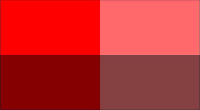
The two reds on the left are more saturated than the reds on the right.
As you increase these values, the colors in the image will become brighter, more vibrant, and even more 'dazzling'. Conversely, reducing the Saturation and Vibrance values will make the image look pale. When the value drops to 0, the color returns to greyscale
However, they do this in completely different ways.
Effects of Saturation
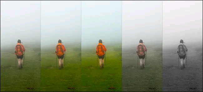
From left to right: Original Image, Saturation +50, Saturation +100, Saturation -50, and Saturation -100. Notice how the orange color of the backpack changes
In Photoshop Lightroom, the Saturation slider will adjust the saturation of every color in your image in the most precise way possible. You simply drag the slider to the right to increase the overall saturation of the image and drag to the left to decrease it.
Saturation affects the saturation of the image in a fairly uniform way and can make things become more dishonest if you don't align well.
When you adjust the Saturation value, the system will also increase or decrease the intensity of all the colors on the image. Therefore, if a certain color on the image has reached the saturation threshold and you continue to increase the Saturation value of the image, the range of colors on the image will exceed the saturation threshold and be overly 'harsh', resulting in too dark , loss of detail.
Effects of Vibrance
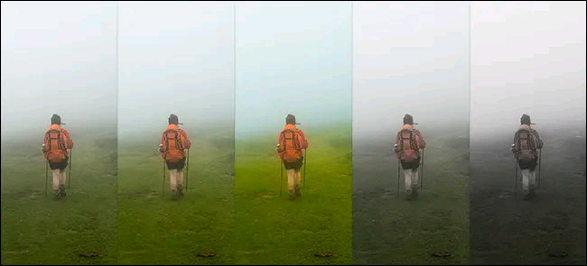
From left to right: Original Image, Vibrance +50, Vibrance +100, Vibrance -50, and Vibrance -100. Again, let's see how the orange color of the backpack changes
Vibrance is a more 'subtle' version of Saturation. It adjusts the saturation of each color in your image in a detailed and selective way.
For example, when you increase the Vibrance value, the colors that are already saturated in the image will almost stay the same. Instead, Vibrance will only affect less saturated colors. This helps us to preserve details in the image better, avoiding the phenomenon of a color band being over the saturation, out of focus.
Should use Saturation or Vibrance
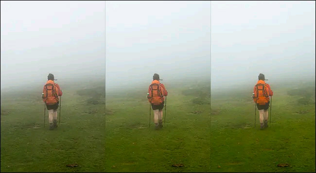
From left to right: Original Image, Vibrance +50, and Saturation +50. For this photo, the Vibrance adjustment +50 is clearly the main highlight. It gives the grass a more vivid look without making the orange backpack look too dazzling
Both Saturation and Vibrance hold important roles in the photo editing process.
Saturation is best used carefully to add more emphasis to your entire image. For example, if you take several photos on a gray, cloudy, cloudy day, using Saturation can make your entire photo look more fresh, 'more alive'.
Meanwhile, Vibrance offers a slightly more 'safe' usability that allows you to interfere with certain bands of color in the image. Vibrance, for example, is a sensible choice when you want to enhance the freshness of the colors in an image without making the whole picture look too colorful or dishonest.
In general, Saturation and Vibrance can - and should - be used together. A common method is to use the Saturation slider to decrease the saturation in the image and then use the Vibrance slider to add the vibrance back to the slightly grayed areas.
Alternatively, you can also use Saturation and Vibrance with Lightroom's other local adjustment tools to target specific areas in an image. This is useful if you want to reduce the saturation of an area of color that is being overexposed in the background.