What features users expect on iOS 14 and Android 11
Here are the features users expect to have in iOS 14 and Android 11.
Apple and Google operating systems still have many bugs, affecting the user experience despite being constantly updated. Here are the features users expect to have in iOS 14 and Android 11.
1. Change the default software (iOS)
Since 2008, when the App Store was launched, Apple has always forced users to use their phones at their disposal, never letting users set third-party apps as the default option.
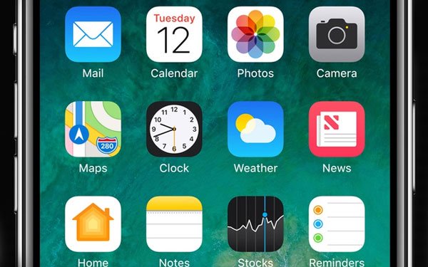
Photo: Pinterest.
2. Better utilities (both operating systems)
Apple has now expanded the notification center similar to Google, but this has yet to satisfy users. Simply because both giants can do better by improving the interface more beautiful and more convenient, add visual shortcuts, improve view speed.
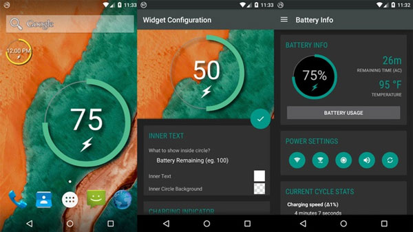
Photo: Androidauthority.
3. Smarter notifications (both operating systems)
Through various versions of the operating system, both Apple and Google have made efforts to fix notification errors. But that still cannot satisfy users. They hope that the two giants can take measures to let the phone identify which messages are really necessary to notify users, stop confusion with spam messages as today.

Photo: Engadget.
4. Screen recording (Android)
When Android 10 operating system launched the official version, the screen recording mode was removed despite appearing in the Beta version. Currently, to use this feature, users must find a 3rd party application from Google Play to install. Many users of this function can go back to Android 11.
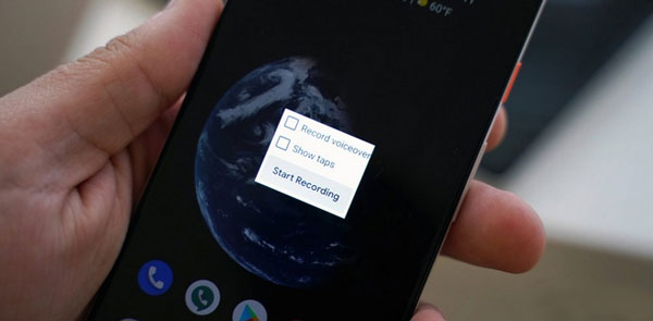
Photo: Selular.
5. Better integration with other devices (both operating systems)
In this day and age, wireless synchronization and control between devices is becoming increasingly important and irreplaceable. Although users can now use third-party applications, they still hope the two technology giants can make this feature a default application in iOS and Android.
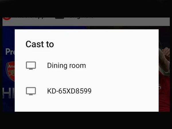
Photo: Gizmodo.
6. The screen is always displayed (iOS)
Android users have experienced the Always On Display mode, which allows quick display of information such as the number of new notifications, battery life, date, clock, and weather. This mode does not consume too much battery and is very convenient. Many Apple fans hope this mode will appear on iOS 11.
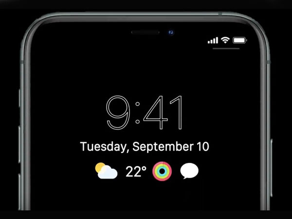
Photo: Softpedia.
7. Screen split feature (iOS)
For a long time, "iFan" had hoped that the iPhone would have a split-view function, allowing users to use two applications at the same time. Meanwhile, users can just watch Youtube while surfing the web or texting easily instead of having to switch between the two tabs today.
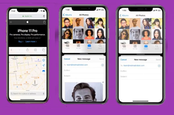
Photo: 9to5mac.
- This is the iOS 14 operating system we all expect
- Android 11 operating system allows videos above 4GB


 How to change the display name of guest users in Microsoft Teams
  Turn your Android device into a webcam for Windows 10
  Android emulator online right in the browser
  Fivetown Explained: CS: GO's Newest Steam Scam
  Instructions for configuring DNS Service Discovery
  Issues related to the KB4579311 update