Navigation Bar - Navigation Bar in CSS
Navigation Bar - Navigation Bar, or menu bar, is used to navigate the main sections of a website.
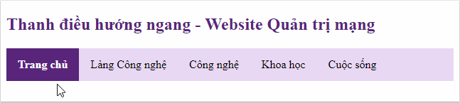
Navigation Bar - Navigation Bar , also known as menu bar, is used to navigate the main sections of a website, for example, on TipsMake.com there are some navigation such as "Home", "Technology village", " Technology "," Programming " . Navigation Bar is usually placed at the top of the web page or after the header, making the website clearer as well as making it easier for users to interact.
There are 2 most commonly used navigation types:
- Vertical Navigation - Vertical navigation bar.
- Horizontal Navigation - Horizontal navigation bar.
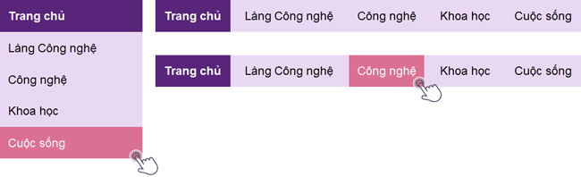
With CSS, you can make boring menu bars more beautiful.
Create navigation bar
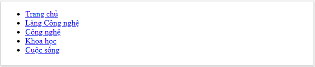
There are many ways to create navigation, in this lesson TipsMake.com will work with you to learn how to create navigation using lists using tags
- and
- .
For example, you can create a list of elements as shown above:
- Home page
- Technology Village
- Technology
- Science
- Life
Result:
However, we should remove the index and margin, padding from the list:
 ul {
  list-style-type: none;
  margin: 0;
  padding: 0;
 }
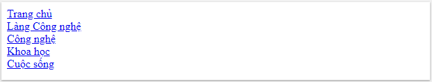
- Use list-style-type: none to remove the bullets because the navigation bar does not need this marker.
- Set margin: 0 padding: 0 to remove the default setting of the browser.
Full code like this:
- Home page
- Technology Village
- Technology
- Science
- Life
Note: This code is used for both horizontal and vertical navigation bars.
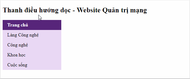
Vertical Navigation - Vertical navigation bar
To build a vertical navigation bar, you continue to format the element inside the list in the example above, adding the code below:
 li a {
  display: block;
  width: 60px;
 }
- display: block is used to display the link as a block element, so you can click anywhere in the block to open the link (not just click on the text as before).
- Can specify width, padding, margin . if desired.
Also, you can set the width of both
- and produce the same result as above:
 ul {
  list-style-type: none;
  margin: 0;
  padding: 0;
  width: 60px;
 }

 li a {
  display: block;
 }
Example vertical navigation bar
Create a simple vertical navigation bar with a certain background color and change the background color of the path when the user hovers over it:
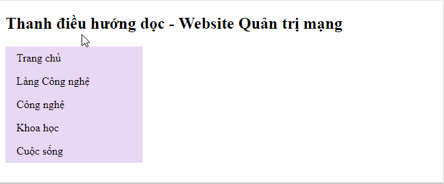
Vertical navigation bar - Website Network administration
- Home page
- Technology Village
- Technology
- Science
- Life
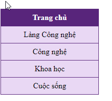
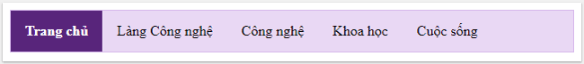
The current navigation path is active
Add 'active' to the current link so that users know what category they're currently viewing:
 .active {
 background-color: #58257b;
 color: white;
 }
Vertical navigation bar - Website Network administration
- Home page
- Technology Village
- Technology
- Science
- Life
Align paths and add borders (border) for navigation
Add text-align: center in
- or to align the path to the center of the block.
Add the border attribute
- to surround the navigation bar. If you also want the border inside the navigation bar, add border-bottom to all elements
- except for the last card:
 ul {
  border: 1px solid #db7093;
 }

 li {
  text-align: center;
  border-bottom: 1px solid #db7093;
 }

 li:last-child {
  border-bottom: none;
 }
Vertical navigation bar - Website Network administration
- Home page
- Technology Village
- Technology
- Science
- Life
Fixed vertical navigation bar height
Create a navigation bar defining the height, fixed on the left:
 ul {
  list-style-type: none;
  margin: 0;
  padding: 0;
  width: 25%;
  background-color: #f1f1f1;
  height: 100%; /* chiều cao 100% */
  position: fixed; /* cố định thanh điều hướng cả khi cuộn để đọc website */
  overflow: auto; /* nếu nội dung quá dài sẽ có thêm thanh cuộn để xem phần còn lại */
 }
- Home page
- Technology Village
- Technology
- Science
- Life
Introduction to CSS (by: TipsMake.com)
CSS helps a lot when writing a website in HTML.
What is CSS?
CSS stands for English phrase "Cascading Style Sheet".
CSS describes how HTML elements display on screens and methods
Other convenience.
CSS is very useful and convenient. It can control all pages
on a website.
The external stylesheet is stored as .CSS files.
Why should CSS be used?
CSS is used to define styles for pages on the website
you, including the design, the layout and the different ways to display it
device with different screen sizes.
CSS helps solve big problems of HTML.
HTML does not have an element to format the web page. HTML only
used to create content for the site. When elements like and attribute
Colors are added to HTML 3.2, the nightmare of web developers
begin. Developing a large website that adds font or color information
sharpness on each page requires a lot of time.
To solve this problem, the World Wide Web Consortium (W3C) has created
CSS, eliminating style formatting from HTML pages. Definitions
related to the style that is included in the .css file and thanks to the file
External stylesheet, you can change the whole website with just one episode
Unique news.
Note :
- The div element has a margin-left left margin of 25% because the side navigation bar has a width of 25%. If not using margin-left, the navigation bar will overlap on this div.
- Use overflow: auto to add a scroll bar if the content is too long to see the rest.
- This example may not work correctly on a mobile device.
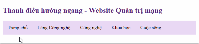
Horizontal Navigation - Horizontal navigation bar
There are 2 ways to create a horizontal navigation bar, that is to use a list inline or float .

Use Inline
Inline is a way to display elements on the same row. To create a horizontal navigation bar, you add the display: inline attribute to the element
- in the example create a navigation bar at the beginning of the article.
 li {
  display: inline;
 }
By default,
- is a block element, we override display: inline, remove interrupts before and after each element, display only one line.
Use Float
Another way to create horizontal navigation bar is float elements
- and layout format for navigation links:
 li {
  float: left;
 }

 a {
  display: block;
  padding: 8px;
  background-color: #e9d8f4;
 }
- Use float: left so that the floating elements are side by side.
- The display: block attribute allows you to display links as block elements, so you can click anywhere in the block to open the link (not just click on the text as before), you can specify padding, height, width, margin . if desired.
- padding: 8px: block elements by default occupy the entire available width of the web page so that elements cannot float side by side. So, specify some padding to make them appear more neat.
- background-color: # e9d8f4: Add background color to each element (should be added
- instead of element).
- Home page
- Technology Village
- Technology
- Science
- Life
For example horizontal navigation bar
Create a simple horizontal navigation bar with a background color and change the background color of the path when the user hovers over it:
Horizontal navigation bar - Website Network administration
- Home page
- Technology Village
- Technology
- Science
- Life
The current navigation path is active
Add 'active' to the current link so that users know what category they're currently viewing:
 .active {
  background-color: #58257b;
  color: white;
 }
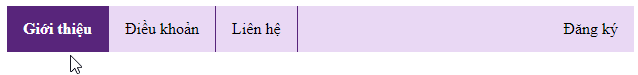
Align navigation link
You can push an element to the right of the screen according to the layout of the website using float: right
- Introduce
- Rules
- Contact
- Registration
Divide the navigation bar by border
Add a right border to all list items, except for the last item, to divide the navigation bar into clearer items.
 li {
  border-right: 1px solid #db7093;
 }

 li:last-child {
  border-right: none;
 }
Introduce
- Rules
- Contact
Registration
The navigation bar has border
 ul {
  border: 1px solid #d6b7eb;
  background-color: #e9d8f4;
 }

 li a {
  color: #black;
 }
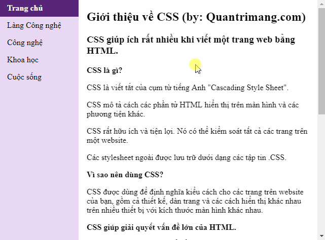
Fixed navigation bar
1. Use position: fixed
Fixed the navigation bar at the top or bottom of the page even when users use the scroll bar to move page content:
Fixed top side Fixed bottom side
 ul {
  position: fixed;
  top: 0;
  width: 100%;
 }
 ul {
  position: fixed;
  bottom: 0;
  width: 100%;
 }
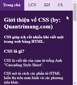

- Home page
- LCN
- Customer
- CS
Introduction to CSS (by: TipsMake.com)
CSS helps a lot when writing a website in HTML.
What is CSS?
CSS stands for English phrase "Cascading Style Sheet".
CSS describes how HTML elements display on screens and methods
Other convenience.
CSS is very useful and convenient. It can control all pages
on a website.
The external stylesheet is stored as .CSS files.
Why should CSS be used?
CSS is used to define styles for pages on the website
you, including the design, the layout and the different display ways
Many devices with different screen sizes.
CSS helps solve big problems of HTML.
HTML does not have an element to format the web page. HTML only
used to create content for the site. When elements like and attribute
Colors are added to HTML 3.2, the nightmare of web developers
begin.
To solve this problem, the World Wide Web Consortium (W3C) has created
CSS, eliminating style formatting from HTML pages.
2. Use position: sticky
Using this attribute, the original menu will still have a flexible position until a certain location and "stick" there.
 ul {
  position: -webkit-sticky; /* áp dụng với Safari */
  position: sticky;
  top: 0;
 }

Website Administration Network
Knowledge - Experience - FAQ
- Home page
- Technology Village
- Technology
- Science
- Life
Introduction to CSS (by: TipsMake.com)
CSS helps a lot when writing a website in HTML.
What is CSS?
CSS stands for English phrase "Cascading Style Sheet".
CSS describes how HTML elements display on screens and methods
Other convenience.
CSS is very useful and convenient. It can control all pages
on a website.
The external stylesheet is stored as .CSS files.
Why should CSS be used?
CSS is used to define styles for pages on the website
you, including the design, the layout and the different display ways
Many devices with different screen sizes.
CSS helps solve big problems of HTML.
HTML does not have an element to format the web page. HTML only
used to create content for the site. When elements like and attribute
Colors are added to HTML 3.2, the nightmare of web developers
begin. Developing a large website that adds font or color information
sharpness on each page requires a lot of time.
To solve this problem, the World Wide Web Consortium (W3C) has created
CSS, eliminating style formatting from HTML pages
The meaning is related to the style that is included in the .css file and thanks to the file
External stylesheet information, you can change the entire website with just one
single file.
Previous article: Opacity / Transparency Properties in CSS
Next lesson: CSS Dropdown effect
 Marvin Fry