Table of Contents
Bootstrap 5 creates a floating label by wrapping a form control and its label in form-floating. The control must come before the label. Text inputs and textareas also need a non-empty placeholder because Bootstrap's CSS uses the :placeholder-shown state to position the label.
Create floating input labels
The following markup creates floating labels for an email address and password:
<div class="form-floating mb-3">
  <input class="form-control" id="email" name="email"
    type="email" placeholder="name@example.com"
    autocomplete="email" required>
  <label for="email">Email address</label>
</div>

<div class="form-floating">
  <input class="form-control" id="password" name="password"
    type="password" placeholder="Password"
    autocomplete="current-password" required>
  <label for="password">Password</label>
</div>
When an input is empty, the label appears within the field. It moves to the floated position when the input receives focus or contains a value.
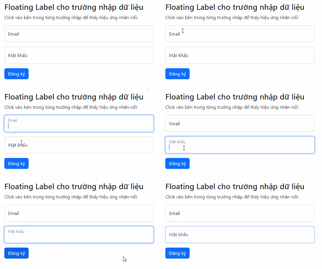
Why markup order and placeholders matter
- The
inputmust appear before thelabelso Bootstrap can select the label with a CSS sibling selector. - The input's
idmust match the label'sforvalue. - A text input needs a non-empty
placeholder, even though the floating label hides that text visually. - The label remains real HTML text and should describe the field clearly.
Do not treat the placeholder as a replacement for a label. Placeholder text can disappear after typing and is not as reliable for identifying a control. The Bootstrap floating-label documentation explains the required structure and supported controls.
Use a floating label with a textarea
Wrap the textarea and label in the same way. Bootstrap ignores the rows attribute for this presentation, so set a deliberate height in a custom class when more space is needed:
<div class="form-floating">
  <textarea class="form-control message-field"
    id="message" name="message"
    placeholder="Write your message" required></textarea>
  <label for="message">Message</label>
</div>
.message-field {
min-height: 8rem;
}A minimum height allows the control to grow if other project styles enable resizing, while giving users enough room to review a short message.
Use a floating label with a select
Floating labels also work with a normal form-select. Select labels always appear in the floated position and do not require a placeholder:
<div class="form-floating">
  <select class="form-select" id="topic" name="topic" required>
    <option value="" selected disabled>Choose a topic</option>
    <option value="billing">Billing</option>
    <option value="technical">Technical support</option>
    <option value="feedback">Product feedback</option>
  </select>
  <label for="topic">Support topic</label>
</div>
Bootstrap does not support this floating-label treatment for selects that use multiple or size.
Add validation feedback
Validation classes can be applied to a floating control. Place the feedback inside form-floating after the label:
<div class="form-floating mb-3">
  <input class="form-control is-invalid" id="accountEmail"
    name="email" type="email" value="member@example.com"
    placeholder="name@example.com"
    aria-describedby="accountEmailError">
  <label for="accountEmail">Email address</label>
  <div class="invalid-feedback" id="accountEmailError">
    An account already uses this email address.
  </div>
</div>
Use is-invalid when the server has rejected a particular field. For submit-time browser validation, apply was-validated to the form after a failed submission. The error text should state how the user can correct the value rather than only saying “Invalid.”
Build a responsive floating-label form
Place each form-floating wrapper inside a grid column. This example stacks fields on narrow screens and places them side by side from 768px:
<form class="row g-3">
  <div class="col-md-6">
    <div class="form-floating">
      <input class="form-control" id="firstName" name="firstName"
        type="text" placeholder="First name" autocomplete="given-name">
      <label for="firstName">First name</label>
    </div>
  </div>

  <div class="col-md-6">
    <div class="form-floating">
      <input class="form-control" id="lastName" name="lastName"
        type="text" placeholder="Last name" autocomplete="family-name">
      <label for="lastName">Last name</label>
    </div>
  </div>

  <div class="col-12">
    <button class="btn btn-primary" type="submit">Continue</button>
  </div>
</form>
Common problems
- The label does not move: check that the control is first and has the correct Bootstrap class.
- The label overlaps an empty input: add a non-empty placeholder to text inputs and textareas.
- Clicking the label does not focus the field: match the label's
forwith the control's uniqueid. - A textarea is too short: set its height or minimum height with a scoped CSS class.
- A select does not behave like an input: select labels intentionally remain floated.
- The form is difficult to scan: reserve floating labels for compact forms; conventional labels above fields may be clearer for complex instructions.
Use a capable HTML editor to catch mismatched IDs and malformed markup. If you are still choosing a UI toolkit, compare Bootstrap with other CSS frameworks.
Related Articles
 Lesson 37: Form Validation in Bootstrap 53 minutes read
 Lesson 42: Large Grid in Bootstrap 54 minutes read
 Lesson 38: Grid Systems from Stacked to Horizontal in Bootstrap 54 minutes read
 Lesson 30: Flexing in Bootstrap 59 minutes read
 Lesson 15: Pagination in Bootstrap 54 minutes read
 Lesson 4: Typography in Bootstrap 512 minutes read
Reader Comments 0
Sign in with email or Google to join the discussion.