Lesson 35: Input Groups in Bootstrap 5
Input groups in Bootstrap 5 give you a way to extend an input control. Here's how to use input groups in Bootstrap 5..
Input groups in Bootstrap 5 provide a simple way to extend an input control. Here's how to use input groups in Bootstrap 5 .
Input Group
A class .input-groupis a container that enhances input by adding an icon, text, or a button before or after the input field as 'help text'.
To format the help text style, use the class .input-group-text:
Sample code:
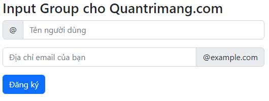
@ @example.com For example:
Bootstrap Example Input Group for TipsMake.com.com
@ @example.com
Input Group Size
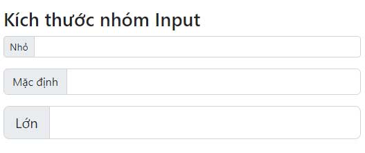
Use classes .input-group-smfor small input groups and .input-group-lgfor large input groups. Sample code:
Small Default Large For example:
Bootstrap Example Input Group Size
Nhỏ Mặc định Lớn
Multiple Inputs and Helpers
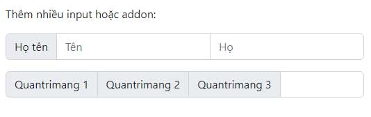
Add more inputs and addons like in the sample code:
Person One Two Three For example:
Bootstrap Example Add more inputs or addons:
Họ tên TipsMake 1 TipsMake 2 TipsMake 3
Input Group with checkbox and radio
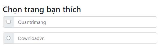
You can also use checkboxes or radio buttons instead of text. Here's some sample code:
For example:
Bootstrap Example Choose the page you like
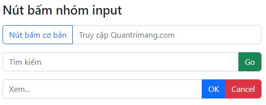
Input Group buttons
Sample code:
For example:
Bootstrap Example Input group button
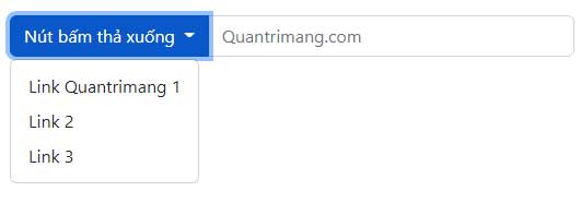
Input Group with drop-down button
Add a dropdown button to the input group. Note that you don't need a 'wrapper' .dropdownas usual.
Sample code:
For example:
Bootstrap Example
Above are the things you need to know about creating Input Groups in Bootstrap 5. Hopefully, this Bootstrap tutorial with examples is helpful to you.
 David Pac