Lesson 33: Checkboxes and Radio Buttons in Bootstrap 5
Checkboxes and radio buttons are two useful components when building list items on a website. Below is how to create checkboxes and radio buttons in Bootstrap 5..
Checkboxes and radio buttons are two useful components when building list items on a website. Below is how to create checkboxes and radio buttons in Bootstrap 5 .
Checkbox
Checkboxes are commonly used if you want the user to select any number from a given list of options.
Sample code:
Detailed explanation:
To style checkboxes, use the 'wrapper' element with the class="form-check" to ensure proper alignment for labels and checkboxes.
Next, add the class .form-check-labelto the label element, and .form-check-inputformat the checkbox appropriately inside the container .form-check.
Use the attribute checkedif you want that checkbox to be checked by default.
For example:
Bootstrap Example Checkboxes
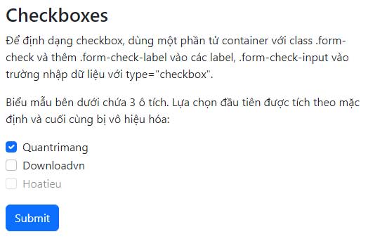
To format a checkbox, use a container element with the class .form-check and add .form-check-label to the labels, and .form-check-input to the input field with type="checkbox".
The form below contains 3 checkboxes. The first option is checked by default and the last one is disabled:
Radio buttons
Radio buttons are used when you want to restrict users to having only one option in the list. Sample code:
Option 1 Option 2 Option 3
For example:
Bootstrap Example Button radio
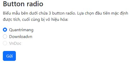
The form below contains 3 radio buttons. The first option is checked by default, the last one is disabled:
Selection switch
If you want to format the checkbox as a toggle button like a switch, use the class .form-switchalong with the container .form-check.

Basic code:
Above is how to create checkboxes and radio buttons for web and application development. Hopefully, this Bootstrap 5 lesson is helpful to you.
 Kareem Winters