Table of Contents
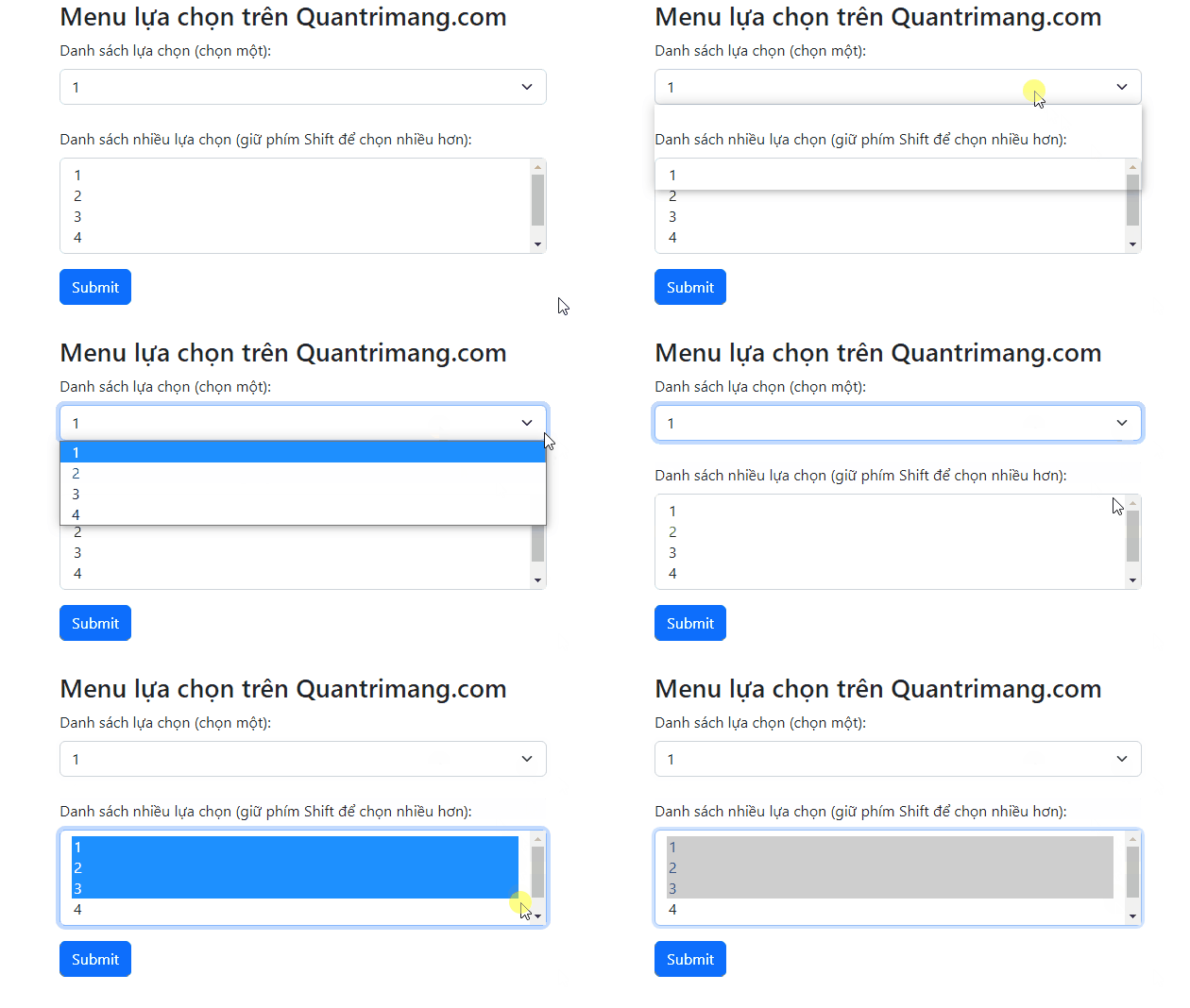
Add form-select to a native <select> to give it Bootstrap 5 styling. The element keeps its built-in keyboard and form behavior; Bootstrap changes its initial appearance rather than replacing it with a custom JavaScript menu.
Create a single-choice select
Give the select a visible label, a unique ID, a name for form submission, and meaningful option values:
<div class="mb-3">
  <label class="form-label" for="country">Country or region</label>
  <select class="form-select" id="country" name="country" required>
    <option value="" selected disabled>Choose a country or region</option>
    <option value="ca">Canada</option>
    <option value="sg">Singapore</option>
    <option value="gb">United Kingdom</option>
    <option value="us">United States</option>
  </select>
</div>
The first disabled empty option acts as a prompt. With required, the form is invalid until the user chooses an option with a non-empty value.
Allow multiple selections
Add multiple when the user may select more than one option. Use a field name that the server interprets as a list and explain the interaction:
<div class="mb-3">
  <label class="form-label" for="interests">Topics of interest</label>
  <select class="form-select" id="interests"
    name="interests[]" multiple size="5"
    aria-describedby="interestsHelp">
    <option value="accessibility">Accessibility</option>
    <option value="css">CSS</option>
    <option value="html">HTML</option>
    <option value="javascript">JavaScript</option>
    <option value="performance">Web performance</option>
  </select>
  <div class="form-text" id="interestsHelp">
    Select every topic that applies.
  </div>
</div>
Desktop browsers may use Ctrl, Command, or Shift for multi-selection, while touch behavior varies. For a short list, a set of checkboxes can make multiple choices clearer and keep all options visible.
Change select size
Use form-select-lg or form-select-sm beside the base class. The default size needs no modifier:
<label class="form-label" for="largeSelect">Large select</label>
<select class="form-select form-select-lg mb-3"
  id="largeSelect" name="largeExample">
  <option value="one">Option one</option>
  <option value="two">Option two</option>
</select>

<label class="form-label" for="defaultSelect">Default select</label>
<select class="form-select mb-3"
  id="defaultSelect" name="defaultExample">
  <option value="one">Option one</option>
  <option value="two">Option two</option>
</select>

<label class="form-label" for="smallSelect">Small select</label>
<select class="form-select form-select-sm"
  id="smallSelect" name="smallExample">
  <option value="one">Option one</option>
  <option value="two">Option two</option>
</select>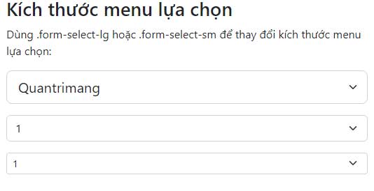
Choose a size for the form's overall hierarchy rather than mixing sizes only for decoration. The Bootstrap select documentation lists the supported modifiers.
Group related options
Use optgroup when a long menu has meaningful categories:
<label class="form-label" for="office">Office</label>
<select class="form-select" id="office" name="office">
  <option value="" selected>Choose an office</option>
  <optgroup label="Americas">
    <option value="new-york">New York</option>
    <option value="toronto">Toronto</option>
  </optgroup>
  <optgroup label="Asia Pacific">
    <option value="singapore">Singapore</option>
    <option value="sydney">Sydney</option>
  </optgroup>
</select>
Groups improve scanning, but they do not solve an excessively long menu. Search, filtering, or a different control may be more appropriate for hundreds of choices.
Disable a select or one option
The disabled attribute prevents focus and interaction and excludes the select from form submission:
<label class="form-label" for="archivedPlan">Archived plan</label>
<select class="form-select" id="archivedPlan"
  name="archivedPlan" disabled>
  <option selected>Legacy plan</option>
</select>
To make only one choice unavailable, add disabled to its option. Explain why an unavailable option is shown; otherwise remove it from the list.
Add validation feedback
Bootstrap validation classes work with form-select:
<div class="mb-3">
  <label class="form-label" for="supportTopic">Support topic</label>
  <select class="form-select is-invalid" id="supportTopic"
    name="supportTopic" aria-describedby="supportTopicError" required>
    <option value="" selected>Choose a topic</option>
    <option value="account">Account</option>
    <option value="billing">Billing</option>
    <option value="technical">Technical issue</option>
  </select>
  <div class="invalid-feedback" id="supportTopicError">
    Choose the topic that best matches your request.
  </div>
</div>
Use is-invalid for a specific error returned by the server or add was-validated to the form after a client-side submission attempt. Important choices must still be validated on the server.
Offer suggestions with a datalist
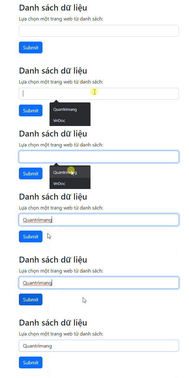
A datalist attaches suggestions to a normal input. Unlike a select, it usually allows the user to enter a value that is not in the list:
<div class="mb-3">
  <label class="form-label" for="city">City</label>
  <input class="form-control" id="city" name="city"
    type="text" list="cityOptions"
    placeholder="Start typing a city">
  <datalist id="cityOptions">
    <option value="Chicago"></option>
    <option value="Los Angeles"></option>
    <option value="New York"></option>
    <option value="San Francisco"></option>
    <option value="Seattle"></option>
  </datalist>
</div>
The input's list value must match the datalist's id. Datalist styling and behavior vary more between browsers and operating systems than a select.
Select or datalist?
| Requirement | Better control |
|---|---|
| User must choose one of the supplied values | select |
| User may choose several supplied values | select multiple or checkboxes |
| User may type a new value or accept a suggestion | input with datalist |
| Choices need rich interactive content | A carefully designed custom component, with full keyboard support |
Common problems
- The form submits visible text instead of a stable code: give every option an explicit
value. - The select has no accessible name: use a visible label linked by
forandid. - A required prompt is accepted: give the prompt an empty value.
- Multiple selection is confusing: consider checkboxes for a short list.
- The dropdown options do not match the Bootstrap theme: native option styling is limited by the browser.
- A disabled value is missing from the request: disabled controls are not submitted; include the value separately only when the server genuinely needs it.
Use an HTML editor to check labels, IDs, and option values. If you are selecting a UI toolkit, compare Bootstrap with other CSS frameworks.
Related Articles
 Lesson 18: Creating a Dropdown Menu in Bootstrap 56 minutes read
 Answering Frequently Asked Questions About Bootstrap7 minutes read
 Lesson 42: Large Grid in Bootstrap 54 minutes read
 Lesson 38: Grid Systems from Stacked to Horizontal in Bootstrap 54 minutes read
 Lesson 30: Flexing in Bootstrap 59 minutes read
 Lesson 15: Pagination in Bootstrap 54 minutes read
Reader Comments 0
Sign in with email or Google to join the discussion.