JavaScript code to create Pareto charts & graphs
The example below illustrates a Pareto chart template created with JavaScript. You will also have the source code to edit in the browser or save to your computer to run locally.
Table of Contents
Pareto Chart or Pareto chart is a combination of column & line graph. The columns are placed in descending order, and the line graph represents the cumulative total.
This type of chart/graph is used to highlight most important situations. It is also interactive, responsive and supports animation & photo export.
The example below illustrates a Pareto chart template created with JavaScript . You will also have the source code to edit in the browser or save to your computer to run locally.

Source : CanvasJS
Tweak the chart
You can change colorthe column or line to highlight it. Some other popular editing options include dataPointWidth- data point width, markerType- marker style, markerColor- marker color, etc.
Was this article helpful?
Your feedback helps us improve.
Related Articles
 JavaScript code that generates Pareto chart template with Index/Data . label1 minutes read
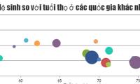 JavaScript code to create bubble charts and graphs.2 minutes read
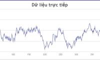 JavaScript code to generate dynamic line graphs/charts1 minutes read
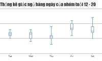 JavaScript code to generate box and whisker charts/graphs2 minutes read
 JavaScript code to create a combined area and line chart.1 minutes read
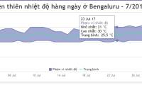
 JavaScript code to create multi-series graphs that update live data1 minutes read
Reader Comments 0
Sign in with email or Google to join the discussion.