IPhone screen X: Size and special features
iPhone X owns a large, high resolution Super Retina screen, rounded, ultra-thin screen border that brings a richer and deeper experience than ever for iPhone believers.
iPhone X owns a large, high resolution Super Retina screen, rounded, ultra-thin screen border that brings a richer and deeper experience than ever for iPhone believers.
Screen size
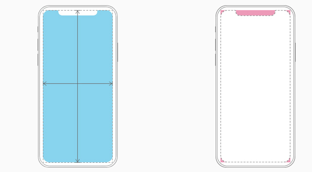
Vertical, iPhone X screen width matches the width of 4.7-inch screen of iPhone 6, iPhone 7 and iPhone 8. However, iPhone X screen is 145pt higher than 4.7 inch screen, this makes Increase 20% of vertical space for content.

Size when vertical
Size when horizontal
1125px × 2436px (375pt × 812pt @ 3x)
2436px x 1125px (812pt × 375pt @ 3x)
Provide high-resolution images for all artwork in the application
iPhone X has a high resolution Super Retina screen with a ratio of 3x. For glyph and other flat vector artwork, it provides PDF files with their own resolution. For rasterized artwork, the device offers both @ 3x and @ 2x versions.
Layout
When designing for iPhone X, users need to make sure the layout fills the screen and is not obscured by rounded corners, sensor covers or the main screen access indicator.
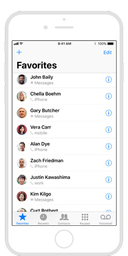
Most applications use standard user interface elements and are provided by the system such as navigation bar, table and auto collection that automatically adapts to the device's new form factor. Background material extends to the edges of the screen and user interface elements are entered and placed appropriately.
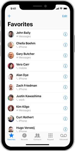
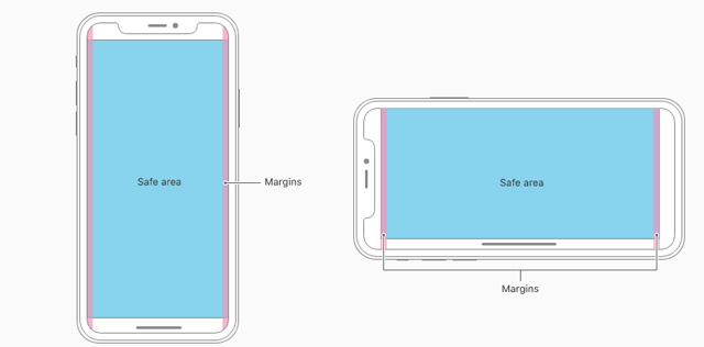
For applications with custom layouts, it is relatively easy, especially if the application uses the Auto Layout interface and follows the instructions for allocating safety and margin areas.
Preview the application on iPhone X
Users can use the Simulator (available in Xcode) to preview the application and check for clipping (cutting) and other layout issues. If the application supports landscape mode, make sure the layout looks great regardless of whether the device has been rotated left or right. The upside-down mode is not supported by iPhone X. Some features such as extended color upgrades are best previewed on real devices.
Provide a full screen experience
Make sure the background extends to the edges of the screen and vertical scrolling layouts.
Set up the content needed to prevent content removal
In general, content should be centered and symmetrical to look great in any direction and not be obscured by the device sensor's angle or cover or indicator to access the main screen. For best results, use system-provided interface elements and Auto Layout to build the interface. All applications must comply with the safety zone and tool margin defined by UIKit, ensuring the insetting settings are appropriate based on the device and context. The safe area also prevents content from overlapping the status bar, navigation bar, toolbar and tab bar.
Status bar height
The status bar on iPhone X is higher than other iPhone versions. If the app has a fixed status bar height to locate content under the status bar, you need to update the app to automatically locate content based on the device. Note that the status bar on iPhone X does not change height when background tasks such as recording and location tracking are active.
In case the application is currently hidden in the status bar:
The screen height on the iPhone provides vertical space for more content than the iPhone 4.7 inch screen and the status bar occupies an area of the screen so applications cannot be fully used. The status bar also displays information that people find useful, so it is only hidden when there is more important information.
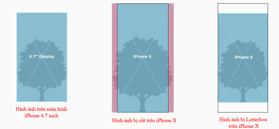
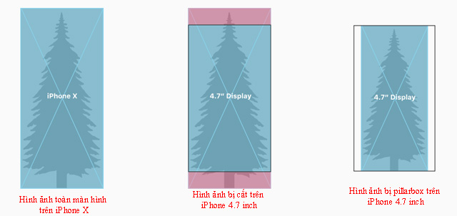
Notice the difference in frame rate when reusing existing artwork
iPhone X has a different frame rate than the 4.7-inch iPhone screen. Therefore, full screen images on iPhone 4.7 screen will be cut or letterbox when full screen display on iPhone X. Similarly, full screen images in iPhone X will be garbled or pillarbox when Full screen display on iPhone 4.7 inch screen. Make sure that important image content is still viewable on both display sizes.
Avoid clear interactive controls at the bottom of the screen and corners
People use swipe gestures at the bottom of the screen to access the main screen and the app converter. However, these gestures can cancel custom gestures performed in this area. The far corners of the screen may be the hard-to-reach area of the screen.
Do not hide or pay special attention to the main display features.
Do not try to hide rounded corners, sensor covers or indicators to access the main screen by placing black bars at the top and bottom of the screen. Do not use visual decorations such as frames, shapes or text to pay special attention to these areas.
Allow auto-indicator to access the main screen
When auto-hide is activated, the indicator will fade if the user does not touch the screen for a few seconds. It reappears when the user touches the screen again. This behavior should only be enabled for passive viewing experiences such as watching videos or photo slideshows.
Color
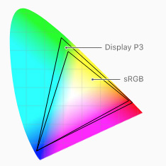
The display on iPhone X supports P3 color space, which can create richer, more saturated colors than sRGB.
Use extensive color enhancement to enhance the visual experience
Photos and videos use identical wide colors and image data and status indicators using wide colors have a stronger impact.
Video
The video player available in the system provides two viewing modes: full screen and frame matching. By default, the system selects a view based on the video's aspect ratio and users can switch modes during playback.
Full screen view
Video ratio will fill the display. Edge cropping may occur. This is the default view for wide videos (2: 1 to 2.40: 1).
The view fits the frame
The entire video is displayed on the screen, which may occur in case of letterbox and pillarbox. This is the default view for standard video (4: 3, 16: 9 and any standard on 2: 1) and extremely wide video (over 2.40: 1).

Make sure the custom video player works as expected
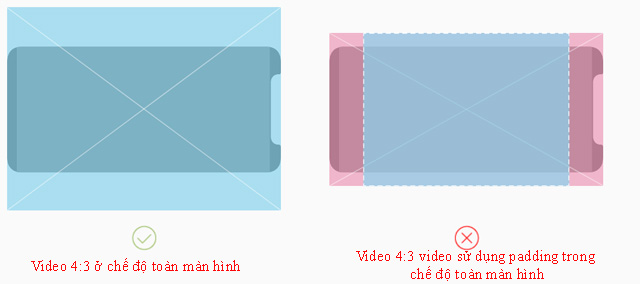
The goal is to fill the screen by default when playing video content on iPhone X. However, if filling the display can lead to cropping, the video must be scaled to fit the frame. . Users should also switch between full-screen view and frame-matching mode based on personal preferences.
Always display video content in the original aspect ratio
If the video content uses letterbox or pillarbox to match the specific frame rate, iOS will not be able to rate the video correctly based on the user's view. Using padding embedded in the video frame can make the video appear smaller in full screen mode and frame-appropriate mode. It also prevents videos from being displayed correctly in contexts other than full-screen, such as Picture in Picture mode on the iPad.
Gesture
The screen on iPhone X uses screen-side gestures to provide access to the main screen, application switching, Notification Center and Control Center.
Avoid interfering with gestures next to the screen
People rely on these gestures to use every application. In rare cases, appealing applications such as games may require customizable side-screen gestures to take precedence over system gestures, the first swipe of the gesture dedicated to The application and the second swipe will activate the system's gesture. This behavior (called edge protect) should not be used much, because it makes it more difficult for users to access system-level actions.
Additional designs
Authentication reference method correctly
iPhone X supports Face ID for authentication. If the application integrates with Apple Pay or other system authentication features, users should not use Touch ID on iPhone X. Similarly, ensure that the application does not refer to Face ID on Touch-enabled devices. ID.
Do not repeat the keyboard features provided by the system
On the iPhone X, the Emoji / Globe key and the Dictation key automatically appear below the keyboard - even when using a custom keyboard. Your application cannot affect these keys, so avoid confusing them by repeating them on the keyboard.
- How to increase text size and icon (icon) on iPhone
- Apple will provide a special iPhone version for hackers
- How to split screen on iPad
- Hidden features on iPhone X may not be known
- iPhone 7 will have to offer to lose the iPhone 8 super product by 5 outstanding features later
- Replacement operations for home button on iPhone XS, and iPhone XS Max


 How to test the screen, check the iPhone screen easiest
  How to fix black screen error on League of Legends
  8 ways to take screenshots of MacBook Air M1 2020
  How to share a video call screen on Viber
  How to display a full screen PowerPoint presentation
  How to prevent students from drawing on Zoom