Instructions for using Sveltestrap
Svelte is great for building user interfaces, while writing custom styles may be enough for small projects, a component library is often better for large-scale projects.
Svelte is great for building user interfaces, while writing custom styles may be enough for small projects, however, a component library is often better for large-scale projects.

Such libraries offer many benefits such as consistent UI design options, improved accessibility, and flexible customization. So, let's learn how to work with the Sveltetrap component library to streamline the development process!
What are Svelte and Bootstrap?
Svelte is a special JavaScript framework. Instead of running most operations at runtime, Svelte compiles your application to JavaScript during the build process.
This unique approach eliminates the need for a virtual DOM and significantly reduces boilerplate code.
Bootstrap is a CSS framework that pioneered the mobile-first design philosophy. It provides a rich design component resource.
Install Svelestrap in your project
Before you can install Sveltestrap in your project, you need to make sure Svelte is set up correctly. Make sure you have Node.js, NPM or Yarn running on your computer. You can create a new Svelte project with this command:
npm create vite # hoặc yarn create viteName the project Svelte and when prompted to select a framework and variables, click Svelte and JavaScript respectively. After doing that, put the cd into the project directory and run:
npm install # hoặc yarnThis command will install the required dependencies for the specific Svelte project.
Once the Svelte project is ready, you can now install the Sveltetrap library by running:
npm i sveltestrap # hoặc yarn add sveltestrapDelete the assets and lib folders , then delete the contents of the App.svelte and App.css files . You can now launch the programming server by running:
npm run dev # hoặc yarn devUse Sveltetrap in projects
To start using Sveltestrap, you need to include a link to the Bootstrap style sheet using a CDN link. You can do this inside the head element in the HTML layout or from the svelte:head tag in the Svelte element.
Open the index.html file and add the following code to the head element :
If you like, you can enter or add the link tag directly into the special element svelte:head as follows:
Additionally, you can use the @import rule in any element's style tag like this:
Button component in Sveltestrap
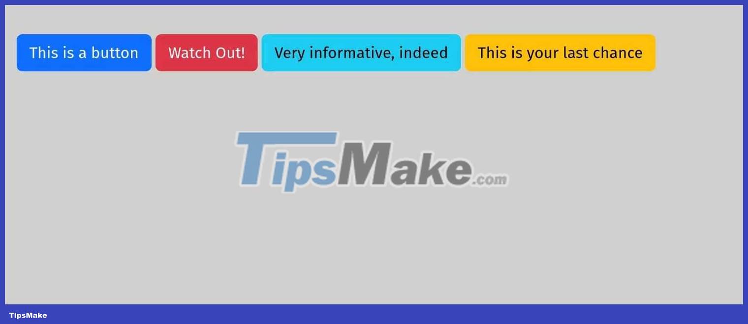
The standard Bootstrap framework provides a series of class names that you can use to style your buttons. These class options include names like "primary," "danger," "info," "link," etc.
In Sveltetrap, each Button element has a color value that matches Bootstrap's default style options. This simplifies customization processes. To import a component such as a button, add the following code to any .svelte component file , such as src/App.svelte :
Then add the Button component , passing a value to the color property .
The above code block will produce the following result:

Create notifications in Sveltetrap
Adding the notification component is as simple as importing it from the Sveltestrap library like this:
To suppress a warning, you must add the 'dismissible' attribute to the Component as follows:
This is an alertJust like with the Button component , you can customize the color of the notification with the color property .
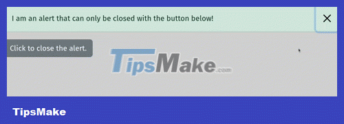
This is an alert.The Alert component also provides an isOpen and toggle properties that give you granular control over the open/closed state of the notification box.
alert("Haha, that doesn't work! Use the button below the alert.")}> I am an alert that can only be closed with the button below! This code block defines an Alert component with isOpen and toggle properties . Each Alert component has a 'close' icon to dismiss the alert, but you can override the behavior with the toggle attribute .
For example, clicking the x icon displays the native browser notification dialog box instead of closing the notification.

In a real application, you can use toggle to call a function whenever the user dismisses the alert.
How to use drop-down menu in Sveltestrap
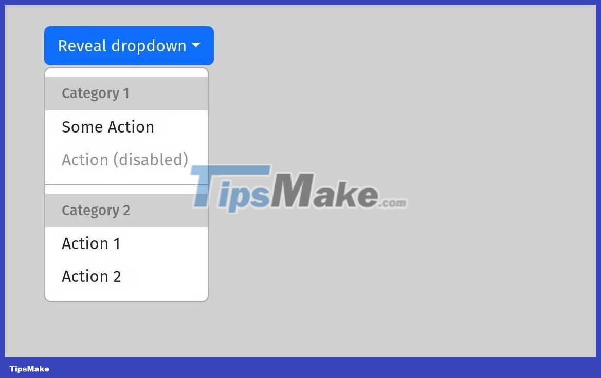
To work with dropdown menus, use the ButtonDropdown utility from the sveltetrap library . Ideally, you should add a DropdownToggle component as a child of ButtonDropdown to toggle the dropdown menu. Use another child component - DropdownMenu to contain dropdown items.
Reveal dropdown Category 1 Some Action Action (disabled) Category 2 Action 1 Action 2 The above code block imports 4 components: ButtonDropdown , DropdownItem , DropdownMenu , and DropdownToggle . Each DropdownItem provides a header and a divider that you can use to group related dropdown items.

Understanding icons in Sveltetrap
If you want to add a Bootstrap icon to your project, you must import the Icon component .
You must also include a CDN link to the Bootstrap Icons package in the project, preferably in the special element svelte:head .
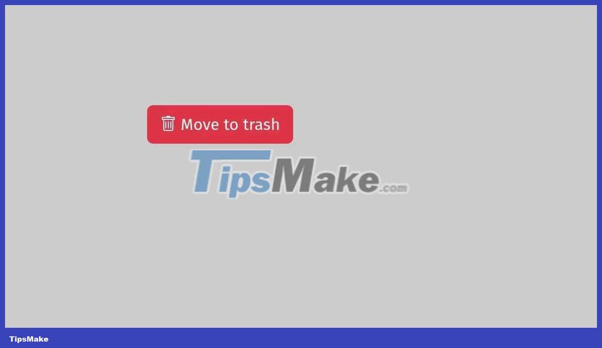
Each Icon element has a name attribute , where you pass in the name of the desired Bootstrap icon. You can use the official Bootstrap Icons website to find the name of the icon you want to use.
Notice how the icon automatically adjusts its color to its context:

Above are the things you need to know about how to combine Svelte and Bootstrap in programming . Hope the article is useful to you.


 What are transitions and animations in Svelte?