Table of Contents
Claude Artifacts can turn a structured data file into an interactive chart without requiring you to build the visualization from scratch. The basic workflow is simple: clean the data, upload it to Claude, describe the chart you need, and then refine the Artifact until it communicates the result clearly.
Prepare the data before uploading it
Start with a tidy table in which each row represents one observation and each column has a clear heading. Check for duplicate rows, missing values, inconsistent category names, invalid dates, and obvious entry errors. A smaller, well-organized dataset is usually easier to visualize than a large file containing unused columns.
CSV is a practical format for tabular data because it preserves a simple row-and-column structure. Before exporting, decide which fields the chart actually needs and remove personal or confidential information that should not be sent to an AI service.
Create the first visualization
- Open Claude and start a new conversation.
- Attach the prepared CSV file.
- Ask for a specific chart and explain what each axis, series, or category should represent.
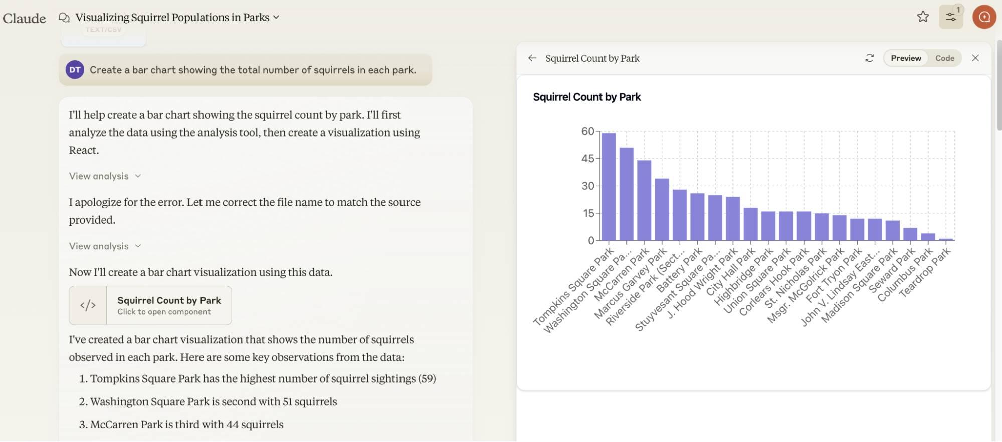
- Review the generated Artifact and verify its labels, values, scale, and legend against the source data.

A useful first prompt is:
Create an interactive [chart type] from the attached CSV. Use [field] for the horizontal axis and [field] for the vertical axis. Group the results by [category], add clear labels and tooltips, and do not infer values that are missing from the file.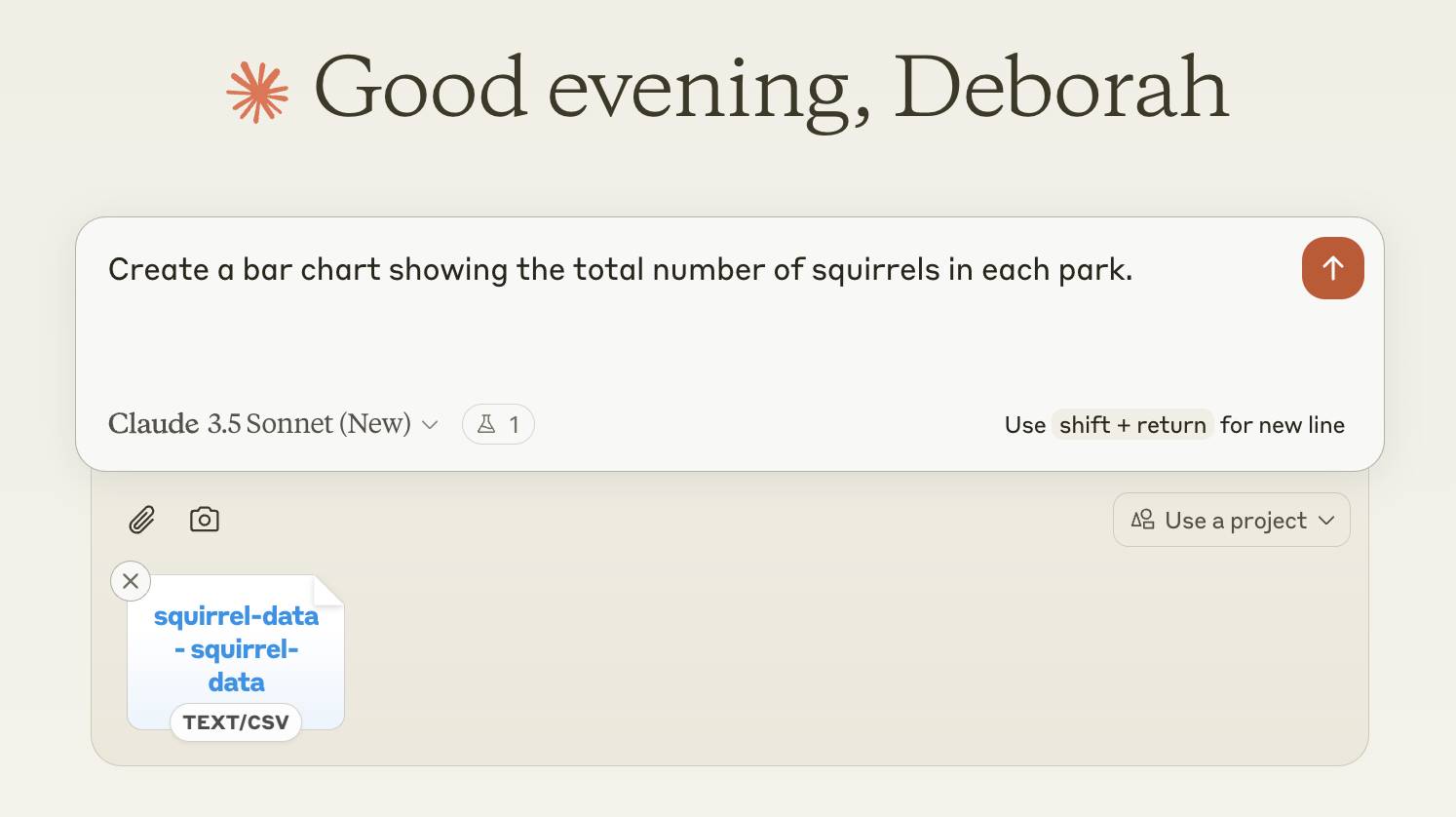
Choose a chart that matches the question
- Bar chart: compare values across categories.
- Line chart: show change over time.
- Scatter plot: examine the relationship between two numeric variables.
- Pie or donut chart: show a small number of parts within a whole; avoid it when many categories make comparison difficult.
- Treemap: compare hierarchical proportions when groups contain subgroups.
Do not accept the default chart automatically. The best format is the one that answers the reader's question with the least effort. Ask Claude to change the chart type if the first result hides important comparisons.
Refine and verify the Artifact
Use follow-up prompts to request clearer axis titles, accessible colors, a useful sort order, concise annotations, or more informative tooltips. Make one or two changes at a time so that you can identify which instruction improved or damaged the result.
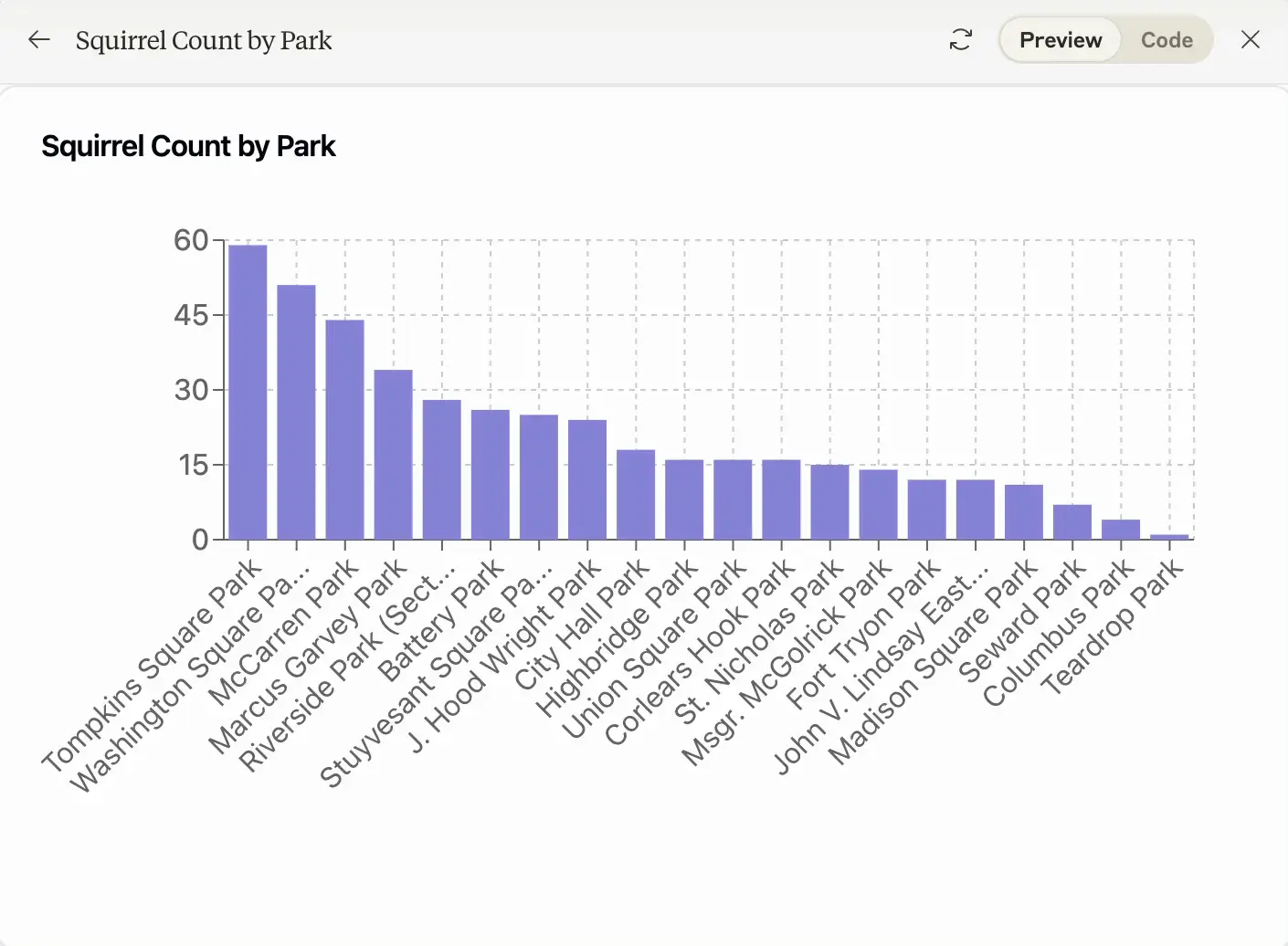
Check every important number against the uploaded file. Also look for truncated labels, misleading axis ranges, categories combined incorrectly, and totals that do not reconcile. A polished chart can still be wrong if the underlying data was misunderstood.
If a complex Artifact becomes unstable, return to a simpler prompt or begin a fresh conversation with a reduced dataset. Save a copy of the working version before requesting major structural changes.
Download or share the result
Available actions can vary as Claude's interface changes, but an Artifact may offer options to download its code or publish a shareable version. Review the shared output first and confirm that it does not expose private data, file names, or information that was not meant for publication.
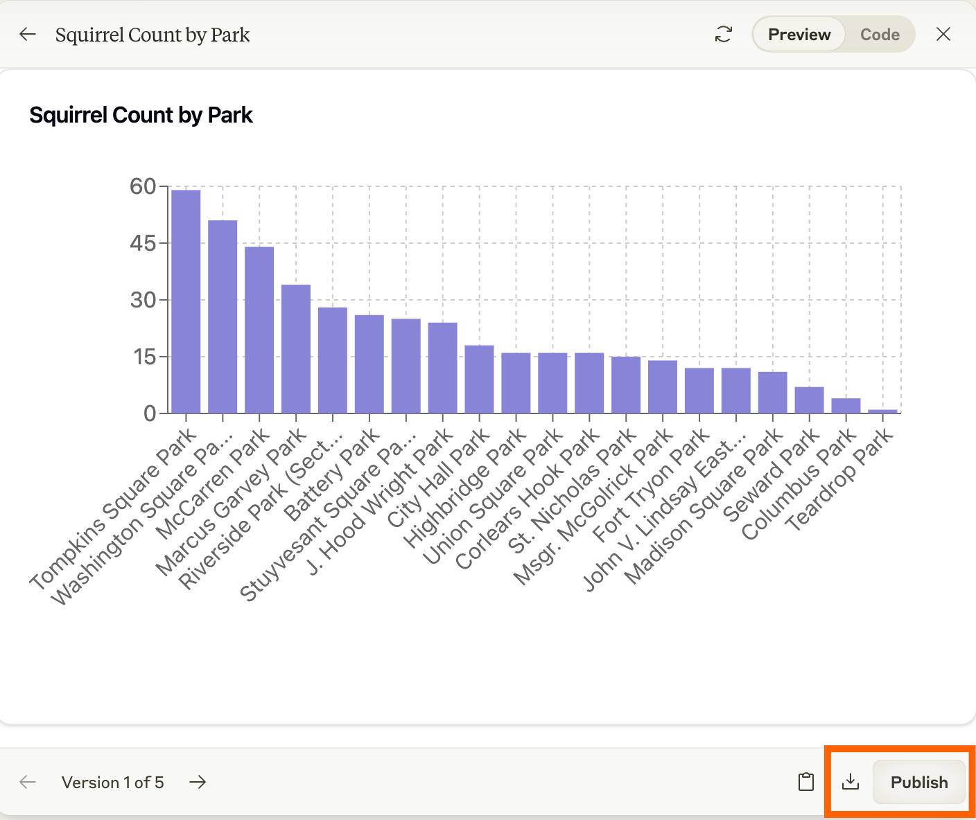
For use in another project, download the generated file and inspect the code and dependencies before integrating it. For a quick presentation, a published Artifact can be convenient, but the chart should still be validated against the original dataset.
Related Articles
 What Are Claude Artifacts?: What You Need to Know10 minutes read
 Reasons to Try Claude's Artifacts: What You Need to Know7 minutes read
 How to Export Claude's Dialogue to PDF5 minutes read
 minutes read
 Claude AI Can Now Read Health Data and Provide In-depth, Personalized Analysis4 minutes read
 What Is the Claude Code: Clear Explanation7 minutes read
Reader Comments 0
Sign in with email or Google to join the discussion.