How to combine SEO and user experience (UX)?
UX designers and SEOs can put aside differences to work together. Here are a few ways to help you combine SEO and UX.
Over the years, SEO and UX have always been separated and it's hard to eliminate "we and them" thoughts. But if you want your business to succeed, you will need to know how to combine them together.
The responsibility of SEOs is to keep track of how Google algorithms work, so people who make UX must always listen to their opinions even when it comes to design issues. But the good news is that SEO and UX are getting closer . When visitors visit a better user experience, businesses will also know how to make their customers happy (assuming they conduct research on how the art works). math), UX designers and SEO people can put aside differences to work together. Here are a few ways to help you do this.

Data on website visitors can help UX
Now, the main task of SEOs is to focus on understanding your website best to be able to inform the designer.
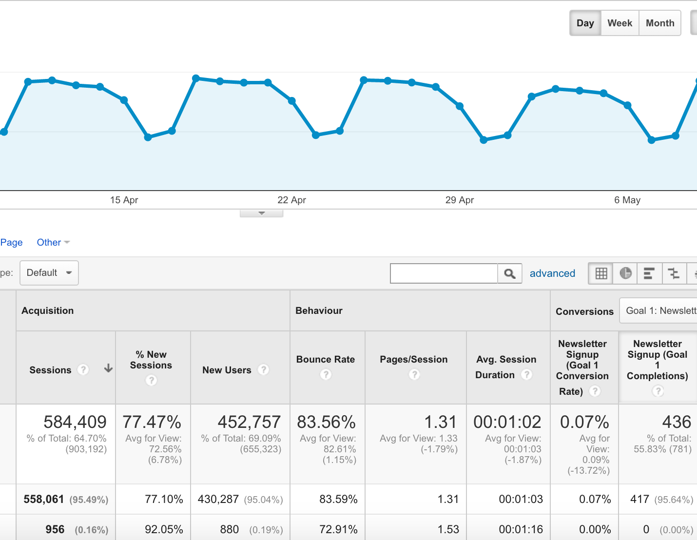
In order to get detailed figures, data collection can be used with Google Analytics, from which you get numbers like user behavior, the most interesting content on the page, users. What to look for on the page, how long they stay, how fast or slow the website loads or how far the user uses the mouse scroll on the page .
These data are very important for designers because it will help them create the structure, layout and content layout to make it easy for users to navigate between the content they love.
In short, SEOs explore the type of user experience they want and UX designers create those experiences.
Analyze Google rankings to find things to improve in UX
Knowing where your website is located, how important ranking is, especially during the research phase.
For a designer, the fact that SEOs know the page rank on Google also doesn't help their design process because increasing page rank seems to be a marketing activity, not a UX maker. But knowing which pages on the website are ranked (or not rated) well will cause you to ask questions (related to SEO) about those sites, research technical issues, internal content as well as rivals have good rankings.

From these analyzes, SEOs can inform the party to do UX, make sure the designer knows what the user needs and put it on his website. SEO practitioners can also report technical errors affecting the user experience such as pop-ups or internal links.
Report to improve constantly
When the new design of a website came out, it was just the beginning of the journey, not the end. UX designers will have to create products based on their own experience, skills or in-depth analysis, but even so, there are things that make users unhappy with the website, affecting Their use experience.
In order to monitor and detect UX's potential problems, the website needs to be able to collect data about customers' real experiences . These data will create the necessary changes in the future, in order to bring a better user experience.
And that's when SEOs can help.

In order for Google Analytics to accurately track user behavior on the website, goals and tasks should also be set up correctly. In addition, setting up advanced segments and filters will also help provide deep, detailed information instead of vague, generic data. Finally, it is also important to connect to Google Search Console (or Google Webmaster Tool), help fix broken links, speed up websites, improve friendliness when using websites on mobile and provide lots of data. More metadata, which helps bring more relevant content to end users.
4 UX design techniques to encourage user participation
Encouraging users to stay and use the site does not always involve code or graphics. Some of the simplest layouts like Reddit.com still make users enjoy the content and have fun when interacting with the site.
The secret lies in the user experience and the functional review of the website. Interaction stems from page elements and action flows from one page to another.
Today's article will look at some UX design techniques, which can be applied to improve the user experience and increase their level of interaction. Note that these things do not always apply to every website, and it is more important to understand why these techniques work, so you can use them in your own way.
The user experience theme is huge and requires patience to fully understand. The more you practice, the more you will understand it.
The best thing you can do is refer to the websites you like and find out what you like. From your own experience, you can deduce consistent ideas and find out what helps you (and perhaps others) interact with a website.
1. Use contrast to attract attention
Each site is built with very few elements, created for user interaction: Hyperlinks, buttons, input fields, sidebar utilities, lists, etc. But not all Both elements should be created the same. Some factors are obviously more important to visitor interaction, and must be designed with higher contrast to stand out from other elements on the page.

This idea comes from high color contrast and how people handle visual data in models. When something stands out from the surroundings, whether by color, size, shape or space, it can become more important based on context.
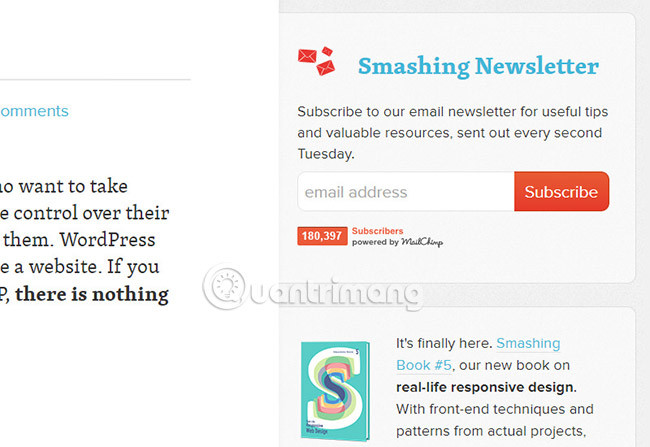
Use contrast to attract visitors' attention to the most elements on the page. If your goal is to create more subscriptions, your subscription box should have a light Subscribe button or a single vector icon.

The goal is to attract attention by building an attractive interface for visitors, so that they perform some desired actions.
If you have time, you should run a few typical A / B tests to see which colors / elements have the best role. Statistics are difficult to identify, but you'll be surprised to learn that you can learn a lot from a simple split test.
2. Attractive UI / UX animation
Recently there is a post titled 'What Disney knows about interface animation'. It includes important points of animation and its role in user psychology, when interacting with a flat 2D screen.
Different types of animations may imply certain behaviors. For example, when hovering over a button, it will respond to the user knowing it can click. Error messages often flash to attract attention from users.
Remember that UX animation needs to be displayed very subtly. Animations are often far superior to TV and movies, not the interface.
But that does not mean that your interface remains the same. In fact, most users want some kind of animation because it gives the illusion of a smoother experience. Digital design is part of creating a magic interface, but the more realistic it appears, the more users want to interact.
3. The responsive design is a requirement
Actually, there is a majority of Internet users browsing the web from their mobile phones. Links are shared with social networking sites like Facebook and Twitter which are often accessed right on smartphones and tablet devices.
This means that every website must be optimized for mobile devices in some way - preferably with a fully responsive design.
When you are forced to consider the screen size, it places important features in a completely new way. As a designer, you need to choose which features are most important and how they will appear on smaller screens. This responsive design strategy takes time to learn, but the best way is to research other websites and choose the technique you prefer.

The truth is that responsive design works and it is accepted more and more by the design community every year.
Users also hope the website will respond fully to serve any device screen. When a website does not fit into a mobile web browser, it may not be suitable for the user experience.
4. Simplify the interactive process
Smashing Magazine recently published one of the best posts, to help simplify interface design. It says no one wants to endure challenges to use your website or application. People only care about the end result and the fastest means to get there.
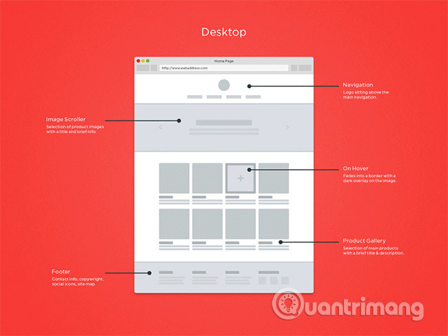
Many people like to build UX block diagrams for each element of the interactive page, whenever they outline the wireframes. These help visualize what the site will look like and how it works.
But in reality, it is not important how you plan based on experience. Just make sure you're planning the fastest and simplest experience possible. When it comes to activities that encourage visitor interaction, you'll want important things that the design wants to do.
If someone accesses your web application and doesn't understand how to register immediately, that's a big problem. It clearly tells the user what your website can do and how they can interact with it.
The best point to start with is UX design research and how users interact with the interface. From there you will be able to draw conclusions regarding your own projects and simplify the interfaces to achieve the greatest potential.
There is no single answer on how to design (or fix) websites to improve usability. You can try some things but each site will be a bit different and the research on UX design is very complicated.
Hopefully this article can help you understand more about some common techniques for building a highly usable interface. The best thing you can do is put yourself in the position of a typical user and try to identify the main vulnerabilities of the interface. And once you realize the problem, you'll find an easier solution!
See more:
- 7 ways to combine SEO and Content Marketing to create quality traffic
- How to become a good UX Designer without a degree!
- Top 7 UX design tools, leading UI
- Combine 2 networks to speed up
- How to combine layers in Photoshop
- How to combine multiple screen shots into a single photo on iPhone and iPad
- Samsung's obvious advantage in the 'user experience' race
- How to combine 2 columns Full name in Excel does not lose content
- How to Combine Two Internet Connections


 How to determine the posting date of a website or an information on the Internet
  15 websites for free and effective English learning at home
  How to add a Wordpress website to Adobe Dreamweaver CS6
  5 scary websites make you cry when you visit
  What is Admin? Admin Facebook, what is the website?
  6 ways to fix the error 'This site can't provide a secure connection'