75 great user interface design ideas you need to know - Part 2
After studying the article 75 great user interface design ideas you need to know - Part 1, TipsMake.com continues to provide you with a list of 75 great user interface design ideas you need. know - Part 2 helps to optimize the user interface in the most effective way. Invite you to consult!
Table of Contents
- Top 7 IT related jobs do not need to know the code
- How to become a good software developer?
- 7 signs that your design style is out of date
After studying the article 75 great user interface design ideas you need to know - Part 1, TipsMake.com continues to provide you with a list of 75 great user interface design ideas you need. know - Part 2 helps to optimize the user interface in the most effective way. Invite you to consult!
26. Use Opt-out strategy instead of Opt-in
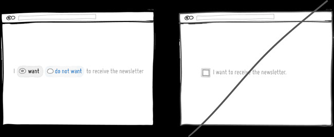
Opt-out strategy implies that users or customers can cancel the subscription order and freely choose what they want. While using Opt-In, users are required to confirm that they will receive information and cannot select specific purposes, which will make it difficult for users.
There are two good reasons to choose Opt-out strategy than Opt-In. First, Opt-out helps minimize unnecessary activities that users need to perform. Secondly, it is a form of recommendation that contains some kind of standard - " because everyone considers it so, I can do the same ". Opt-out strategy is, of course, often controversial because marketers will abuse it. For example, reducing the ability to read Opt-out text, while being able to use cryptic text or double negative segments. Both of these examples will lead to less awareness of users actually signing up for something. If you decide to follow the Opt-out approach, make it clear and understandable to your customers, what they are defaulting to.
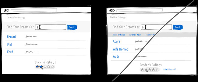
27. Try to unify the interface instead of making people "confused" during use
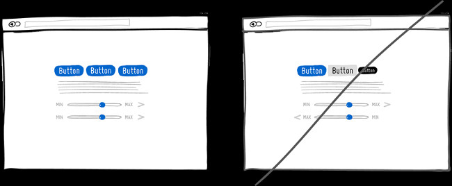
Appropriate UI user interface or simple operations are a great way to help customers not have a headache, be confused when trying a interface or your product. Moreover, you can freely create color or style fonts for features. However, if you do so, users will be easily confused and confused when using your website.
Unified interfaces can be achieved through many things like: color, navigation, behavior, position, size, shape, title and language. However, before making things consistent, keep in mind that keeping things inconsistent still has its own value. Inconsistent elements or behaviors come from the depths of the subconscious - this can be good when you want to get attention.
28. Leave some default information for users to easily visualize when registering
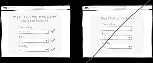
Using the default values or pre-filling in the registration form with suggestions will help users not to think and choose. This is a fairly common technique to help users manipulate faster, while also respecting their limited time. Users will definitely feel bored when they have to enter and re-enter the information previously asked. Therefore, show the suggested words or available information to help users take no time and take time to register. Perform as few operations as possible.
29. Let's design a common convention instead of making new ones
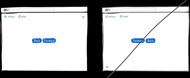
The general principle in design is to put the ' Back ' button (Back) on the left and the ' Forward ' button (Forward) on the right; or before the ' Delete ' button with the trash icon and before the ' Setting ' button will be a wheel. So far at any website. Therefore, you cannot change and assign in user memory that the 'Back' button (Back) on the right and the 'Forward' button (Forward) on the left; or replace the trash icon before the "Delete" button (Delete) with the leaf and flower icon. This will make users feel unfamiliar.
30. Try mentioning avoidance of loss instead of emphasizing the benefits
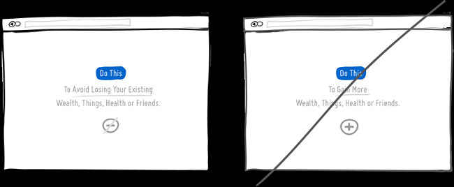
Normally, according to the psychological rules, people always want to have something but hate to lose things that belong to them. Most likely we like to avoid more losses than profits. This may apply to the promotion of a certain product or service package.
Understand that your product will be protected by benefits, users will not lose anything when using the service, so it is more effective than trying to provide users with the things that they not yet available. For example, insurance companies, are they selling compensation after the accident, or are they selling us a solution to protect what we have?
31. Separating information into clear ranks
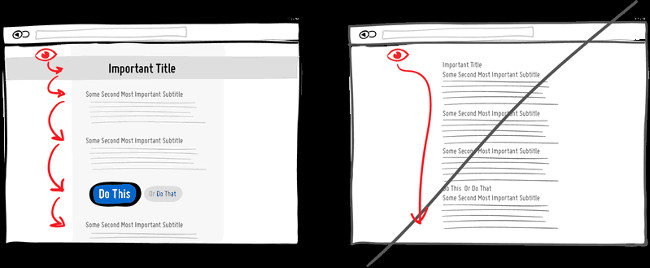
A clear hierarchy will make it easy for users to distinguish important information from less important information. A clear hierarchy is identified based on differences in alignment, line spacing, font size, size between other components (such as image size) and the distance between letters. When combining different methods (increasing the title font size and changing the font color), can create good effects for users, helping them focus on page content.
In addition, a clear hierarchy has both the ability to attract, and help reduce the speed of page reading from top to bottom of the user. The user experience on the site is like a long trip. You can take the highway and reach the destination faster (down the bottom of the page) or you can choose a scenic road, remember interesting things on that road, then stop to look.
32. Include related things in a group to avoid clutter
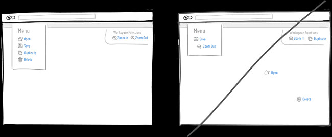
Adding things to each other in a group is the easiest way for users to use your site more easily. It is well known that objects such as knives and forks should be in the same group instead of separating them, or as a 'Save' button and an 'Open' button. Relevant things should be close to each other so that users can easily use them based on their experience. Remember, users never want to waste time searching for small details in your website. That means they will want to switch to another site immediately if they feel things are messing up.
33. Show errors to users instead of delaying them to the end
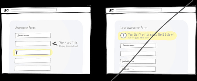
When a user has a problem filling out the form and error when filling in the information, it is better to try to point out the error as soon as possible. The popular interaction model mentioned above is Inline validation (as shown above). By giving an error message as soon as the error has just occurred (and mentioning the importance of that information) the user can fix the error immediately. On the other hand, if you do not give an error message and show up after pressing Submit, it will cause the user to perform some additional operations such as visualizing what they have done from previous steps.
34. Do not put serious data type problems
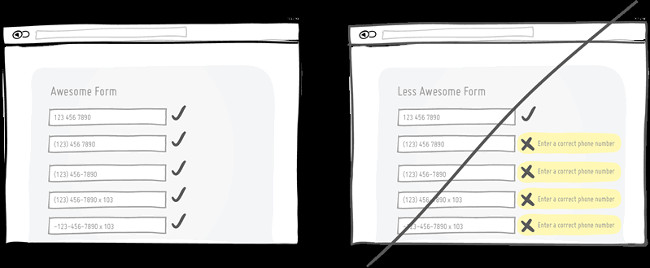
Don't be too strict with the data users enter, your system will grow to a more 'humane' level. This helps you anticipate and understand the level of data diversity, creating a user-friendly experience. For example, when you ask the user to enter a phone number (there are many ways to enter the phone number, as shown), let the programming system do some extra work and the user on the page will not have to do it. What more.
35. Try urging by limiting time
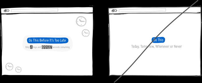
Creating an emergency is a method that can be used to get users to act immediately, instead of delaying it to 'the next day' or even never. Promoting by limiting time is an effective method because it creates scarcity (things available today, which may end tomorrow).
This method also touches the "lost" mentality of people - nobody likes to take a chance at all. Some people consider this method a 'bad play' to urge people to act. However, if all information is real and valuable, this is a method to use. Pay attention when using this method, because if the user suspects it will be counterproductive.
36. Creating scarcity
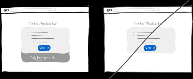
When your product is only in small quantities, we tend to appreciate more. Scarcity suggests that if there are many products yesterday, there are only a few products available today and there will be no product tomorrow.
Consider a wholesale store and a shop selling unique accessories, then compare the selling price of the product in 2 stores. Try thinking about wholesalers and paying attention to the 'scarcity' method they use (although there are many types of products). For large wholesalers or retailers, they only sell a certain number of products and do not produce more.
In the software world, we rarely recognize 'scarcity' because whether it is bits or bytes, it is easy to Copy - Paste. However, when applied to the website interface, the 'scarce' method can be used to show off the limit. Can be illustrated by example of the number of tickets for webinar (online seminars), the number of limited customers you can take care of in a month or the number of products you own before being offered more . Everything is displayed to provoke user actions. Always remember the law of supply and demand. "Less is more" is understood as something that is used in small quantities, which brings more benefits when used more.
37. Give suggestions instead of forcing users to remember
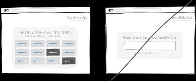
Making suggestions instead of forcing users to recall is the basic principle of arrangement, closely linked to human psychology. Showing that it is easy to identify something that exists instead of having to remember it, users will like to get more suggestions. Suggestions for consumers to identify the signals that touch the user's past. When you have to recall something, users are forced to 'dig up' everything in their heads. That is why the autobiographical question is often more time-consuming than multiple-choice questions on tests. Make suggestions for users, instead of expecting them to remember everything.
38. Zoom in on the 'Click' button
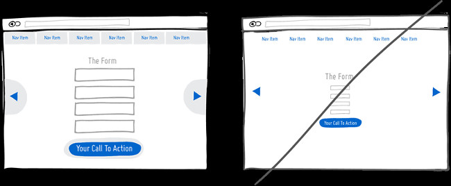
Users will easily click the link link, registration form or large-sized Call-to-action buttons. According to the Fitt rule, we need a lot of time to click on a specific item on the website if the detail is too small and away from the mouse cursor.
So increase the size of the registration form, the Call-to-Action button and the link link. Or you can leave the size of some elements intact and instead, increase the size of the places that can be clicked like text areas (blank boxes to enter text).
39. Speed up page loading for websites
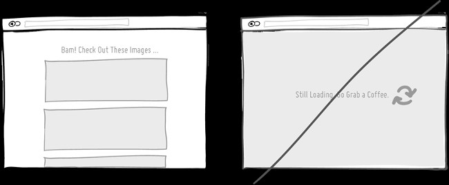
Page loading speed will affect users. Make your page load speed as fast as possible because the website's responsiveness to user actions is the key to deciding page loyalty. A study shows that the longer the page loading speed, the lower the drop-rate, interaction and conversion rate on the website.
The solution here is to reduce page load speed by optimizing code and images; or reduce awareness of page load times by applying psychological measures. There are two ways that users do not feel that they are waiting too long to display the loading progress bar (which makes users expect more) or create jobs for users during page load (obviously going The set on the conveyor belt will be better than standing still.
40. Design shortcuts
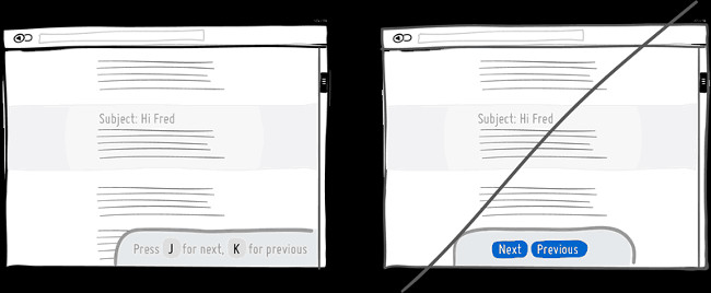
When the site has a large number of users, consider loyal users - people who often visit and spend a lot of time on your website / gadget. They will find ways to make repetitive actions faster and shortcuts can help them. When memorizing shortcuts, users can speed up the execution of the action unexpectedly. For example, Gmail, Google Reader, Twitter and Tumblr used the J and K keys to replace the Next / Previous button. Using the mouse to click is not bad, but if done with shortcuts, it will be more convenient for users.
41. Create an anchor instead of starting with a price
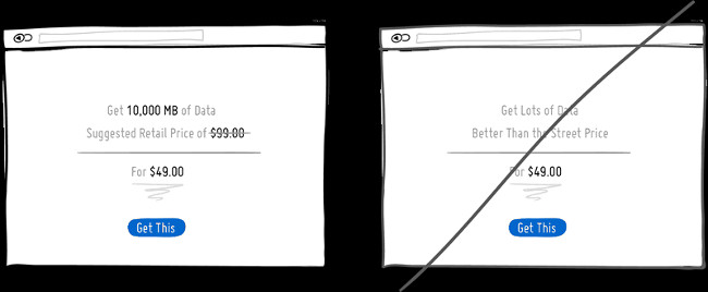
According to Kahnemen's observation, most people fall into the awareness trap and the 'anchor' is one of the hard-to-resist traps. Research has proven that our decision is affected by the first number encountered. If we start with a huge number and then replace it with another small number, users will feel that price is not expensive! What people overlook, is often the first number they see (and of course, that number is not the real price). For example, marketers who use the 'anchor' effect show the manufacturer's retail figures and then, offer a lower price (the price they sell).
42. Create motivation
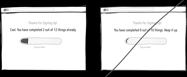
Nothing creates excitement to continue the process than pointing out that we are about to finish the job. Taking advantage of this psychology, some coffee shops often give customers loyalty cards. Or in the Internet environment, the reward for completing all registration steps is the tick mark in the to-do list.
Stephen Anderson labeled the model similar to the Completion Set in his glossary, when officially it could be called Goal Gradient Effect. Either way, make users feel that sooner or later, they will also complete the entire cycle.
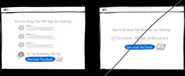
43. Use Progressive Disclosure instead of rampant information display
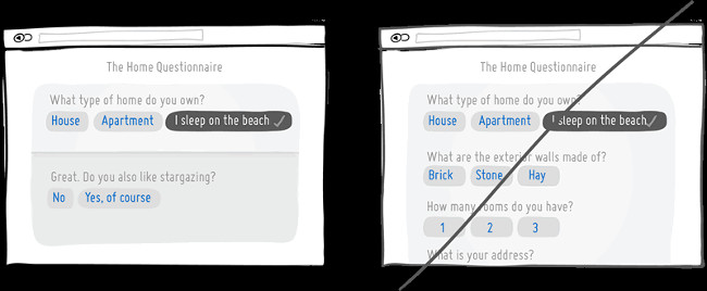
Progressive Disclosure helps users avoid access to unrelated information. The key to this method is to display information gradually and it is really effective, especially in the case of form filling. How to gradually display the information of the Progressive Disclosure usually comes with the Animation effect or continuation questions.
If there are too many questions to answer, users will have to put in a lot of effort (and they don't like that). Therefore, using the Progressive Disclosure method will help users not to fill out irrelevant questions and they only have to answer important information.
44. Step by step commitment
People often like small promises, instead of a big commitment! A big commitment can make users feel scared. According to research by Robert Cialdini, the commitment is an extremely effective persuasion strategy to exploit users' desires and create consistent images. Consistency is the key for users to climb up small steps and connect a sequence of actions instead of taking a long step.
An application of this strategy is often referred to as the Foot-in-the-door strategy (simply 'Long beams of rain'). For example, a price strategy is that we ask customers to pay monthly fees, rather than yearly. A similar method with the 'small commitment' method is not to make the Contract binding as soon as it starts, because that can cause customers to leave immediately without ever returning.
45. Gentle reminders instead of using the status window
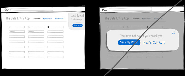
The status window or status dialog is the way to get attention or maybe not. Attracting people's attention can be a good option, but the status window brings some problems. First, the status window prevents users from using other functions or filling in more information at the back. It will be difficult to get out and give the machine to someone else to use.
The status dialog also prevents the computer from performing other operations (it should have been done) when the user is temporarily not using the computer. Finally, a status window can interrupt users when they are highly concentrated and unwilling to perform other actions. So why not consider it in a lighter way and still attract the attention of users.
46. Integrate many necessary functions
Simple design is often appreciated because in some ways, simple design means easy to use. Simplify the system interface for users to integrate multiple functions. If you have a tool, integrate two or more additional functions. For example, we can integrate filter functions in search engines and minimize unnecessary results; Or you can include ranking function with rating onhover function to filter other sections.
However, multifunctional integration is not all. Although it has been simplified, this tool makes us spend a lot of time learning and using it. These integrated functions will generate a number of risks (often difficult to detect). At that time, the website can only apply this function to familiar users who are more experienced than new users. Use this function intelligently, not abuse it!
47. Use symbols in a way that is easy to understand
The icon symbol can be meaningful and if it comes with an explanation word, the user will not feel vague. For example, the down arrow means moving everything down, reducing the priority or downloading? Icon 'X' means delete, disable or close? This multifaceted problem becomes more serious when users do not have much time to learn about the meaning of each icon. Therefore, to make the icon easier to understand, attach an explanation word on the side. If the phrase costs too much space, include all the phrases on a menu bar (better than attaching each phrase corresponding to each icon).
48. Use words naturally and non-rigidly
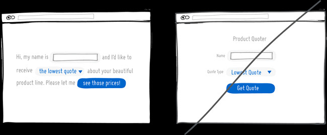
Natural language is less formal than short, rigid questions, but in return, they are highly interactive. This type of language is also capable of understanding people, automatically removing unnecessary elements and vice versa. There are two great benefits when using natural language. If you type in any phrase, the computer will be optimized to fully understand the meaning of this phrase. And then, the computer will respond to the user in a friendly way. Although we do not fully understand the meaning of the phrase that users type, in some cases we can still respond exactly to what the user wants.
With a user interface that uses messages like conversation, there are some results that prove that natural language will create a good effect.
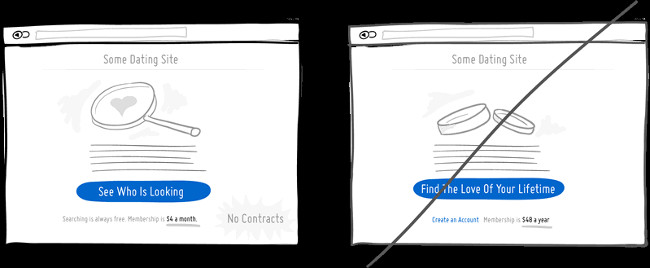
49. Create curiosity instead of being reserved
Inspiring curiosity is the method that makes users crave something by offering a decoy. Decoy can be a book chapter, trial version or some free content. Then lead the user to the next action "To see the rest"; "To use more features, please .".
Evoking curiosity from users, customers or potential customers with sample products will create motivation and curiosity for them. When applying this method, to be successful, you must not display all information or products right away in a few steps. Let users feel hungry and want to get more.
50. Guaranteed user rights
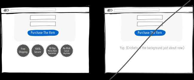
Before you finish, leave some assurance for your customers. Tell them they will be happy, the money will be safe, free ship goods and they can cancel the order without taking any risks. Everything will be fine. Don't worry too much, have fun. Finish in a positive way, making sure to increase your conversion rate to your customers.
Refer to some more articles:
- How to become a good UX Designer without a degree!
- "Explore" design details on the Google logo
- Synthesis of 12 professional and unique CV application forms for you
- 13 best free eBooks for Web Designer
Having fun!
Was this article helpful?
Your feedback helps us improve.
Related Articles
 75 great user interface design ideas you need to know - Part 120 minutes read
 75 great user interface design ideas you need to know - Part 317 minutes read
 Find inspiring user interface design with Collect UI3 minutes read
 Find inspiration to design user interface with UIDB3 minutes read
 What is UI UX? Differences between UI and UX design5 minutes read
 How to Become a UI Designer14 minutes read
Reader Comments 0
Sign in with email or Google to join the discussion.