75 great user interface design ideas you need to know - Part 1
Join TipsMake.com to consult the list of 75 great user interface design ideas you need to know (Part 1) to help optimize the user interface in the most effective way in this article!
Table of Contents
- If you are a Web Developer, don't miss out on these 67 useful tools, libraries and resources!
- Top 20 free Bootstrap template templates for Admin Dashboard
- How to become an Android application developer?
TipsMake.com - Great user interface (UI) is an interface with high conversion rate and easy to use. In other words, it appeals to both businesses and users.
When learning about user interface design (UI), many of us will ask ourselves what makes the user interface friendly and beautiful. Here is a list of the 75 great user interface design ideas you need to know (Part 1) that help optimize the user interface in the most effective way. Invite you to consult!
1. Try layout a column instead of multiple columns
The layout of a column makes it easier to control your story. It can direct readers to anticipate content from top to bottom. Meanwhile, the multi-column approach will lead to users losing focus on the core purpose of the page. Lead the reader with a story and a prominent call to action at the end.

2. Try giving a gift instead of closing the sale immediately
A friendly gesture like giving a customer a gift will bring sympathy to your website. However, deeper, gift giving is also an effective persuasion strategy based on reciprocity principles.

3. Try incorporating functions instead of fragmentation UI interface
During the process of implementation, it is easy to accidentally create many items, elements and features to perform the same functions. It is based on the 'Entropy' principle - everything starts to fade over time. Pay attention and include duplicate functions because it can put pressure on your customers. Normally, the more fragmented user interface (UI) is, the more problems customers will face. Review the UI UI arrangement by merging similar functions together.
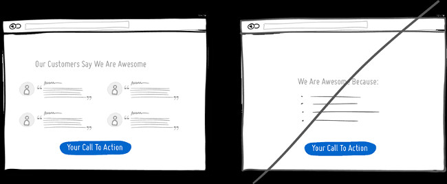
4. Instead of talking about yourself, let customers talk about you (Social Proof Marketing)
Social Proof is a marketing tactic that captures customers' psychology, because people tend to trust those who go first, specifically those who use certain products or services. and have reviews about them. Only with a few comment lines, likes and shares, brands can fully utilize the crowd psychology to attract a large number of visitors. Let customers see other users' feedback, reviews or display which demonstrates other users of your product.
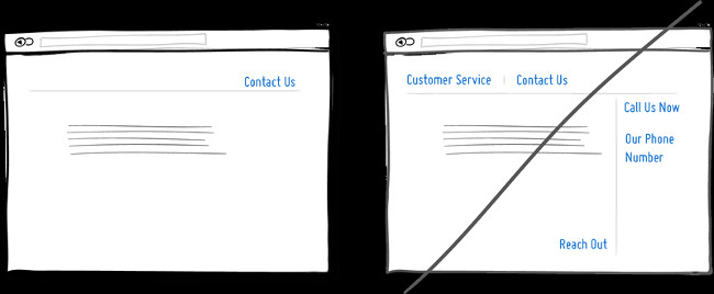
5. Try repeating the call to action instead of showing it once
Repeating the call to action that you want users to do is a commonly used strategy to make pages longer, or repeat on multiple pages. Surely you don't want your offer to show 10 times on a page and get your users bored?
However, the "one page" trend makes pages become longer becoming standard and the idea of squeezing everything "above the fold" fades away. Your website will have no effect if there is a small button on the top and another small button is highlighted at the bottom. When the reader scrolls to the bottom of the page, they stop and think about what to do next - a great position to make a purchase offer or accept a deal.

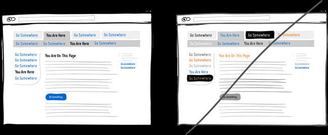
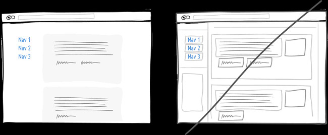
6. Try Distinct Clickable / Selected Styles instead of hiding them
Images, designs as well as color, depth and contrast are reliable tools to help people understand the basic symbol system in your interface like: " Where am I and do I have?" Where can I go? " . Let these things become clear to users, clickable things (links, buttons), selected elements (selected items) and plain text should be marked differently. consistent and consistent application throughout the interface.
In the visual example, I selected the blue color to show what was clicked and black for all that was selected. When applied correctly, people will easily learn and use these signs to navigate within the interface. Do not make it difficult for users by confusing them together.
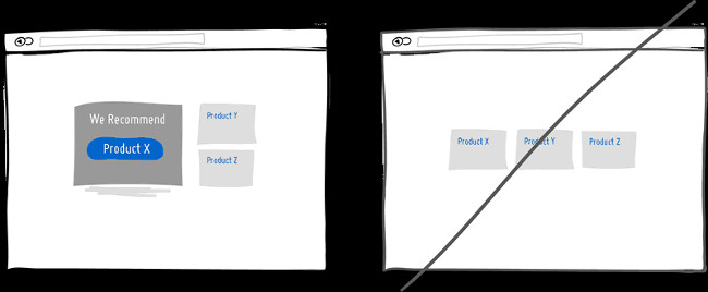
7. Try recommending products instead of the same display options
When displaying multiple products on sale, users will be confused when choosing one for themselves. At this point, suggesting the most appropriate product for the user will become very useful because some people need some thrust or they are bewildered between a dozen options presented before them. I believe that there are some psychological studies that show that the more options, the harder it is to make decisions and implement it . To limit that, try to highlight and emphasize certain options over other options.
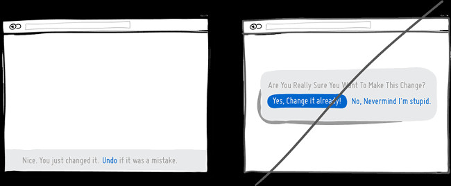
8. Let the Undo command instead of having to confirm
Imagine that you only need to press the action or link button.Undo commands respect the initial opinion of the user by allowing the options to go smoothly. Reminding will make it difficult for users to know what they are actually doing and ask questions for what they have done above. This means that they have a higher rate of canceling things they have just done giving a small line of notice as shown.
Many websites only give you 2 choices: Agree to change (Yes) and Don't agree to change (No) . A small mistake will cause you to go back from the first operation. Therefore, let your users more secure by allowing undo actions instead of just confirming Yes or No.
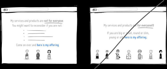
9. To be clear about the product, who is this service instead of targeting all people?
Are you targeting everyone or just targeting your target audience exactly? Aiming at the right target audience will make your customers less diluted, products or services that can reach the right people and become more exclusive. When approaching people incorrectly, those customers will feel that their products or services are not as expected and from there, they will easily lose faith in us. Therefore, this is a great conversion idea so you can tell exactly who your product or service is for. However, the risk of this strategy is to reduce customers and limit potential customers.
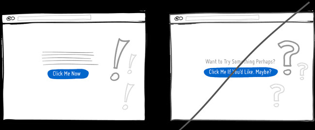
10. Be assertive instead of asking questions
Can you send your message to customers in a shaky voice, uncertain or want to send them a message with confidence? If you end your message with a question mark or use phrases like 'maybe', 'maybe', 'do you like it?', 'Would you like it?' then you probably have some opportunity to change your mind or at least rethink what you have done. Instead of giving customers the opportunity to hesitate to make decisions, be assertive and eliminate I believe that efficiency will increase many times.
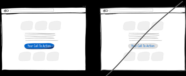
11. Try to stand out instead of being in tune
Know how to attract your users, become more noticeable and distinguishable from the surrounding elements and components. That will make your UI better. You can easily highlight your UI page in many ways. With tones, you can make many components appear darker or brighter. In terms of depth, you can turn a few components closer, while the rest will become a little further away ( ie using shadows and gradients ). Finally, you can add colors from the palette ( such as yellow and purple ) to enhance the contrast of the site.
In short, highlighting a button that performs certain actions compared to the rest of the site is a good thing to do to get a perfect user interface.
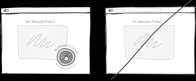
12. Leave personal markings instead of general
Introducing yourself or your product with a name, image or place of origin is one of the ways to make your brand more personal. The mention of countries, states and cities is a very normal thing. If you do so, the evaluation for you is friendly.
Sometimes, making a clear statement of product origin is also a way for users to feel they are being used, experiencing higher quality (perhaps) products. Mutually beneficial. For example, when you mention a product, people will think of you and only you will. This makes them feel that your product is slightly higher quality than the other parties.
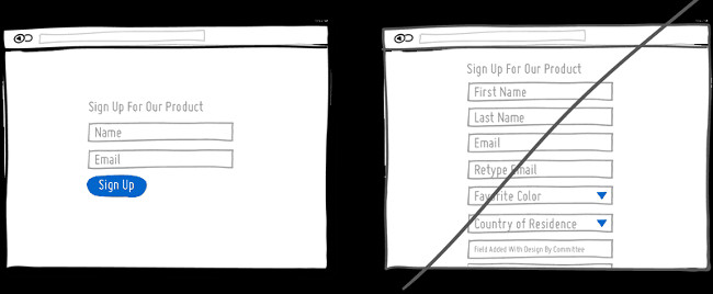
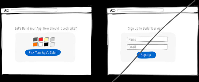
13. Use as few forms as possible
People tend to fight hard labor and here users also don't want to fill in long, hard forms. Just add an information that you ask them to enter, the rate they tend to " give up " is increasing. Not everyone has the same typing speed and not everyone is willing to do it. The question is whether the information you ask them to fill in the form is really necessary, remove it as much as possible?
Assuming there are questions that are not required to answer, consider moving it to independent pages after the user clicks the "Submit" button to submit the information. Although this makes your form a bit "messy", that change makes users feel better.
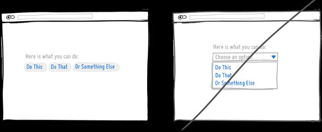
14. Show maximum user selections instead of hiding them
No one would want to click on the drop-down arrow and click again to select it again. Please simplify all user operations, do not force them to click or select too many times.
Assuming that information is concealed is information that users need, it is essential to leave it in a visible place. But don't turn away from the drop-down menu, use them for easier and easier options such as setting dates (geography) or geographic location (choosing a city .).
Occasionally, the drop-down menu can be used for interfaces where the frequency of continuous use or actions that the user has to repeat over and over again. Use the drop down menu intelligently for secondary items.
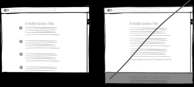
15. Create seamless content instead of breakage
Scrolling the page along the site is of course, but beware of making readers and users feel like content and information is about to run out even though it is still quite a bit below. For pages that need scrolling, the content layout is seamless and orderly so that the reader can unconsciously rely on and scroll down. Be careful with the spaces between sections that may occur due to site spacing on multiple devices.
Like this article, it will be much better if each content is marked with a clear number. Users are easy to follow and understand the focus, instead of 75 long, unordered content items.
16. Try to keep your focus on a content instead of engulfing them in the sea of links
It's easy to create a website with multiple links on the screen in the hope of meeting customers' needs as much as possible. However, if you are building a narrative page, telling stories towards a call to action below, think carefully. You must understand that any link that appears above the call to action can distract customers, distract you and forget the main purpose of the article below that you want them to do.
Pay attention to the number of links on the site and balance the style of site discovery (a bit heavy on the link ) and the style of the pipe ( with a few links and higher conversion rates ). Removing unrelated links is a sure way to increase your chances of getting more access to the most important call-to-action button.

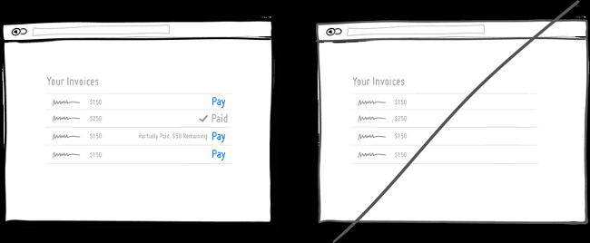
17. Display the status of the order
In any user interface we often see elements with different states. Unread emails, unpaid bills to user notifications in social networks, missed calls . are important information and users need to know them. Inform the user about the specific state in which the item is a good way to provide feedback. Status notifications make users realize what they have done, whether the actions and interactions they have done before have been successful, or whether they should take action.
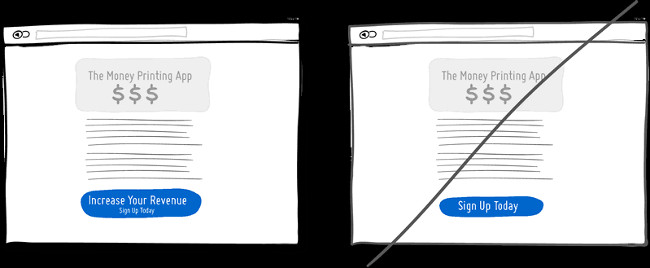
18. Create a "benefit" button in place of normal buttons
Imagine having two buttons displayed on the same site: a button with the content ' Save You Money - Sign Up ' (Register now) and a button asking ' Sign Up ' (Sign up) right). I bet the first button will have a higher chance of being used than the second button. For the same purpose, the first button will have a higher conversion rate because simply because the other registration button has no inherent value other than asking us to enter information. In addition, the first button will benefit the reminders of why 'Sign up now', so it will be easier to convince customers to act more.
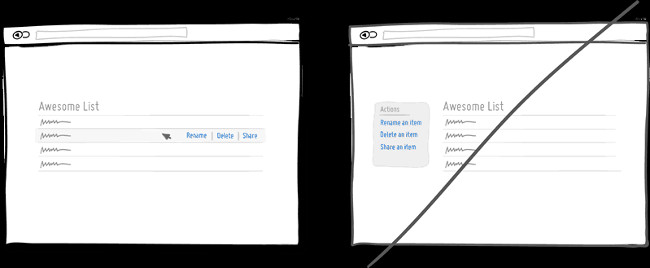
19. Try to manipulate directly instead of setting the menu bar
Let the action right above the content that the user needs to handle, all the user needs to do is drag the mouse on the content and click.
Sometimes, you can allow each component in the interface to become more direct, instead of using contextual menus to perform functions. When displaying multiple lists of information, you always want the user to interact with the items inside. Clicking on that item is a way to know what actions can be taken (add, edit, delete .). In addition, an example illustrating the usual direct operation is to click on an item, the item will turn into an array of editable data (such as a home address). Allowing these interactions to reduce the number of required steps, compared to the same task started without the context of the item - because the selection has been made.
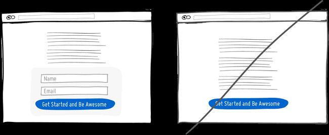
20. Try to expand the scope instead of creating more pages
When creating landing pages that convey values, it can be useful to display real form fields on the conversion page itself. Combining the registration form with the landing page comes with some benefits compared to creating separate multi-page subscriptions. First, cut down the tasks to be done and see which tasks need less time to implement. Then by displaying the number of form fields right there, giving the user the feeling that doing those operations takes no time. This will be easy if you add shorter forms.
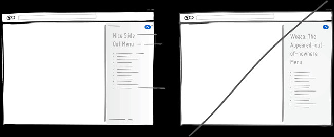
21. Try changing the display effect
The menu on the right from the display shows the user. It's different from the fact that once the page is loaded, the user won't notice it and will soon ignore it.
Interface elements often appear, hide, move, change and resize when users perform their work. A deliberate delay in animation or transition, respecting awareness and giving people the time needed to understand the change in size or position. Remember that when we start increasing the transition time by more than 0.5 seconds, some people will feel uncomfortable. For those who just want to get things done quickly, too long delays can be a problem.
22. Let users join themselves instead of asking them to register now
Instead of asking customers to register immediately, why not invite them to experience our own applications. In the first interactions, the benefits of the product can be displayed to everyone, which can also make the product different, personal. When users start to see the value of the product and see how it becomes their own, then they will be more open about sharing more information for you.
23. Remove contours to avoid attention to users
The contours often draw more attention than the main content. The focus of the user on the main content is really important that we can only grasp at a certain time.
Certainly the contour can be used to define a clear and precise space, but it also causes us to lose our cognitive energy. To determine the relationship between elements on the screen, group the elements together by distance, association, have different backgrounds or even just share a similar typographic style.
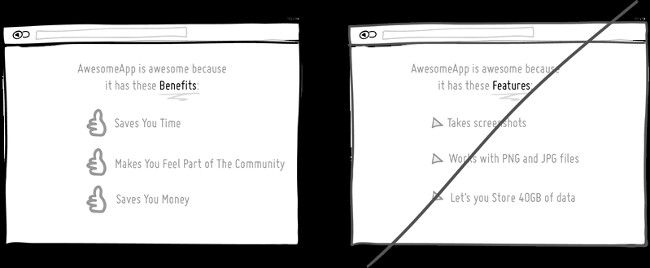
24. Convince customers with benefits instead of features
Maybe this is the marketing idea 101. People tend to be more interested in the benefits of services, products than its features. Because benefits give them more clear and specific values.Chris Guillebeau - author of "The $ 100 Startup" (roughly translated: "Starting with $ 100") wrote that people really care about how to get more money, more love and more free time. But while I hope to have less stress, quarrel and trouble to me, there are still many people who are more interested in the feature, but remember to be attached to the benefits whenever possible.
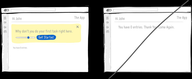
25. Design for blank data
There are situations where you will have 0, 1, 10, 100 or more than 10,000 data results displayed in different ways. We often forget to design for when there is nothing to display, so we are easily overlooked by users. The first time users look at your application and all the data is just a blank space without any instructions, which makes them not know what to do next. So invite them to do a task or direct them to another place on your website.
- 75 great user interface design ideas you need to know - Part 2
Refer to some more articles:
- Why Web Designer should learn Ruby on Rails?
- 9 things Java programmers should know in 2018 if they want a successful career
- How to become a good software developer?
Having fun!
Was this article helpful?
Your feedback helps us improve.
Related Articles
 75 great user interface design ideas you need to know - Part 222 minutes read
 75 great user interface design ideas you need to know - Part 317 minutes read
 Find inspiring user interface design with Collect UI3 minutes read
 Find inspiration to design user interface with UIDB3 minutes read
 What is UI UX? Differences between UI and UX design5 minutes read
 How to Become a UI Designer14 minutes read
Reader Comments 0
Sign in with email or Google to join the discussion.