75 great user interface design ideas you need to know - Part 3
Join TipsMake.com to consult the list of 75 great user interface design ideas you need to know - Part 3 helps to optimize the user interface in the most effective way!
- How to become a good UX Designer without a degree!
- Synthesis of 12 professional and unique CV application forms for you
- 13 best free eBooks for Web Designer
After learning the article 75 great user interface design ideas you need to know - Part 1 and Part 2, TipsMake.com continues to provide you with a list of 75 great user interface design ideas You need to know - Part 3 helps to optimize the user interface in the most effective way. Invite you to consult!
51. Create virtual effects when pricing

You can let customers evaluate the value of the product yourself or you will help them do it. If you intend to take advantage of the irrationality in user awareness, you can set a price for customers to feel they are being welcomed with 'bargain prices'.
The simplest way is to use phrases like 'Only', 'Affordable' or 'Attractive rates' in front of the price. You can then apply a method of dividing the product price into small items (for example, 30 ¢ per page instead of $ 30 per book or membership fee of $ 1 / day instead of $ 30 / month). Besides, you can also set the price with the last number of 9 instead of rounding. The price should be left with fewer digits (like $ 30 instead of $ 30.00) with the aim of adding 'virtual effects' to the price.
52. Say 'Thank you' instead of 'Confirm successful transaction'
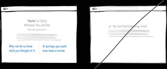
Saying thank you can make you, your business, your product or user experience become closer because users feel you are appreciative and interested in them. The thanks should be put in place after the customer completes a certain job and of course it will have a better effect than simply answering " You succeeded ".
Moreover, a system that says' Thank you 'will promote other users' activities. Naturally, the Thank screen is a perfect detail that encourages the user's next tasks. Thank you for reading this article. :)
53. Use a smart calculation tool
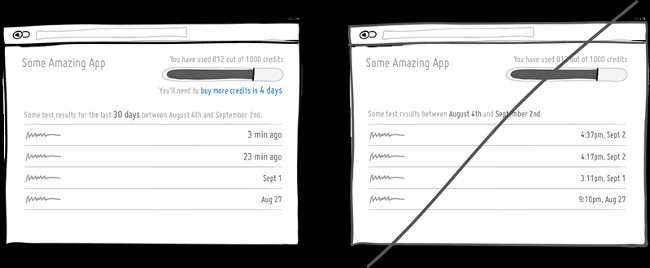
Smart user interface can perform simple to complex calculations and eliminate unnecessary steps for users. For example, some applications can filter out important information from a "messy" information basket. This function will be more useful if it can tell users how many days they have left before the application expires.
Or another simple and more common example, that's when we re-examine the old data. In this case, a line of words '3 minutes ago' will be more useful because users do not have to calculate a specific number like '4 37 minutes pm on September 2'.
54. Re-affirm freedom rather than just implying it
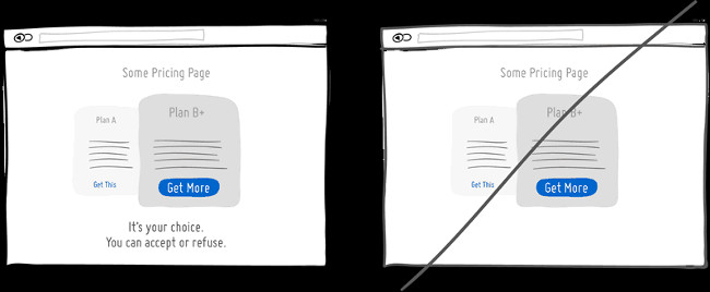
Users tend to perform more tasks if they are free to choose and make their decisions. Based on studies using the BYAF (But You Are Free) method, cases for customers to make their own decisions, efficiency is doubled! The purpose of this is to encourage users to take actions or decisions, with a few suggestions like 'It's your choice' or 'You can totally refuse' . This method will achieving the highest efficiency when making suggestions directly or promoting user actions.
55. Choose random gifts instead of easy-to-guess gifts
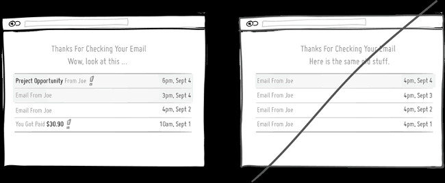
Random gifts are a great way to make users feel " addicted ". Like a mouse, when it is 'pulled to the right' without knowing the amount of food it will receive (sometimes without food), it will feel extremely excited. Similarly, people like random gifts, gifts that bring the highest response rate in the shortest time.
Another example is checking email mailboxes for example. How to check your email inbox makes users excited if they can't predict what gifts will appear in Gmail.
56. Try to attract attention
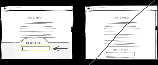
Your efforts to attract users' attention to important tasks are extremely valuable. You can do this in different ways like increasing the size or increasing the contrast of a certain element. Another way to attract attention is to use different shapes, focus areas, paragraph markers, interact with fixed banner, or navigation arrows. Certainly you cannot put all these things on the same page, but try to draw attention to 'key' actions.
57. Compare in an easy-to-understand way to avoid confusion
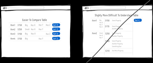
The user interface will sometimes display comparisons of updated content or new features of the product, which can easily affect use. There are a few simple comparisons that help motivate users to switch to using those updates.
First, when comparing, you should limit the comparison of two objects to avoid confusing the user. This tip will be more effective if the two objects are compared close together. In this way, it is clear that comparing this thing to the other. Second, give a clear indication as to whether the 'better' or 'latest' version stops users from speculating and judging. Third, clearly display the changed or unmodified features. In other words, pointing out what is better has been added, what is worse is removed and what is preserved.
58. Place products in sets instead of individual products
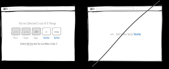
Users often like to collect many things. Whether real or virtual, seeing a complete suit will create a goal for users to try. Normally, when there is a complete set, users will be encouraged by adding value to that 'collection' (as a complete set of games will be more valuable than individual items). Offering a set of products also encourages customers to perform more actions. Remember the motivation for collecting a complete suit will be more effective if the number of suits is finite (because it creates scarcity).
59. Create expectations instead of showing ignorance
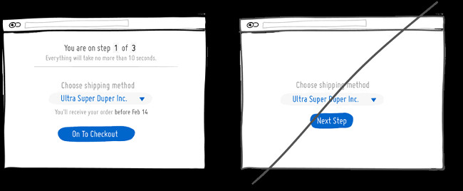
It would be great if everyone put their expectations on each other. It will not take much effort for a certain person or function to be able to announce the time to complete the next steps. You are in step 1 of the X process. Your choice will result in Y. You will get something before Z. All these little promises are not just informative, but also build trust for users. In contrast, a less friendly interface will make users feel "superficial" and less interested in users.
60. Funny instead of serious
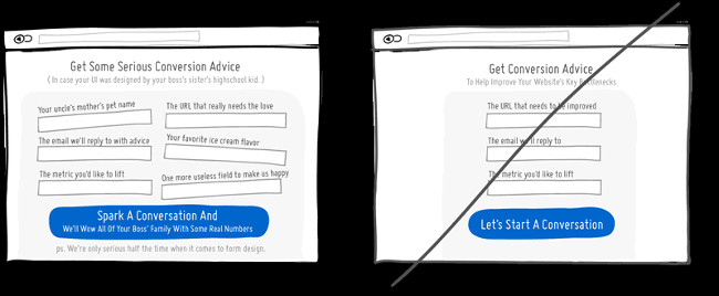
Why do you always make things so serious? In fact, you absolutely do not need to. You can make things more pleasant with just a joke or something. Adding funny elements when building your user interface can be effective or not. However, when effective, this factor can build a sustainable relationship between you and the customer / user. So, build funny content for future use. In tough times, users / customers - who have a close relationship with you, will be more altruistic towards the mistakes you make.
61. Give feedback instead of silence
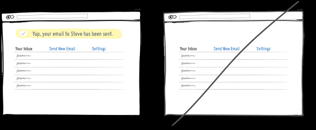
When performing an action or a task, the user always needs to find out if the action has been completed or not. User feedback is a useful way to meet user expectations. A sophisticated website will display a status window informing you that your email has been sent.
Besides, the silence makes users feel unsafe. Users will wonder 'Has it worked? Did I click? Or did not press the button? Should I do it again? ' Therefore, responding to customers will help them answer all of the above questions. Remember that feedback is an effective way to successfully interact with customers.
62. Try to judge customers' intentions
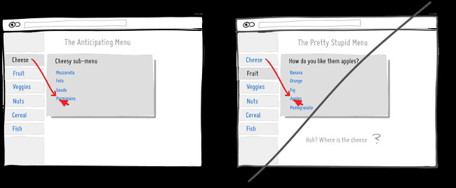
Owning a user interface that can predict what users want will make customers happy and want to pay more. For example, Amazon.com has adopted this interface at close interaction level, using the mega-drop-down menu bar (using jquery CSS). This menu needs to correctly guess a sub-menu and display options that are appropriate for the user. This will help users not to move the mouse diagonally to the desired submenu and only to find if the submenu bar has changed to another or has disappeared.
However, judging the intention of the user / customer, is just an action that promotes interaction more easily and simply. Techniques for judging other users' higher needs will require more gray matter.
63. Leave more space
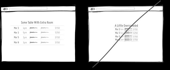
Spaces can make web content / data much easier to read. You should not leave the sections, items, words in a page sticking together, nor should they be placed too far away, but just enough space to facilitate reading. Without appropriate spaces, the components will become separate and non-harmonious as a whole. This strategy will be useful if the website contains information in the form of spreadsheets, paragraphs or lists.
64. Tell stories, instead of listing a list
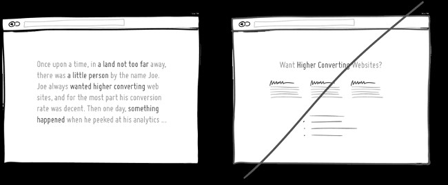
Storytelling is the most classic type of media that can be used on landing pages, applications, and user interfaces. Instead of listing a series of bulleted information, why don't you try to report a story? A simple story will have simple elements like storyline, character and a specific problem-solving situation. Those stories will bring feelings to users as if they have actually experienced that situation. And then those stories will be engraved in the user's mind. For example, sales letters often apply storytelling tactics and that is why they are always highly effective.
65. Always tell the truth
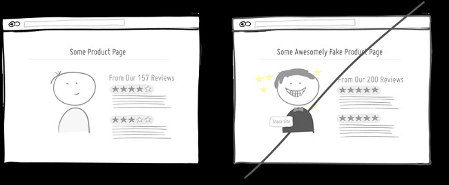
Most people try to speak a little too much. Therefore, telling the truth is the way to make your product / website more reliable. The image of "a smiling person" (not for a specific reason) can quickly undermine customer trust. A position can also make customers suspicious, which is where the product is evaluated. You should alternate between good reviews which are a few bad reviews, which will make customers less suspicious of 'What is so perfect?' Finally, a non-rounding figure will make customers feel more reliable.
66. Reduce progression (Progressive Reduction)
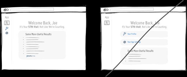
Progressive Reduction (Progressive Reduction) was developed by LayerVault. The idea is that when users get used to your interface or application, important functions (at the beginning) will become less important. For example, some simple functions such as editing Personal Profile, editing Apps Settings . will not appear in the Welcome screen of the website (giving way to other more important content). Or the website can automatically hide the meaning of the icons in the website (because users already understand what the icon means). Users always learn how to use the interface better and gradually reduce progress toward respect for that need.
67. Put user interests first
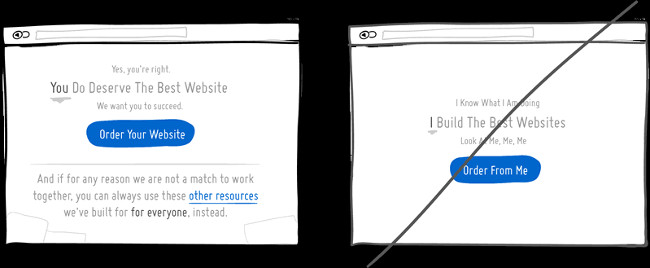
Nobody likes to hear stories about other people too much. Put customers' importance above your importance. Instead of saying 'I will create a great website for you', encourage customers with the phrase 'You will create a great website' to show respect to customers.
Let your customers or users be the center of attention. Moreover, it is clear that supporting their interests will add credibility to your product (this has been proven). Sometimes, observing and commenting on things from the perspective of others (although this is not immediately beneficial) can also benefit in the long run.
68. Please explain, instead of default, everything is clear
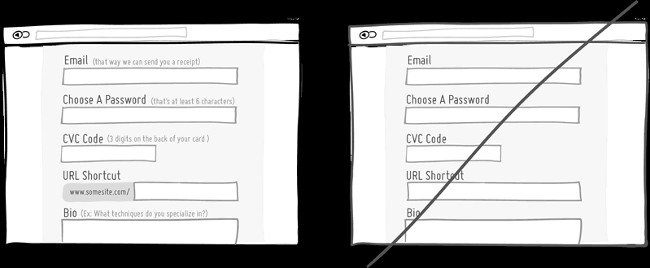
Some things may be obvious to us but not necessarily clear to others. Form of filling information is a typical example. When filling out the available form, attach some explanations, descriptions and signs. However, when using this method, do not include that explanation in Placeholder (where more information is provided to the user), because when you start filling in information, the user will quickly forget the information in that placeholder.
69. Eliminate unnecessary words
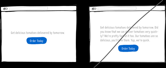
Write short sentences, using simple and understandable words. After writing the first draft, continue to condense the sentence. Displaying mainstream content helps users understand the message you want to convey and doesn't distract them.
70. Create a responsive interface
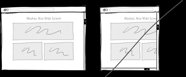
The worst thing on the site is that there are 2 scroll bars! Strictly speaking, this makes the user feel as tired as they are looking on the map, pull up and then pull down, left and right again. Information will not show up on one screen if it is a 'static' interface, especially when you view this interface on smaller devices (like phones). To overcome this problem, use a responsive interface that can dynamically change the shape and size flexibly.
71. Clear visual testing instead of ambiguity
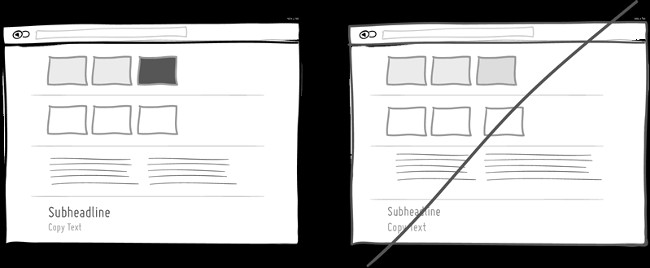
When users hover on an image, access a menu or switch to the 2nd and 3rd page in the content category. This is why it is better to group things (or keep them apart), use multiple font sizes (or make them look the same) and use multiple tones (or make them identical) . Help users feel more clearly about where they are and what they are doing so they really pay attention to what they are doing instead of leaving things without much difference and ambiguity.
72. Try turning on editing instead of fixed
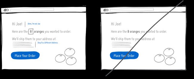
The inevitable is that your users, interfaces or businesses can make mistakes. Allowing adjustments in such situations will save time and effort when starting over. Perhaps the user has logged in to your account and wants to confirm it? Perhaps the user wants to change the quantity of goods or delivery address? The user interface allows users to make such subtle modifications - it is natural.
73. Try social commitments
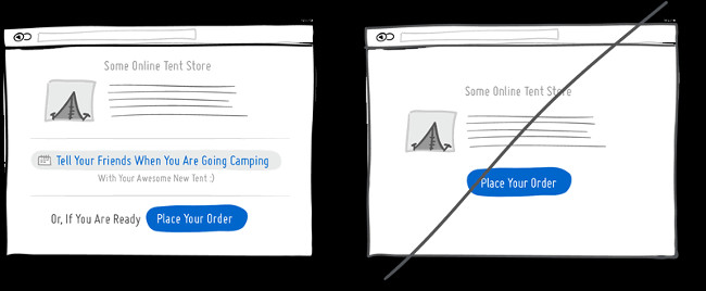
Social commitment can be a form of self-motivation. We tend to be suitable for a consistent image. In this regard, giving a public or social promise about something will help you be more responsible. This has even been shown to be effective in losing weight. Therefore, when we tell people that we will do something (or perform actions that are publicly visible) there will be a higher chance of performing consistent actions in the future.
74. Create Retry and Redo (Redo)
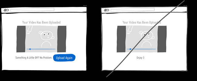
Sometimes things will not work as originally intended and users may want to try again. File upload failed or wanted to reprint a different version of the document without making any changes or modifications. The user interface can perform redo and review easily or difficult. When the outcome of an action is not satisfactory and there is no way to retry, it will certainly cause stress (and loss of conversions) afterwards.
75. Don't give too many choices
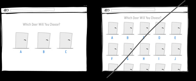
The number of options should be considered and limited (as mentioned in section 7), recently discovered a great way to write (by ConversionXL). Obviously the more choices are made, the more difficult it is to make decisions.
- Top 7 IT related jobs do not need to know the code
- How to become a good software developer?
- 7 signs that your design style is out of date
Having fun!
- Find inspiring user interface design with Collect UI
- Find inspiration to design user interface with UIDB
- What is UI UX? Differences between UI and UX design
- How to Become a UI Designer
- Microsoft has revealed the new Windows 10 interface, inviting you to view and comment
- 38 extremely creative design ideas for narrow-sized apartments (Part 1)


 How to change the display name of guest users in Microsoft Teams
  Turn your Android device into a webcam for Windows 10
  Android emulator online right in the browser
  Fivetown Explained: CS: GO's Newest Steam Scam
  Instructions for configuring DNS Service Discovery
  Issues related to the KB4579311 update