10 Lightroom mistakes that can ruin your photos
How are your Lightroom skills? Do you make your photos shine or spoil them with a variety of inappropriate techniques?
Browse through any online photo sharing site and you'll see the same mistakes over and over again: Poor exposure, too high saturation, etc.
All of them are easy to avoid, but only if you can recognize them in the first place. Let's take a look at the 10 worst Lightroom mistakes that you need to avoid.
This tutorial works for both Lightroom (formerly known as Lightroom CC) and Lightroom Classic. The article will highlight any differences between the apps so it doesn't matter which version you use.
1. The horizon is not straight
This is the first thing you fix in Lightroom. Straight lines look better and sometimes straightening them is just a matter of simple logic. As a general rule, you should always straighten the horizon in landscape shots - especially if your shot has a seascape.
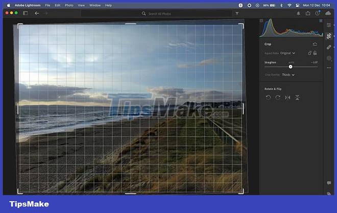
When there is no clear horizon line, such as in architectural shots or indoor portraits, look for things like frames, shelves, roofs, etc., and straighten them horizontally or vertically.
- In Lightroom Classic, select the Crop tool , then the Straighten Tool located along the Angle slider . Now draw a line on your image along the horizon. The image will rotate so that the horizon is now perfectly straight. Note that the corners of the image will be cropped when you do this.
- For Lightroom CC, just select Crop & Rotate and drag the Straighten slider . The Auto tool also works well here.
If you're intentionally trying to get slanted angles, a 1-degree offset may seem like a mistake, while 15 degrees will make the photo look more like a collage.
2. Ignore Histogram
You should always calibrate the monitor when processing images. If your monitor is set too bright or too dark, it can be difficult to judge the correct exposure. That's especially true if you're just looking at it with the naked eye, like many other users.
An easy way to avoid this problem is to use a Histogram. It will tell you if your photo is overexposed, underexposed, or whether highlights or shadows are cropped.
It can also warn you about a poorly calibrated monitor. If the histogram shows a balanced exposure, but your eyes think it should be darker, it could be a sign that your monitor's brightness level is set too high.
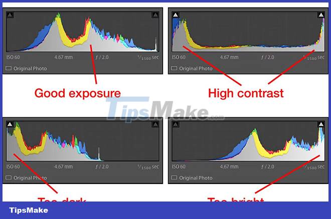
This is very important when you are going to print your photo. One of the most common complaints is that the printout is too dark and is almost always the result of setting the monitor too bright.
Ironically, it's easy to ignore the Histogram in Lightroom CC because it's hidden by default. Go to View > Edit Panels > Histogram to turn it on. The article recommends leaving this chart visible at all times.
3. Excessive Clarity Increases
The Clarity slider is everyone's essential tool for adding emphasis to an image. Clarity is a variation of the contrast tool that focuses on neutral tones. It helps bring out details and textures without affecting the highlights and shadows of the image. This effect is similar to sharpening, and over-sharpening is often confused with over-sharpening (we'll get to that later).
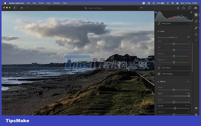
Clarity used to be an unpopular tool for creating edges and blurring effects around objects. It has improved a lot in recent versions of Lightroom, but the effects of increasing Clarity excessively are still very evident.
So while a little Clarity is almost always a good thing, avoid dragging it all the way to +100. Better yet, use the Masking option , select the Brush and adjust the Clarity level. You can now sharpen on specific parts of your photo. For instance, you can use it to make a model's eyes pop, while applying it to the skin will only increase wrinkles or other blemishes.
4. Excessive softening of skin
Moving the Clarity slider too far to the right is bad, but so is sliding it too far to the left. Clarity reduction is often used to smooth the skin, but if you overdo it, you'll end up making your subjects look like they've been carved from a block of wax.
The best way to do that in both versions of Lightroom is to select Masking , then click People and wait for the software to automatically detect faces in the photo (this happens quickly for portraits).
Now, click on a Person and select Face Skin from the list. Now, zoom in and start dragging the Clarity slider to the left until you see wrinkles and other blemishes start to fade, but not to the point of losing all texture.
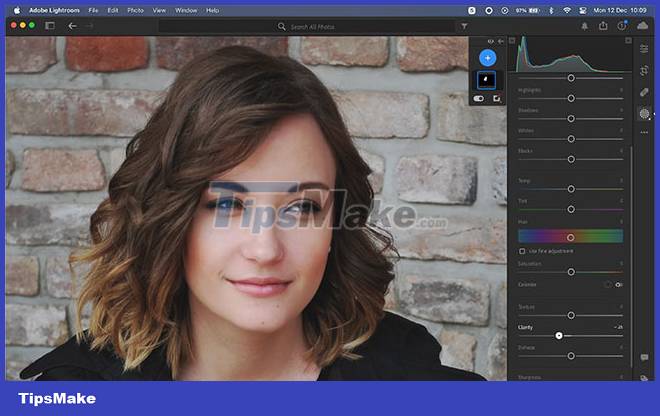
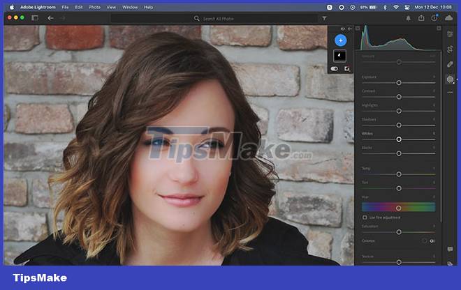
You can see the difference. The photo on the left has enough softness. The photo on the right is overly softened, the difference is obvious.
5. Adding too much color
Lightroom has two basic tools for working with color.
- Saturation adjusts every color in the image by the same amount. It should be used very sparingly.
- Vibrance adjusts colors based on each color already in the image, enhancing the vibrancy of the least saturated colors while leaving only the most saturated ones intact.
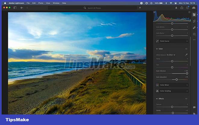
You will get better results using Vibrance instead of Saturation as it is more controlled. However, things can still go negative if over-edited.
A simple trick to avoid overusing this setting is to set the Vibrance slider to whatever level you think you're happy with, and then immediately drop it to 10 or 15 points. You will barely notice the difference and it certainly won't affect your photos.
6. Make a lousy HDR effect
HDR photography is more popular than ever, especially since smartphone cameras do it almost by default. High dynamic range increases the amount of detail in both dark and bright areas of the image. It's especially effective for high-contrast scenes where the camera often has trouble exposing it correctly.
But this can very easily turn into a disaster in Lightroom.
Drag the Highlights slider down, increase the shadows, increase the Clarity and Vibrance a bit, you can get the following result:
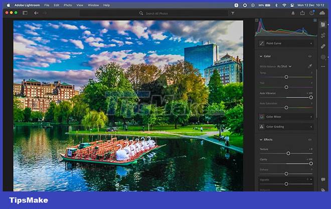
Don't do that! If you like HDR effects, take a moment to learn how to do it properly. The best method is to plan ahead and use exposure compensation to create HDR images in-camera. You can create some striking results while still maintaining a natural look.
7. Excessive sharpening
Every image from a digital camera needs to be sharpened. When you shoot in JPEG, the camera software automatically sharpens the image (although you may still need to add more in post-production). When shooting in RAW, you need to add a sharpening effect when processing the image.
However, over-sharpening is a bad thing. It creates rough, ugly outlines, adds halos around the edges of subjects, creates a texture-like effect in detailed areas like foliage, and can also exacerbate noise in images. high ISO image.

There are 3 things you can do to improve your sharpening:
- Zoom to 200% : The sharpening effect may not be immediately noticeable when the image is being zoomed out. So zoom in on the photo for a more accurate look.
- Use the Masking option : In Lightroom Classic, add some sharpness, then hold Alt or Option and drag the Masking slider to the right. The white bits will be sharpened, the black areas will not. This allows you to limit sharpness to only edges and textures while leaving smooth areas like the sky.
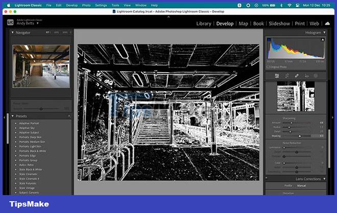
- Paint over areas you want to sharpen : In both versions of Lightroom, choose Masking > Brush . Set the Sharpening level , then start painting over the areas you want to sharpen. You can adjust the level to increase or decrease the effect.
Sharpening cannot fix blurry images. If your camera focuses wrongly or if there is motion blur due to slow shutter speed, sharpening won't help. In fact, it will probably make the photo worse.
8. Overuse effects
Lightroom has a lot of effects that can enhance and enhance photos, but if you use them too much and the result will look very amateur.
A good example is the Vignette tool. You can use it to subtly draw the viewer's eye to a specific part of your photo, but it can also make your photo look like it was taken with a very cheap lens, or even looks like stills from an old silent movie.
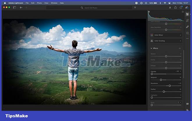
Unless you're intentionally aiming for a classic look, set the Feather slider to around 80 - 100 and keep the Vignette or Amount lower than you'd expect. The effect is a lot stronger than it initially looks - around -10 to -20 is usually enough.
A similar principle applies to Linear Gradient (or Graduated Filter - as it was called). It's great for darkening or adding drama to a bright sky, but it's also misleading. For a natural look, make sure you use a large, smoother range of colors instead of a short, abrupt gradient that will create a fake feel.
9. Increased noise caused by overprocessing
One of the most annoying side effects of many of the mistakes above is that they can seriously degrade your photos. Increasing exposure, over-saturation, or even over-cropping can all make noise stand out, even if it's not obvious in the image at first.
You'll find things can go downhill quickly when you're working with JPEGs or high ISO images (or worst, high ISO JPEGs).
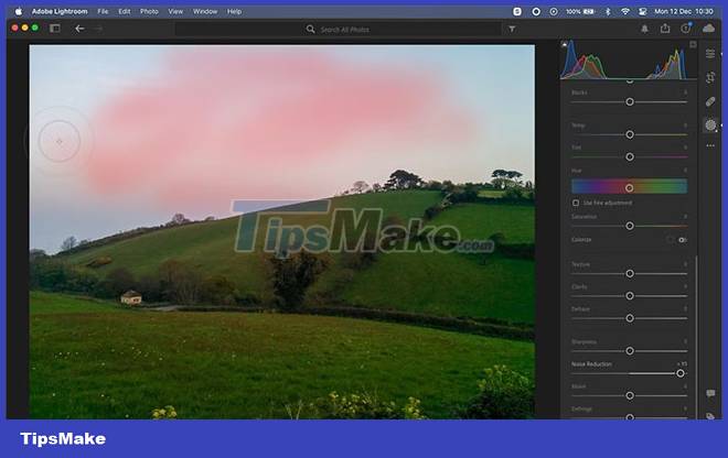
If you find yourself with a more noisy image than you want, you can try to tame it. Go to Masking > Brush and set the noise reduction level, then paint over the part of the image that you want to reduce the noise. You can then repeat this step, creating another mask but this time setting the noise reduction to a lower or higher number.
This allows you to apply different levels of noise reduction to different parts of the image. For example, a clear blue sky can greatly reduce noise, while areas with smaller textures need to be treated more lightly so as not to lose detail.
But the best solution is to avoid creating noise in the first place.
10. Wrong shape cut
The last mistake mainly applies to photos that you intend to print. It's tempting to freely crop photos to remove unwanted objects and improve the framing. But it can bring unexpected problems.
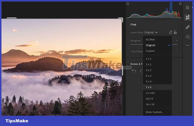
When using online photo printing services and buying ready-made frames, you are limited to some standard sizes and aspect ratios. Even printing and framing standard 16 x 9 images can be a challenge.
Lightroom's Crop tool has a range of presets that correspond to the most common print ratios, such as 1 x 1, 10 x 8 and 7 x 5. Use these if you plan to print.


 How to cut a circle image on Paint
  How to fix the error of saving JPEG images into JFIF on Chrome
  Instructions on how to crop a circle image online
  How to create a 3x4 photo in Paint
  How to batch format photos in Windows 10
  How to delete text in photos with Paint