The Google Play Store app store refreshes the entire interface
The new Google Play Store interface looks brighter and clearer with greener and more white headlines.
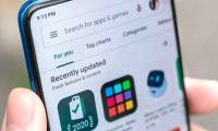
From yesterday night, Google began deploying a new interface to redo the new Material Design language for the Google Play Store app store.
Accordingly, the new Google Play Store interface looks brighter and clearer with greener and more white headlines. Redesigned application icons make the overall Play Store overall more consistent and consistent.

Similar to the App Store on iOS, on the Play Store interface new apps, games, books and other items such as movies, TV programs are divided into separate tabs displayed at the bottom of the screen.
The icons on Play Store are redesigned in the form of squares with rounded corners.
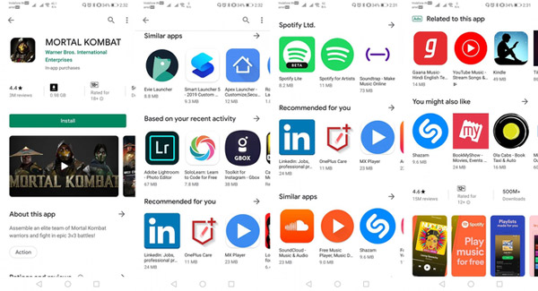
The new Play Store store will also recommend user-specific apps in the "Recommended for you" area, which is different from "Suggested for you", recommendations for paid-for-ads apps shown in area.
In Vietnam, the new interface has appeared since last night (August 21, 2019). If you open Play Store now, you will see a completely new interface.
The renewal of the entire Play Store application store interface is part of the overhaul of the interface in Google's new Material Design language. Earlier, the company also implemented a new interface on Gmail.
- Google Maps deploys Live View - an augmented reality (AR) walk through the phone's rear camera
- Google Translate supports Vietnamese translation directly via camera, available on both Android and iOS
- Google launched the website for Fuchsia, Android's successor operating system
Was this article helpful?
Your feedback helps us improve.
Related Articles
 Google refreshes the Play content repository interface in Android-style web2 minutes read
 What to do when Google Play Store is not working?9 minutes read
 Download Google Play 24.2.15-165 minutes read
 Google Play Store releases updated 'good' application suggestions for users1 minutes read
 How to download CH Play and install Google Play on the phone5 minutes read
 The best Google Play Store alternatives9 minutes read
Reader Comments 0
Sign in with email or Google to join the discussion.