Google refreshes the Play content repository interface in Android-style web
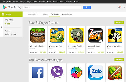
True to the promise of Google I / O, Google has officially updated its new interface for its Google Play content store today.
True to the promise of Google I / O, Google has officially updated its new interface for its Google Play content store today.
Play will now display the app catalog in each individual square, just like Google Play on Android. The app's information display page is also refreshed, in which the item describing the feature of the software is much larger than before, so it is easier to read.

Additional information such as the latest update date, file size, user install, version as well as support links are brought down but not in the right frame as before. Unfortunately, on the Home page, Google has dropped ( or has not yet added ) the display of outstanding apps as well as notable apps depending on the time, which is located at the top of the site.
In addition, Google has added a new navigation bar on the right side of the web page so you can move between the app store and the list of apps you have purchased, browse the game list and applications or Google voted. Google Play in Vietnam still only supports the app, can not buy music, movies, books and magazines like foreign countries. Now you can access the address https://play.google.com to experience the new interface.
Discover more
Google Play utility software google play storeShare by
Marvin FryYou should read it
- Google Play will probably become 'egg-laying chicken'
- Decode all errors that appear on Google Play and how to fix them (Part 1)
- How to download CH Play and install Google Play on the phone
- What is Google Play Points and how to use Google Play Points
- How to fix error 492 on Google Play
- The Quiet Details That Make a Sports Betting Platform Feel Reliable
- Instructions on creating toy set images with ChatGPT AI
- How are AI agents changing the journalism industry?
- CMC InfoSec provides malware removal tool for online DDoS attack
- Apple launches new professional music editing software
- The service takes super fast torrent files using FileStream