How to create Gmail logo with CSS3
Logo creation is very interesting. In today's article, TipsMake.com will show you how to create not just one, but two variations of the Gmail logo with only CSS3.
Table of Contents
Logo creation is very interesting. In today's article, TipsMake.com will show you how to create not just one, but two variations of the Gmail logo with only CSS3.
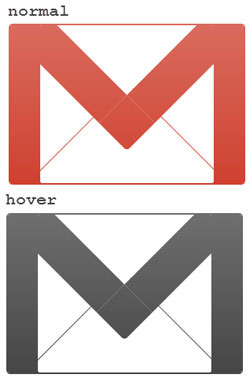
How to create the Gmail logo 1
This first logo is simple and quite easy to create. Start with starting your favorite code editor and enter the following HTML code, then save them as logo-gmail.html.
Gmail CSS Logo
Add the following CSS styles in between to reset to the default CSS values.
.gmail-logo, .gmail-logo *, .gmail-logo *:before, .gmail-logo *:after { margin:0; padding:0; background:transparent; border:0; outline:0; display:block; font:normal normal 0/0 serif; }
The following CSS codes will create a red Gmail logo with a red background and rounded edges.
.gmail-logo { margin:110px auto; background:rgb(201, 44, 25); width:600px; height:400px; border-top:4px solid rgb(201, 44, 25); border-bottom:4px solid rgb(201, 44, 25); border-radius:10px; -moz-border-radius:10px; -webkit-border-radius:10px; }
Then proceed to create a white box in a red background.
.gmail-logo .gmail-box { overflow:hidden; float:left; width:440px; height:400px; margin:0 0 0 80px; background:white; border-radius:5px; -moz-border-radius:5px; -webkit-border-radius:5px; }
To create the red "M" effect, first create a box with a red border.
.gmail-logo .gmail-box:before { position:relative; content:''; z-index:1; background:white; float:left; width:320px; height:320px; border:100px solid rgb(201, 44, 25); margin:-310px 0 0 -40px; border-radius:10px; -moz-border-radius:10px; -webkit-border-radius:10px; -moz-transform:rotate(45deg); -webkit-transform:rotate(45deg); -o-transform:rotate(45deg); }
Then, hide the extra edges to get a complete red "M".
.gmail-logo .gmail-box { overflow:hidden; }
Now add two thin red borders, so that the logo looks like an envelope.
.gmail-logo .gmail-box:after { content:''; float:left; width:360px; height:360px; border:2px solid rgb(201, 44, 25); margin:10px 0 0 40px; -o-transform:rotate(45deg); -webkit-transform:rotate(45deg); -moz-transform:rotate(45deg); }
All operations are almost completed. Just hold some more gradients for this red envelope image.
.gmail-logo:after { content:''; position:relative; z-index:2; content:''; float:left; margin-top:-404px; width:600px; height:408px; display:block; background: -moz-linear-gradient(top, rgba(255, 255, 255, 0.3) 0%, /* rgba(255, 255, 255, 0.3) 30%, */ rgba(255, 255, 255, 0.1) 100%); background:-o-linear-gradient(top, rgba(255, 255, 255, 0.3) 0%, /* rgba(255, 255, 255, 0.2) 30%, */ rgba(255, 255, 255, 0.1) 100%); background:-webkit-gradient( linear, left top, left bottom, color-stop(0%, rgba(255, 255, 255, 0.3)), /* color-stop(30%, rgba(255, 255, 255, 0.2)), */ color-stop(100%, rgba(255, 255, 255, 0.1))); }
Last but not least, give the logo a different color when hovering over. Add the following HTML DOCTYPE first .
And the following CSS styles first .
.gmail-logo:hover { background:#313131; border-color:#313131; /* cursor:pointer; */ } .gmail-logo:hover .gmail-box:before { border-color:#313131; } .gmail-logo:hover .gmail-box:after { border-color:#313131; border-bottom-color:#fff; border-right-color:#fff; }
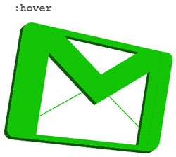
How to create the Gmail logo 2
Next, the article will create the Gmail logo from a different perspective with a small 3D effect. The example will start with basic HTML markup.
Gmail logo 2
Because the logo has a different perspective, we'll start by rotating it a bit and creating the necessary layers (called elements) in sequence.
#gmail-logo2 { margin:0 auto; display:block; width:380px; height:290px; -moz-transform:rotate(6deg); -webkit-transform:rotate(6deg); -o-transform:rotate(6deg); transform:rotate(6deg); } #gmail-logo2 .element1 { display:block; width:380px; height:290px; } #gmail-logo2 .element2, #gmail-logo2 .element3, #gmail-logo2 .element4, #gmail-logo2 .element5 { float:left; display:block; width:380px; height:290px; margin:-290px 0 0 0; }
Style the .element1::before
#gmail-logo2 .element1::before { content:''; position:relative; margin:2px 0 0 14px; float:left; display:block; background:rgb(201, 44, 25); width:30px; height:276px; -moz-transform:rotate(3deg); -webkit-transform:rotate(3deg); -o-transform:rotate(3deg); transform:rotate(3deg); border-radius:22px 0 0 20px; -moz-border-radius:22px 0 0 20px; -webkit-border-radius:22px 0 0 20px; box-shadow: -1px 1px 0 rgb(109, 10, 0), -2px 2px 0 rgb(109, 10, 0), -3px 3px 0 rgb(109, 10, 0), -4px 4px 0 rgb(109, 10, 0), -5px 5px 0 rgb(109, 10, 0), -6px 6px 0 rgb(109, 10, 0); -webkit-box-shadow: -1px 1px 0 rgb(109, 10, 0), -2px 2px 0 rgb(109, 10, 0), -3px 3px 0 rgb(109, 10, 0), -4px 4px 0 rgb(109, 10, 0), -5px 5px 0 rgb(109, 10, 0), -6px 6px 0 rgb(109, 10, 0); -moz-box-shadow: -1px 1px 0 rgb(109, 10, 0), -2px 2px 0 rgb(109, 10, 0), -3px 3px 0 rgb(109, 10, 0), -4px 4px 0 rgb(109, 10, 0), -5px 5px 0 rgb(109, 10, 0), -6px 6px 0 rgb(109, 10, 0); }
Style the .element1::after
#gmail-logo2 .element1::after { content:''; position:relative; margin:40px 5px 0 0; float:right; display:block; background:rgb(201, 44, 25); width:30px; height:238px; -moz-transform:rotate(3deg); -webkit-transform:rotate(3deg); -o-transform:rotate(3deg); transform:rotate(3deg); border-radius:0 18px 26px 0; -webkit-border-radius:0 18px 26px 0; -moz-border-radius:0 18px 26px 0; box-shadow: -1px 1px 0 rgb(109, 10, 0), -2px 2px 0 rgb(109, 10, 0), -3px 3px 0 rgb(109, 10, 0), -4px 4px 0 rgb(109, 10, 0), -5px 5px 0 rgb(109, 10, 0), -6px 6px 0 rgb(109, 10, 0), -6px 7px 0 rgb(109, 10, 0); -moz-box-shadow: -1px 1px 0 rgb(109, 10, 0), -2px 2px 0 rgb(109, 10, 0), -3px 3px 0 rgb(109, 10, 0), -4px 4px 0 rgb(109, 10, 0), -5px 5px 0 rgb(109, 10, 0), -6px 6px 0 rgb(109, 10, 0), -6px 7px 0 rgb(109, 10, 0); -webkit-box-shadow: -1px 1px 0 rgb(109, 10, 0), -2px 2px 0 rgb(109, 10, 0), -3px 3px 0 rgb(109, 10, 0), -4px 4px 0 rgb(109, 10, 0), -5px 5px 0 rgb(109, 10, 0), -6px 6px 0 rgb(109, 10, 0), -6px 7px 0 rgb(109, 10, 0); }
Style the .element2::before
#gmail-logo2 .element2::before { content:''; margin:22px 0 0 48px; float:left; display:block; background:rgb(201, 44, 25); width:315px; height:14px; -moz-transform:rotate(6.8deg); -webkit-transform:rotate(6.8deg); -o-transform:rotate(6.8deg); transform:rotate(6.8deg); box-shadow: 0 1px 0 rgb(109, 10, 0), 0 2px 0 rgb(109, 10, 0), 0 3px 0 rgb(109, 10, 0), 0 4px 0 rgb(109, 10, 0), 0 5px 0 rgb(109, 10, 0), -6px 6px 0 rgb(109, 10, 0); -webkit-box-shadow: 0 1px 0 rgb(109, 10, 0), 0 2px 0 rgb(109, 10, 0), 0 3px 0 rgb(109, 10, 0), 0 4px 0 rgb(109, 10, 0), 0 5px 0 rgb(109, 10, 0), -6px 6px 0 rgb(109, 10, 0); -moz-box-shadow: 0 1px 0 rgb(109, 10, 0), 0 2px 0 rgb(109, 10, 0), 0 3px 0 rgb(109, 10, 0), 0 4px 0 rgb(109, 10, 0), 0 5px 0 rgb(109, 10, 0), -6px 6px 0 rgb(109, 10, 0); }
Style the .element2::after
#gmail-logo2 .element2::after { content:''; position:relative; margin:230px 0 0 36px; float:left; display:block; background:rgb(201, 44, 25); width:310px; height:12px; box-shadow: 0 1px 0 rgb(109, 10, 0), 0 2px 0 rgb(109, 10, 0), 0 3px 0 rgb(109, 10, 0), 0 4px 0 rgb(109, 10, 0), 0 5px 0 rgb(109, 10, 0), -6px 6px 0 rgb(109, 10, 0); -webkit-box-shadow: 0 1px 0 rgb(109, 10, 0), 0 2px 0 rgb(109, 10, 0), 0 3px 0 rgb(109, 10, 0), 0 4px 0 rgb(109, 10, 0), 0 5px 0 rgb(109, 10, 0), -6px 6px 0 rgb(109, 10, 0); -moz-box-shadow: 0 1px 0 rgb(109, 10, 0), 0 2px 0 rgb(109, 10, 0), 0 3px 0 rgb(109, 10, 0), 0 4px 0 rgb(109, 10, 0), 0 5px 0 rgb(109, 10, 0), -6px 6px 0 rgb(109, 10, 0); }
Style the .element3::before
#gmail-logo2 .element3::before { content:''; position:relative; margin:8px 0 0 42px; float:left; display:block; background:rgb(201, 44, 25); width:42px; height:268px; -moz-transform:rotate(3deg); -webkit-transform:rotate(3deg); -o-transform:rotate(3deg); transform:rotate(3deg); }
Style the .element3::after
#gmail-logo2 .element3::after { content:''; position:relative; margin:40px 32px 0 0; float:right; display:block; background:rgb(201, 44, 25); width:22px; height:236px; -moz-transform:rotate(3.0deg); -webkit-transform:rotate(3.0deg); -o-transform:rotate(3.0deg); transform:rotate(3.0deg); box-shadow: 0 1px 0 rgb(109, 10, 0), 0 2px 0 rgb(109, 10, 0), 0 3px 0 rgb(109, 10, 0), 0 4px 0 rgb(109, 10, 0), 0 5px 0 rgb(109, 10, 0), -6px 6px 0 rgb(109, 10, 0); -webkit-box-shadow: 0 1px 0 rgb(109, 10, 0), 0 2px 0 rgb(109, 10, 0), 0 3px 0 rgb(109, 10, 0), 0 4px 0 rgb(109, 10, 0), 0 5px 0 rgb(109, 10, 0), -6px 6px 0 rgb(109, 10, 0); -moz-box-shadow: 0 1px 0 rgb(109, 10, 0), 0 2px 0 rgb(109, 10, 0), 0 3px 0 rgb(109, 10, 0), 0 4px 0 rgb(109, 10, 0), 0 5px 0 rgb(109, 10, 0), -6px 6px 0 rgb(109, 10, 0); }
Style the .element4::before
#gmail-logo2 .element4::before { content:''; position:relative; margin:-2px 0 0 130px; float:left; display:block; background:rgb(201, 44, 25); width:54px; height:192px; -moz-transform:rotate(-49deg); -webkit-transform:rotate(-49deg); -o-transform:rotate(-49deg); transform:rotate(-49deg); box-shadow: -1px 0 0 rgb(109, 10, 0), -2px 0 0 rgb(109, 10, 0), -3px 0 0 rgb(109, 10, 0), -4px 0 0 rgb(109, 10, 0), -5px 0 0 rgb(109, 10, 0), -6px 0 0 rgb(109, 10, 0), -7px 0 0 rgb(109, 10, 0), -8px 0 0 rgb(109, 10, 0); -moz-box-shadow: -1px 0 0 rgb(109, 10, 0), -2px 0 0 rgb(109, 10, 0), -3px 0 0 rgb(109, 10, 0), -4px 0 0 rgb(109, 10, 0), -5px 0 0 rgb(109, 10, 0), -6px 0 0 rgb(109, 10, 0), -7px 0 0 rgb(109, 10, 0), -8px 0 0 rgb(109, 10, 0); -webkit-box-shadow: -1px 0 0 rgb(109, 10, 0), -2px 0 0 rgb(109, 10, 0), -3px 0 0 rgb(109, 10, 0), -4px 0 0 rgb(109, 10, 0), -5px 0 0 rgb(109, 10, 0), -6px 0 0 rgb(109, 10, 0), -7px 0 0 rgb(109, 10, 0), -8px 0 0 rgb(109, 10, 0); }
Style the .element4::after
#gmail-logo2 .element4::after { content:''; position:relative; margin:12px 88px 0 0; float:right; display:block; background:rgb(201, 44, 25); width:54px; height:186px; border-radius:30px 0 0 0; -webkit-border-radius:30px 0 0 0; -moz-border-radius:30px 0 0 0; -moz-transform:rotate(53deg); -webkit-transform:rotate(53deg); -o-transform:rotate(53deg); transform:rotate(53deg); }
Style the .element5::before
#gmail-logo2 .element5::before { content:''; position:relative; margin:115px 0 0 125px; float:left; display:block; background:rgb(201, 44, 25); width:2px; height:150px; -moz-transform:rotate(55deg); -o-transform:rotate(55deg); -webkit-transform:rotate(55deg); transform:rotate(55deg); }
Style the .element5::after
#gmail-logo2 .element5::after { position:relative; content:''; margin:115px 0 0 150px; float:left; display:block; background:rgb(201, 44, 25); width:2px; height:150px; -moz-transform:rotate(-50deg); -webkit-transform:rotate(-50deg); -o-transform:rotate(-50deg); transform:rotate(-50deg); }
Adjust the priority of the z-index .
#gmail-logo2 .element1::before {z-index:3;} #gmail-logo2 .element1::after {z-index:1;} /*#gmail-logo2 .element2::before {}*/ #gmail-logo2 .element2::after {z-index:2;} #gmail-logo2 .element3::before {z-index:5;} #gmail-logo2 .element3::after {z-index:1;} #gmail-logo2 .element4::before {z-index:4;} #gmail-logo2 .element4::after {z-index:3;} /*#gmail-logo2 .element5::before {} #gmail-logo2 .element5::after {}*/
Everything is almost done. Your Gmail logo will look like this:
Finally, let the logo be a different color when hovering.
#gmail-logo2:hover *::after, #gmail-logo2:hover *::before { background:rgba(20, 196, 7, 1); } #gmail-logo2:hover .element1::before { box-shadow: -1px 1px 0 rgb(10, 90, 4), -2px 2px 0 rgb(10, 90, 4), -3px 3px 0 rgb(10, 90, 4), -4px 4px 0 rgb(10, 90, 4), -5px 5px 0 rgb(10, 90, 4), -6px 6px 0 rgb(10, 90, 4); -webkit-box-shadow: -1px 1px 0 rgb(10, 90, 4), -2px 2px 0 rgb(10, 90, 4), -3px 3px 0 rgb(10, 90, 4), -4px 4px 0 rgb(10, 90, 4), -5px 5px 0 rgb(10, 90, 4), -6px 6px 0 rgb(10, 90, 4); -moz-box-shadow: -1px 1px 0 rgb(10, 90, 4), -2px 2px 0 rgb(10, 90, 4), -3px 3px 0 rgb(10, 90, 4), -4px 4px 0 rgb(10, 90, 4), -5px 5px 0 rgb(10, 90, 4), -6px 6px 0 rgb(10, 90, 4); } #gmail-logo2:hover .element1::after { box-shadow: -1px 1px 0 rgb(10, 90, 4), -2px 2px 0 rgb(10, 90, 4), -3px 3px 0 rgb(10, 90, 4), -4px 4px 0 rgb(10, 90, 4), -5px 5px 0 rgb(10, 90, 4), -6px 6px 0 rgb(10, 90, 4), -6px 7px 0 rgb(10, 90, 4); -moz-box-shadow: -1px 1px 0 rgb(10, 90, 4), -2px 2px 0 rgb(10, 90, 4), -3px 3px 0 rgb(10, 90, 4), -4px 4px 0 rgb(10, 90, 4), -5px 5px 0 rgb(10, 90, 4), -6px 6px 0 rgb(10, 90, 4), -6px 7px 0 rgb(10, 90, 4); -webkit-box-shadow: -1px 1px 0 rgb(10, 90, 4), -2px 2px 0 rgb(10, 90, 4), -3px 3px 0 rgb(10, 90, 4), -4px 4px 0 rgb(10, 90, 4), -5px 5px 0 rgb(10, 90, 4), -6px 6px 0 rgb(10, 90, 4), -6px 7px 0 rgb(10, 90, 4); } #gmail-logo2:hover .element2::before { box-shadow: 0 1px 0 rgb(10, 90, 4), 0 2px 0 rgb(10, 90, 4), 0 3px 0 rgb(10, 90, 4), 0 4px 0 rgb(10, 90, 4), 0 5px 0 rgb(10, 90, 4), -6px 6px 0 rgb(10, 90, 4); -webkit-box-shadow: 0 1px 0 rgb(10, 90, 4), 0 2px 0 rgb(10, 90, 4), 0 3px 0 rgb(10, 90, 4), 0 4px 0 rgb(10, 90, 4), 0 5px 0 rgb(10, 90, 4), -6px 6px 0 rgb(10, 90, 4); -moz-box-shadow: 0 1px 0 rgb(10, 90, 4), 0 2px 0 rgb(10, 90, 4), 0 3px 0 rgb(10, 90, 4), 0 4px 0 rgb(10, 90, 4), 0 5px 0 rgb(10, 90, 4), -6px 6px 0 rgb(10, 90, 4); } #gmail-logo2:hover .element2::after { box-shadow: 0 1px 0 rgb(10, 90, 4), 0 2px 0 rgb(10, 90, 4), 0 3px 0 rgb(10, 90, 4), 0 4px 0 rgb(10, 90, 4), 0 5px 0 rgb(10, 90, 4), -6px 6px 0 rgb(10, 90, 4); -webkit-box-shadow: 0 1px 0 rgb(10, 90, 4), 0 2px 0 rgb(10, 90, 4), 0 3px 0 rgb(10, 90, 4), 0 4px 0 rgb(10, 90, 4), 0 5px 0 rgb(10, 90, 4), -6px 6px 0 rgb(10, 90, 4); -moz-box-shadow: 0 1px 0 rgb(10, 90, 4), 0 2px 0 rgb(10, 90, 4), 0 3px 0 rgb(10, 90, 4), 0 4px 0 rgb(10, 90, 4), 0 5px 0 rgb(10, 90, 4), -6px 6px 0 rgb(10, 90, 4); } #gmail-logo2:hover .element3::after { box-shadow: 0 1px 0 rgb(10, 90, 4), 0 2px 0 rgb(10, 90, 4), 0 3px 0 rgb(10, 90, 4), 0 4px 0 rgb(10, 90, 4), 0 5px 0 rgb(10, 90, 4), -6px 6px 0 rgb(10, 90, 4); -webkit-box-shadow: 0 1px 0 rgb(10, 90, 4), 0 2px 0 rgb(10, 90, 4), 0 3px 0 rgb(10, 90, 4), 0 4px 0 rgb(10, 90, 4), 0 5px 0 rgb(10, 90, 4), -6px 6px 0 rgb(10, 90, 4); -moz-box-shadow: 0 1px 0 rgb(10, 90, 4), 0 2px 0 rgb(10, 90, 4), 0 3px 0 rgb(10, 90, 4), 0 4px 0 rgb(10, 90, 4), 0 5px 0 rgb(10, 90, 4), -6px 6px 0 rgb(10, 90, 4); } #gmail-logo2:hover .element4::before { box-shadow: -1px 0 0 rgb(10, 90, 4), -2px 0 0 rgb(10, 90, 4), -3px 0 0 rgb(10, 90, 4), -4px 0 0 rgb(10, 90, 4), -5px 0 0 rgb(10, 90, 4), -6px 0 0 rgb(10, 90, 4), -7px 0 0 rgb(10, 90, 4), -8px 0 0 rgb(10, 90, 4); -moz-box-shadow: -1px 0 0 rgb(10, 90, 4), -2px 0 0 rgb(10, 90, 4), -3px 0 0 rgb(10, 90, 4), -4px 0 0 rgb(10, 90, 4), -5px 0 0 rgb(10, 90, 4), -6px 0 0 rgb(10, 90, 4), -7px 0 0 rgb(10, 90, 4), -8px 0 0 rgb(10, 90, 4); -webkit-box-shadow: -1px 0 0 rgb(10, 90, 4), -2px 0 0 rgb(10, 90, 4), -3px 0 0 rgb(10, 90, 4), -4px 0 0 rgb(10, 90, 4), -5px 0 0 rgb(10, 90, 4), -6px 0 0 rgb(10, 90, 4), -7px 0 0 rgb(10, 90, 4), -8px 0 0 rgb(10, 90, 4); }
Was this article helpful?
Your feedback helps us improve.
Related Articles
 How to create the RSS Feed logo with CSS34 minutes read
 Instructions for creating Gmail signatures with images3 minutes read
 What is CSS3? What's new and different from traditional CSS?5 minutes read
 Using AAA Logo professional logo design5 minutes read
 How to create a beautiful free name logo, very simple4 minutes read
 How to create a logo with Midjourney7 minutes read
Reader Comments 0
Sign in with email or Google to join the discussion.