Unit - Unit of measurement in CSS
CSS supports a lot of length measurement units, also called units, to apply to attributes that need it.
CSS supports us a lot of units of length measurement, also called Unit to apply to the properties that need it such as margin, padding, width, height .
Example units follow length properties, such as 10px, 2em .
However, there are a few things to note when using it:
- Units can have negative values.
- There is no space between the value and the unit of measurement.
Example: 20px, 30em >> right; 2 0 px >> wrong. - If the unit is zero, then there is no need to add the unit to the back.
In CSS there are two types of units that are Absolute and Relative.
Let's find out the meaning of each unit in TipsMake.com later in the article.
Absolute unit - Absolute
Absolute is a fixed-value unit that accurately represents the size it displays, independent of, and not changed by, any external impact. Only use this type of unit for high resolution devices, especially recommended for output as printers. On the computer screen and handheld device you probably won't get what you expect.
Some absolute units in CSS are as follows:
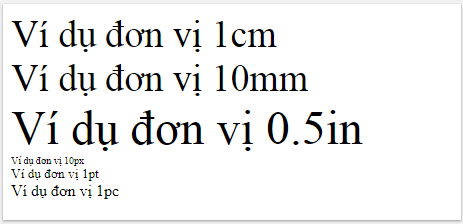
Unit Description cm centimeter millimeter in inch: 1in = 96px = 2.54cm px pixel: 1px corresponding to a pixel on the computer. 1px = 1/96 in pt point: 1pt = 1/72in pc pica: 1pc = 12 ptFor example:
Results displayed on the browser are absolutely accurate according to the actual size.

Relative measuring unit - Relative
Relative is a unit of measurement used in CSS at a relative level, often dependent on a certain component to determine its value.
Some relative units in CSS are as follows:
Unit Description 1em is equivalent to the size of the current font-size, similarly we have 2em = 2 times the font ex 1ex is equivalent to the height (height) 1 x (lowercase) of the current font ch 1ch equivalent to the width (width) of 0 according to the current size rem relative to the original component's font vw 1vw is equivalent to 1% of the browser window width and 1vh is equal to 1% of the height vmin 1vmin browser window is equivalent to 1% of the smallest browser window size vmax 1vmax is equivalent to 1% of the browser window size largest% relative to the original componentExample 1: px and me
These lines have a line-height: 2x16px = 32px.
These lines have a line-height: 2x16px = 32px.
These lines have a line-height: 2x16px = 32px.
span within the div element has a font size of 0.5em, equivalent to
0.5x30 = 15px.

Example 2: px and%
The font size of this document is 16px.
Unit% sets the font size relative to the current font.

Browser support
Unit reference is supported in each version of the browser as follows:
Unit


 em, ex,%, px, cm, mm, in, pt, pc 1.0 3.0 1.0 1.0 3.5 ch 27.0 9.0 1.0 7.0 20.0 rem 4.0 9.0 3.6 4.1 11.6 vh, vw 20.0 9.0 19.0 6.0 20.0 vmin 20.0 9.0 * 19.0 6.0 20.0 vmax 26.0 Does not support 19.0 7.0 20.0
* Internet Explorer 9 supports vmin with the name vm.
Previous lesson: Design Layout - Website layout in CSS
Next lesson: CSS Specificity


 Standard for selecting copper pipes before installing air conditioners and air conditioners
  What is the oil trap on air conditioner? Why use oil traps for air conditioning?
  Learn the structure and principles of operation of the refrigerator
  Quiz: 1 Ha (ha) in how many square meters, square kilometers?
  Install outdoor unit and indoor unit with one room what happens?
  Notes when installing air conditioners do not cost electricity