Slideshow design mistakes you need to avoid
If you've never made a slideshow before, you'll probably be confused as to where to start. Don't worry, you just need to avoid the basic slideshow design mistakes below..
Never use Comic Sans
If you are a designer or 'in the design community', you probably already know that Comic Sans typeface is a joke and often made into a meme. Those who do not know its origin often choose this default font.
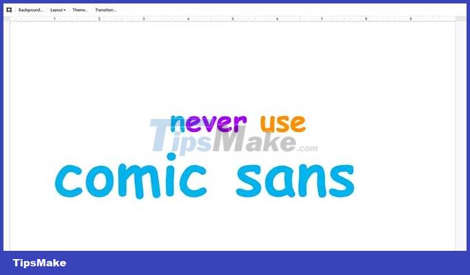
While there are many advantages to using sans-serif fonts for professional work, many people often only use Comic Sans in content intended for young children, such as educational charts.
Avoid cursive
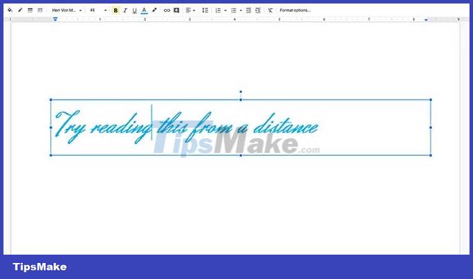
In addition to never using Comic Sans in your slideshow, you should also avoid using confusing typefaces. While cursive writing can make a slide design look better, it can make it difficult to read at a distance. This is especially true if the slideshow is dynamic or has a low color contrast between the typography and background elements.
Remember that when designing a slideshow, the main goal is to draw the audience into the content, not to strain their eyes to read the words that appear on the screen.
So what typeface can you use? If not Comic Sans or cursive? Try sticking with sans serif styles like Arial, Tahoma, Calibri. They are simple, easy to read, modern and professional.
Don't use font colors that are hard to read

After choosing the right font style, the next element to think about is the font color. You may find the default design, black text on a white background boring and tedious. Of course, you can add more color and energy to your slideshow.
However, do not use a font color that is too similar to the background color, such as orange text on a yellow background. Instead, choose contrasting colors to make the content stand out.
Never use unauthorized photos
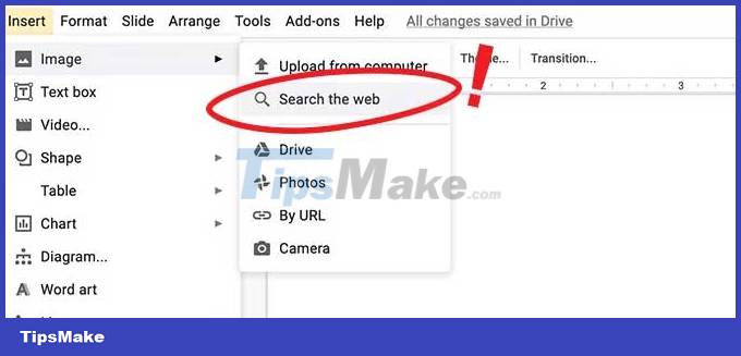
This is the principle you need to keep in mind. Absolutely do not use copyrighted images that you have not been licensed to use. If you're not a photographer or designer, you might want to get your first photos on Google.
If you do not have the right to use the photos, but you put them in the slideshow, you will definitely be in trouble. If you're using Google Slides, Google even warns you to abide by the license agreement when using the Search the web feature.
Never zoom in on a pixelated photo

Have you ever seen a presentation that contained blurry images? That's because it's exaggerated.
Although the slideshow can be enlarged on the screen through the projector, when importing a pixel image into the slideshow, it will stay at a specific size. If you drag a corner of the image so it fits onto the page, you'll notice that the image is out of detail or blurred. If the image is too small, consider using another image
Above are the slideshow design mistakes to avoid . Share other slideshow design mistakes you know with TipsMake.com.com readers!