Table of Contents
Bootstrap 5's grid is a mobile-first, Flexbox-based layout system built around containers, rows, and columns. Each row has 12 template column slots: col-6 spans half the row, col-4 spans one third, and col-12 spans the full width. Breakpoint prefixes such as sm, md, and lg let the layout change as the viewport grows.
The grid is useful for page sections, content columns, card collections, and forms. It is different from native CSS Grid even though both use the word “grid.” Bootstrap's default grid uses Flexbox and predefined classes. For a broader framework comparison, see these popular CSS frameworks.
How the Bootstrap grid is structured
A typical grid has three levels:
- A
containercenters and horizontally pads the page content. - A
rowgroups columns and manages their gutters. - One or more
colelements hold the actual content.
<div class="container">
  <div class="row">
    <div class="col">First column</div>
    <div class="col">Second column</div>
    <div class="col">Third column</div>
  </div>
</div>
The three unnumbered col elements share the available width equally at every viewport size.
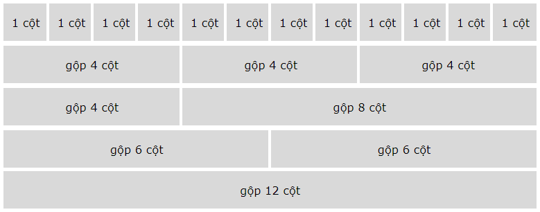
Container choices
containerhas a responsive maximum width at each breakpoint.container-fluidremains 100% wide at every viewport size.container-md,container-lg, and the other responsive variants remain fluid until the named breakpoint, then receive a maximum width.
Use a container when the layout needs Bootstrap's standard horizontal alignment. Avoid nesting containers merely to create columns; nested layout belongs inside a column as another row.
Bootstrap 5 grid breakpoints
Bootstrap's six default tiers use min-width media queries. A class begins at its named breakpoint and continues to apply at larger breakpoints unless another class overrides it. For example, col-md-6 is half width at 768px and above; below 768px it has no numbered grid width and normally stacks at full width.
| Tier | Viewport range | Column prefix | Container max width |
|---|---|---|---|
| Extra small (xs) | Below 576px | col- | None |
| Small (sm) | 576px and up | col-sm- | 540px |
| Medium (md) | 768px and up | col-md- | 720px |
| Large (lg) | 992px and up | col-lg- | 960px |
| Extra large (xl) | 1200px and up | col-xl- | 1140px |
| Extra extra large (xxl) | 1400px and up | col-xxl- | 1320px |
Breakpoints describe viewport widths, not device models. Design around where the content needs to reflow rather than assuming every phone, tablet, or laptop has a particular size.
Create equal-width columns
Use an unnumbered col when Bootstrap should distribute the row's width evenly. You can add two, three, four, or more columns; each receives an equal share.
<div class="container text-center">
  <div class="row">
    <div class="col">Column 1</div>
    <div class="col">Column 2</div>
    <div class="col">Column 3</div>
  </div>
</div>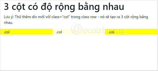
If one item needs a fixed span while its siblings share the remainder, combine numbered and unnumbered classes:
<div class="row">
  <div class="col">Flexible</div>
  <div class="col-6">Six of twelve slots</div>
  <div class="col">Flexible</div>
</div>
Stack columns, then make them horizontal
Breakpoint classes make a layout stack on narrow screens and become columns when space allows. Four col-sm-3 elements each span 3 of 12 slots from 576px upward. Below that breakpoint, they stack.
<div class="row">
  <div class="col-sm-3">Column 1</div>
  <div class="col-sm-3">Column 2</div>
  <div class="col-sm-3">Column 3</div>
  <div class="col-sm-3">Column 4</div>
</div>
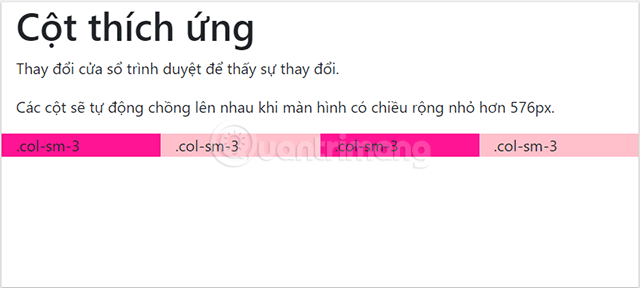
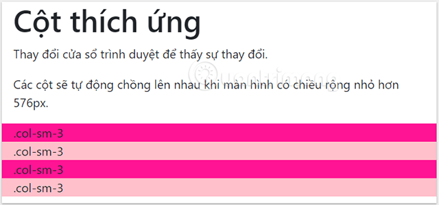
If the content is too cramped at the sm breakpoint, move the change to md or lg. The best breakpoint depends on the actual content, not on a predetermined device label.
Create columns with different widths
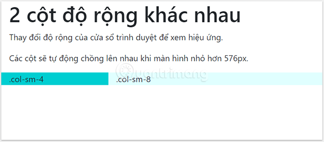
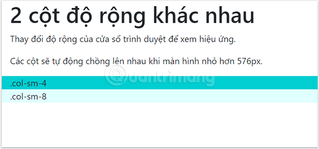
Numbered classes select how many of the 12 template slots a column spans. The following sidebar-and-content layout uses one third and two thirds of the row from the small breakpoint upward:
<div class="row">
  <aside class="col-sm-4">Sidebar</aside>
  <main class="col-sm-8">Main content</main>
</div>
A row is based on 12 template slots, but it can contain more than 12 slots' worth of column spans. The excess columns wrap to a new line. That behavior can be useful, but an accidental total greater than 12 is often a sign that the intended layout needs another row or different span values.
Combine classes at multiple breakpoints
A column can carry several classes so its width changes progressively. In this example, cards take half a row on extra-small screens, one third from the medium breakpoint, and one quarter from the extra-large breakpoint:
<div class="row">
  <div class="col-6 col-md-4 col-xl-3">Card 1</div>
  <div class="col-6 col-md-4 col-xl-3">Card 2</div>
  <div class="col-6 col-md-4 col-xl-3">Card 3</div>
  <div class="col-6 col-md-4 col-xl-3">Card 4</div>
</div>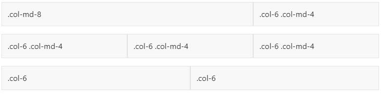
You do not have to repeat the same width at every larger tier. A col-md-4 stays at that width for lg, xl, and xxl until a later class overrides it.
Use row-cols for repeated items
When every child should follow the same column count, put a row-cols-* class on the row instead of repeating a numbered class on every item. This is convenient for card collections:
<div class="row row-cols-1 row-cols-sm-2 row-cols-lg-4 g-3">
  <div class="col">Card 1</div>
  <div class="col">Card 2</div>
  <div class="col">Card 3</div>
  <div class="col">Card 4</div>
</div>
This layout shows one item per row by default, two from the small breakpoint, and four from the large breakpoint. The g-3 utility adds both horizontal and vertical gutters.
Control gutters
Gutters are the space between columns. Bootstrap implements them with column padding and corresponding row margins. Use:
g-0throughg-5for horizontal and vertical gutters together.gx-*for horizontal gutters.gy-*for vertical gutters.- Responsive forms such as
g-md-4when the spacing should change at a breakpoint.
<div class="row gx-4 gy-3">
  <div class="col-md-6">First panel</div>
  <div class="col-md-6">Second panel</div>
</div>
Be cautious with g-0. Removing all gutters can make adjacent cards, form fields, or controls difficult to distinguish.
Nest a grid inside a column
To create a sub-layout, add a new row inside an existing column, then put the nested columns inside that row. The nested row has its own 12-slot grid relative to the width of its parent column.
<div class="row">
  <div class="col-sm-3">Navigation</div>
  <div class="col-sm-9">
    <div class="row">
      <div class="col-8 col-sm-6">Nested column 1</div>
      <div class="col-4 col-sm-6">Nested column 2</div>
    </div>
  </div>
</div>
Common grid mistakes
- Putting content directly in a row. Content should normally be inside a column because columns manage the gutters.
- Starting desktop-first. Write the base layout for narrow screens, then add breakpoint classes for larger widths.
- Assuming breakpoints equal devices. Test where the content actually stops fitting.
- Changing visual order carelessly. Order utilities can make the screen order differ from the DOM and keyboard sequence.
- Nesting rows without a parent column. A nested row belongs inside a column, not directly inside another row.
- Ignoring long content. URLs, tables, translations, and form labels can overflow a mathematically correct grid.
- Using the grid for every small alignment. Flex utilities or ordinary component CSS may be simpler for a single toolbar or button pair.
A practical responsive layout
The following example combines a responsive container, a stacked-to-horizontal content area, and a card grid. It shows the relationships between the classes without relying on custom image URLs or filler markup:
<div class="container py-4">
  <div class="row g-4">
    <aside class="col-lg-3">
      Navigation
    </aside>

    <main class="col-lg-9">
      <div class="row row-cols-1 row-cols-md-2 g-3">
        <div class="col">Article card 1</div>
        <div class="col">Article card 2</div>
        <div class="col">Article card 3</div>
        <div class="col">Article card 4</div>
      </div>
    </main>
  </div>
</div>
Resize the viewport and inspect the transitions rather than checking only the endpoints. One of these HTML editors for Windows can be used to test the examples locally. For all grid modifiers and Sass options, refer to the official Bootstrap grid documentation.
Related Articles
 Lesson 38: Grid Systems from Stacked to Horizontal in Bootstrap 54 minutes read
 Lesson 42: Large Grid in Bootstrap 54 minutes read
 Lesson 41: Grid Medium in Bootstrap 54 minutes read
 Lesson 40: Small Grid in Bootstrap 54 minutes read
 Lesson 39: Ultra-Small Grid Styles in Bootstrap 54 minutes read
 Lesson 30: Flexing in Bootstrap 59 minutes read
Reader Comments 0
Sign in with email or Google to join the discussion.