The latest features of GNOME 40
GNOME 40 includes bold design changes and a host of new features. In this article, TipsMake will join you in reviewing the best features among them.
Best features of GNOME 40
A new look
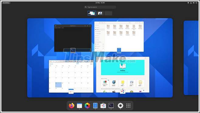
GNOME 40 looks a lot different, but the core workflow is mostly unchanged. Logging into GNOME 40 for the first time is a memorable experience because everything looks so different.
Instead of a blank screen that greets you, the GNOME 40 shows you the redesigned Activities dashboard by default. This allows you to increase your productivity and learn new layouts.
The workspace is horizontal and placed in the center of the overview screen. You can move between workspaces using new gestures or mouse gestures. The running windows show the application icon above it and, depending on the size, it is possible to 'overlap' the edges of each workspace.
The dash is present at the bottom of the screen. The dock now displays a separator between your favorite (i.e., pinned) apps and those that are running but not pinned.

App launcher (app launcher) now slides up from the bottom of the screen (shrinks the workspace down to a strip of thumbnails that support drag and drop). App launcher, still fully customizable via drag and drop, supports horizontal paging.
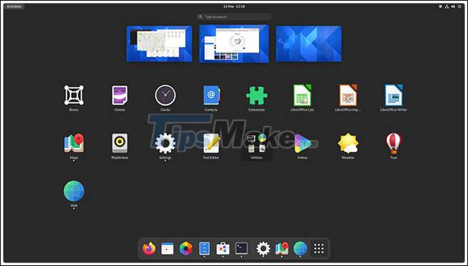
While these layout changes may look impressive, it should be emphasized that GNOME Shell's workflow remains largely unchanged: There's a hidden dashboard with configurable favorites bar and App launcher, plenty of workspace and search access are still possible with one key press.
If you are familiar with GNOME Shell 3.30 and above, you should have no problem grasping all that is new in GNOME Shell 40.
Visual change
You'll notice many rounded corners in GNOME 40, including on the workspace switcher, dash, and the 'active' status of items in the Top Bar. You'll also find new rounded bottom corners in many major GNOME apps, including System Monitor, Characters, and Nautilus. This enhancement gives a softer look and a more modern feel.
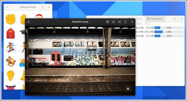
Other visual tweaks include a larger scrollbar in the GTK 3 and GTK 4 apps, the truncated app name in the extended app launcher on hover, the addition of app icons in the selector windows, remove the 'app menu arrow' from the top bar when navigating to apps.
Two apps, Software and Web, have new icons and Adwaita wallpapers (which aren't used by default on most distributions) have been updated.
New workspace gestures
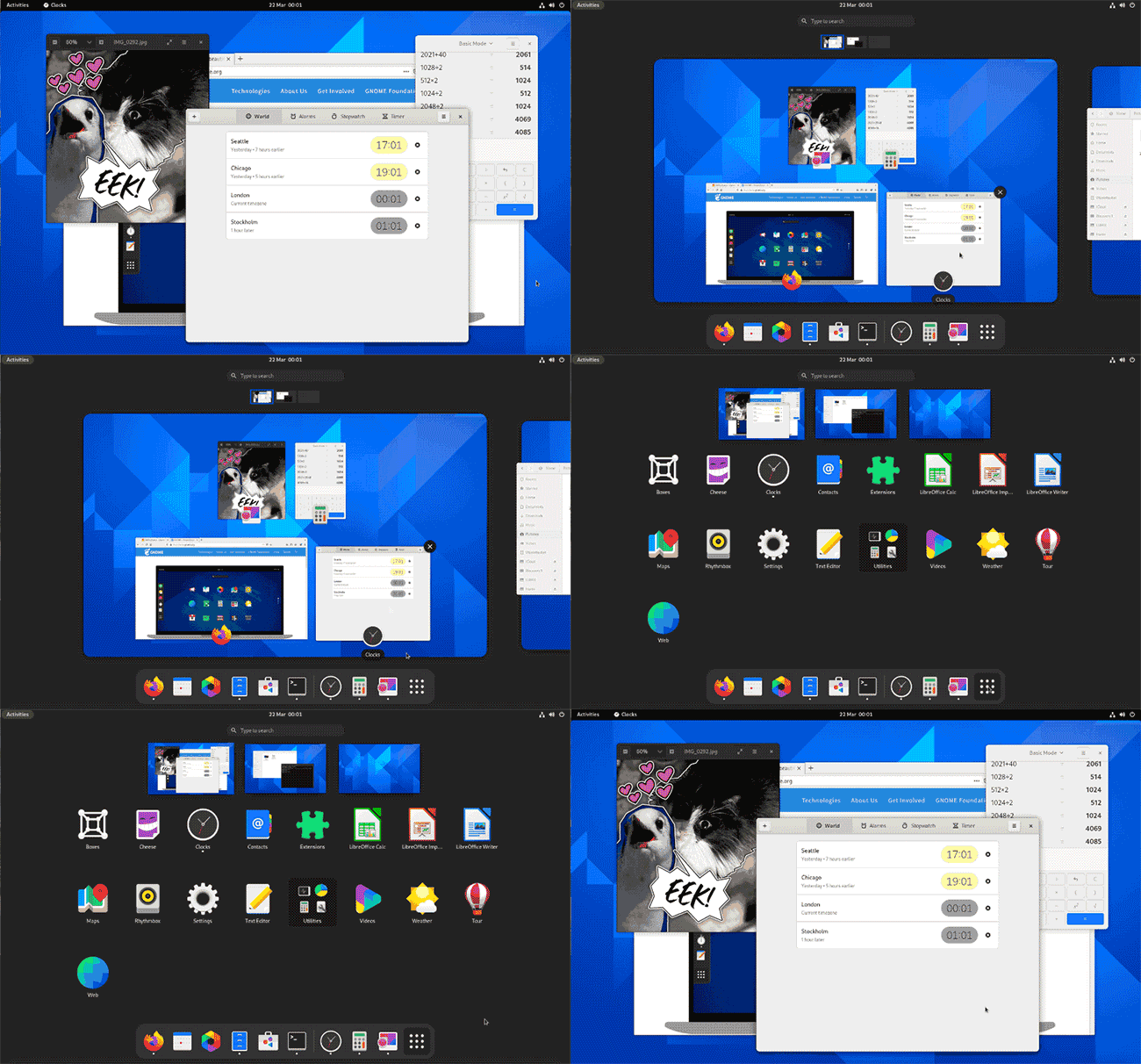
GNOME's decision to move from a vertical (fixed) workspace to a horizontal (dynamic) workspace is the most controversial change in this release.
Users with a vertical workspace may find this a bit annoying, but spatially speaking this has a positive effect: Moving the workspace to the left / right feels It's more intuitive to see in GNOME 40 than moving up / down.
New touchpad gestures for navigation workspace and dashboard in / out are enabled by default in GNOME 40.
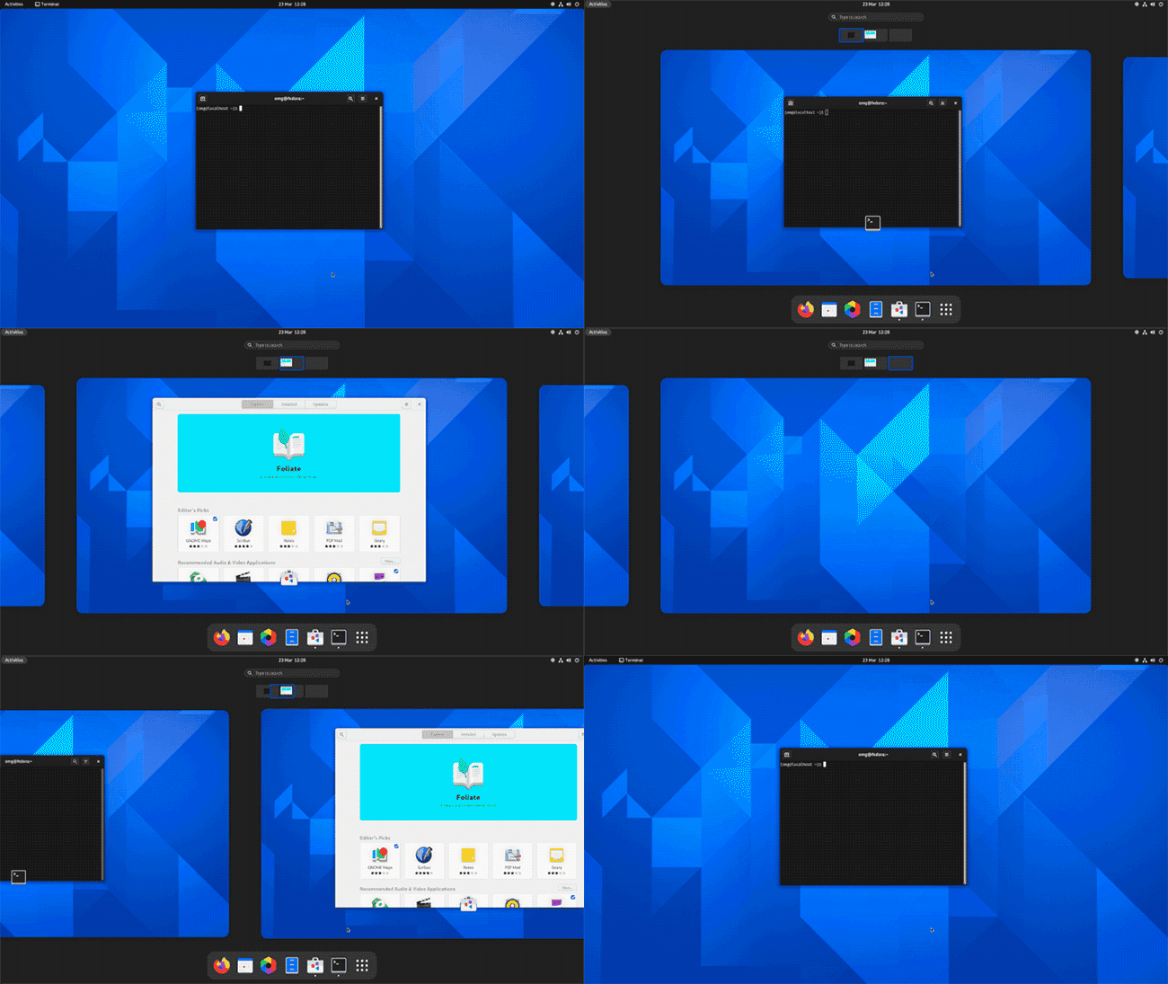
A three-finger swipe left or right moves between workspaces, while a three-finger swipe up goes to Overview, and if you keep pushing up, the app launcher will open. wide. Dragging three fingers in the opposite direction will take you back to the selected workspace.
For keyboard users, press Super + Alt + ↑ to go to the overview and again to open the app launcher. Press Super + Alt + ↓ or Esc to close the app launcher (if open) and again to exit the overview. You can use Super + Alt plus left / right arrows to move between workspaces.
Nautilus
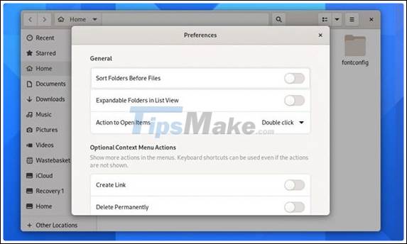
The Files app (aka Nautilus) has also been enhanced in GNOME 40, including the ability to sort files by creation date, more accurately transfer files and copy estimates, complete tabs in the location entry bar.
When trying to copy or move a file somewhere with an existing file of the same name, you now have the option to rename the file being moved and a built-in .zip extraction feature now supports files. Zip is protected by password.
The Nautilus 'overhaul' options make it easier to find specific settings. You will see a small preview when installing the right-click menu of the Nautilus wallpaper and now there is an option to right-click on the application binary and choose the Run as a Program option.
Weather
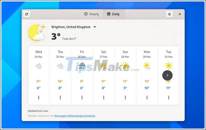
GNOME's Weather engine is one of the best weather apps for the Linux desktop - and now it's even better! The application has been completely revamped for the GNOME 40 with an outstanding new design that relays more clear forecasts than before.
Choose from two main views: Hourly forecast showing weather conditions, high / low, and temperature for the next 48 hours, and a forecast display for the next 9 days.
Maps
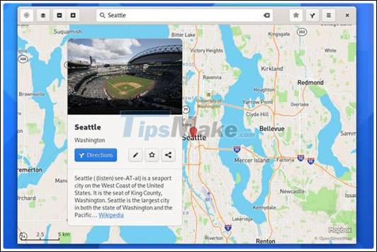
The Maps application in GNOME 40 creates a new platform by refreshing the 'location bubble' interface (displaying information relevant to a specific location or language using the information gathered from Wikipedia, OpenStreetMap and others, the improved location bubble also works well on mobile devices.
Web
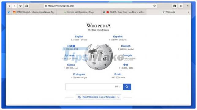
The Web (also known as Epiphany) is not the main web browser for many people, but with each release, the reality will change. Web 40 has a rebuilt tab bar (better suited to modern web activities).
Better than the previous version, it adds some neat new features like an unread indicator, appropriately pinned tabs, drag and drop, etc.
Finally, note for those fans of Google autosuggest, the Web can be configured to display search suggestions as type. However, this feature is not enabled by default.
Software
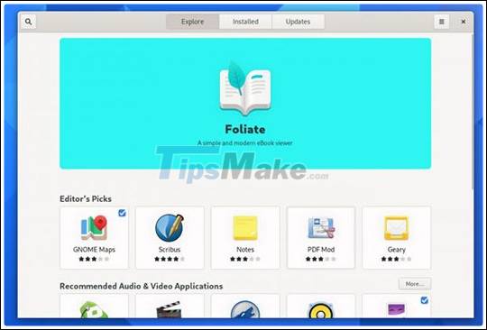
GNOME Software is not the most champion of the GNOME applications but it is an important one. For GNOME 40, the tool exposes new update logic (to reduce the number of less important reminders).
The new 'featured application' wheel does an excellent job of highlighting the software. The various slides are automatically moved, support touch gestures, and display both the app name and summary information about the app's functionality. The slides are also automatically created based on existing data.
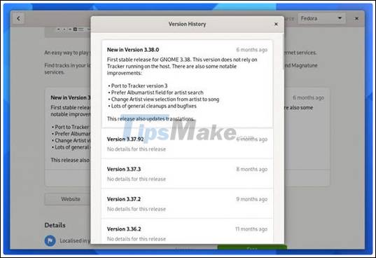
The addition of version history on app listing pages makes it easy to see what's changed in your favorite software, including software installed from Flathub.
Compose Key
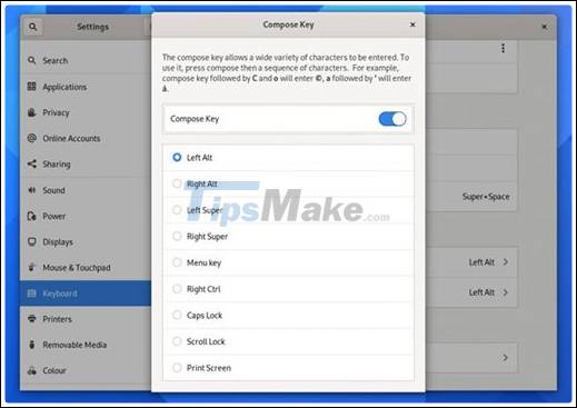
Not all of the changes found within GNOME 40 are as obvious as those presented above. A small change that can have a big impact on users who need to enter special characters (eg ™, °, etc.) or accented letters are the included configurable Compose Key.
Compose Key is not activated by default. You need to enable this via Settings> Keyboard and assign a key (on your keyboard) to act as the trigger. Then you just need to press the corresponding key and enter the compose key combination.
Edit settings
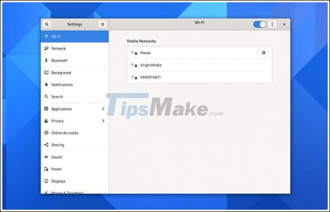
Every good desktop environment needs a concise but comprehensive Settings app to put everything together. GNOME 40 continues its efforts to clean and streamline the console, making it easier to find commonly accessed options.
The Wi-Fi section is easier to use because the network encryption icons show up next to the signal strength icon instead of auxiliary to it; and the network list puts known (that is, previously connected) networks at the top of the list for faster access.
Overhauling the shortcut settings will organize them into smaller groups, with the search field more clearly displayed (and therefore useful). The input source settings have also been moved from the Region & Language section to the Keyboard, where they make more sense.
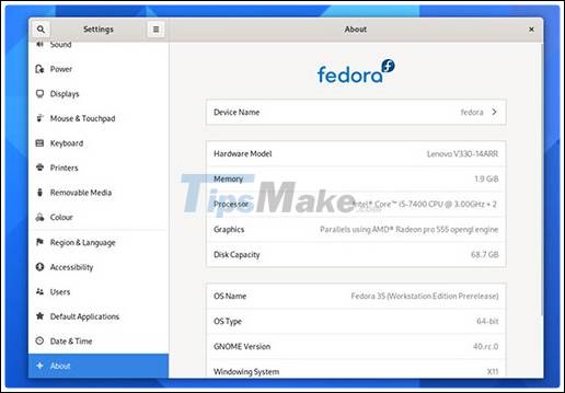
Finally, have you ever gone to Settings> About hoping to find out more information about your device? In GNOME 40, the About page now displays the vendor name and the hardware model name / number (if available).


 How to benchmark storage devices with Gnome Disk Utility
  How to take a screenshot on the Raspberry Pi
  How to install GNOME on Ubuntu 20.04 LTS Focal Fossa
  How to enable Dynamic Transparency on Ubuntu
  How to enable Dark Mode in Ubuntu 20.04 LTS
  Differences in the types of desktop environments on Linux