Table of Contents
Claude Interactive Visuals can turn an explanation into an inline chart, diagram, illustration, or small interactive model. Instead of only describing a system in paragraphs, Claude can show relationships and let you change inputs to observe what happens.
The feature is most useful when interaction adds understanding—for example, toggling logic-gate inputs, comparing options with the same criteria, or moving a control to see how a value changes. Availability and output types can differ by Claude plan, platform, model, and product rollout.

Interactive Visuals versus Artifacts
| Interactive Visuals | Artifacts |
|---|---|
| Usually appear as part of an explanatory response | Open as a distinct work product or workspace |
| Designed to clarify a point in the conversation | Designed for longer editing, reuse, preview, or sharing workflows |
| May include controls tied to the explanation | May contain documents, code, diagrams, webpages, or interactive apps |
| Best when a visual supports the surrounding answer | Best when the output itself is the main deliverable |
The boundary is not always rigid. Both experiences can use web technologies and both can be interactive. The practical distinction is how the result is presented and what you intend to do with it.
How to ask for an effective visual
A vague request such as “visualize this” leaves many design choices unresolved. Include:
- Learning goal: what should become easier to understand?
- Visual form: comparison table, flow diagram, timeline, simulation, chart, or labeled illustration.
- Controls: which inputs should the reader be able to change?
- Output behavior: what should update when an input changes?
- Audience: age, experience, and assumed knowledge.
- Constraints: units, valid ranges, data source, terminology, and accessibility needs.
Example: “Show how AND, OR, and XOR gates work. Give me two toggles for inputs A and B, update each output immediately, include a truth table, and explain the difference for a beginner.”
Example: explore digital logic gates
A static truth table tells you the expected outputs. An interactive visual can connect that table to switchable inputs so that a learner sees the circuit state change immediately.
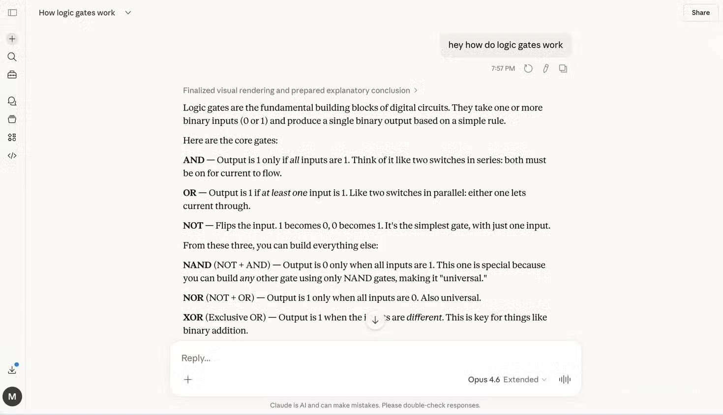
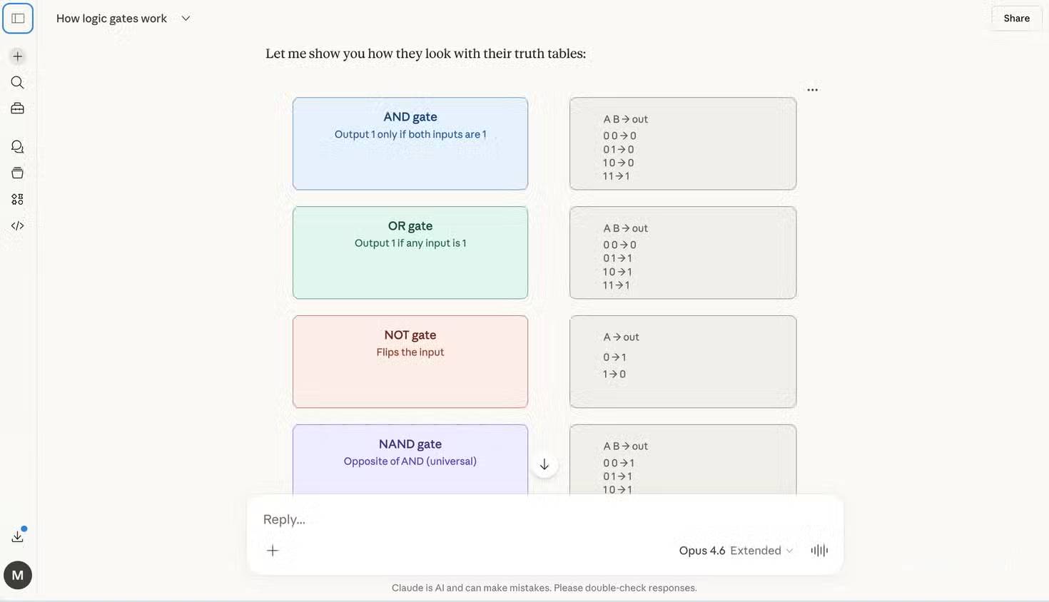
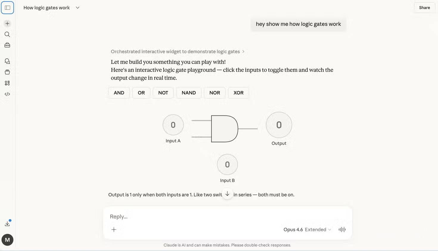
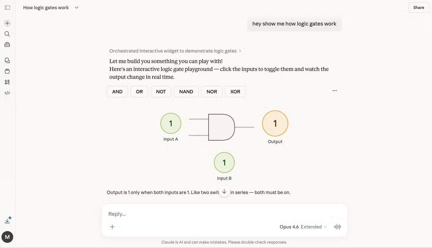
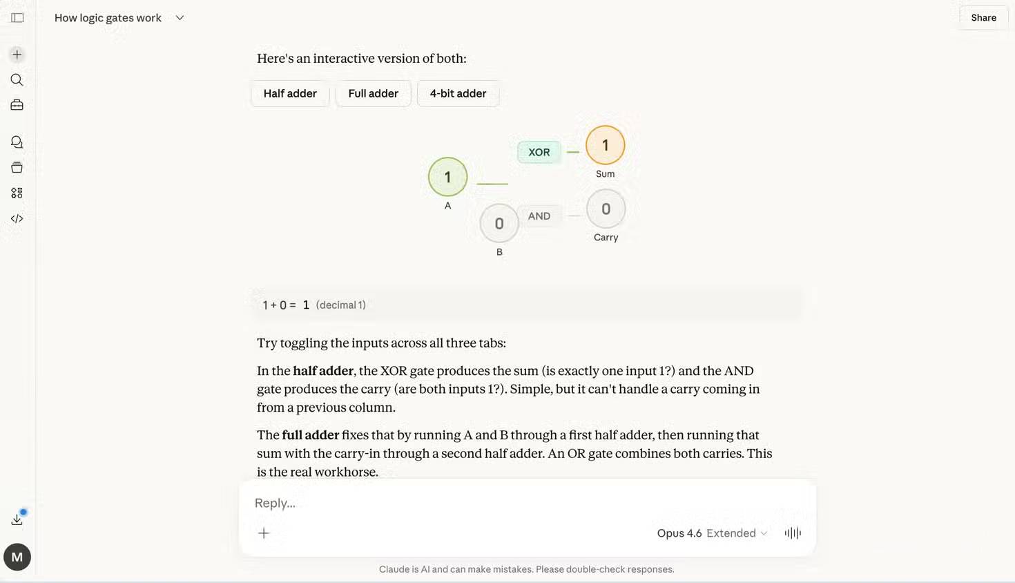
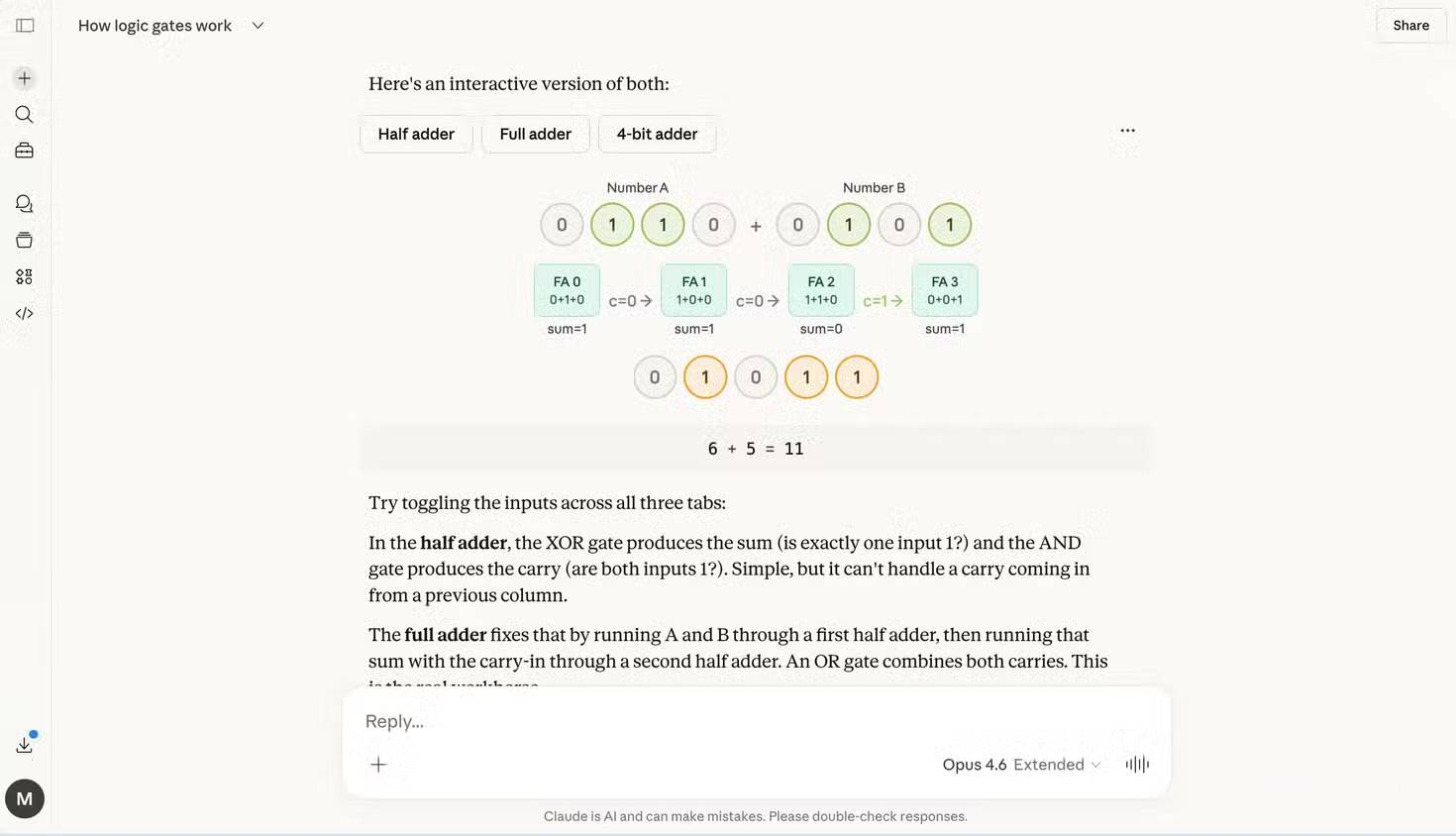
After Claude builds the visual, test all four combinations of two binary inputs: 00, 01, 10, and 11. Compare the outputs with an independently verified truth table. A polished interface can still contain incorrect logic.
Example: compare matcha types and preparation tools
Interactive comparison is also useful when a decision has several criteria. A prompt can ask Claude to organize matcha by intended use, flavor profile, preparation method, and required tools, then let the reader switch between setups.
Example prompt:
I want to make matcha at home and prefer a strong matcha flavor in a vanilla latte. Compare common matcha categories by intended use without inventing universal quality grades. Show preparation options and tools, explain cleanup and difficulty, then let me switch between setups. Clearly label any price or ratio as an estimate that needs verification.
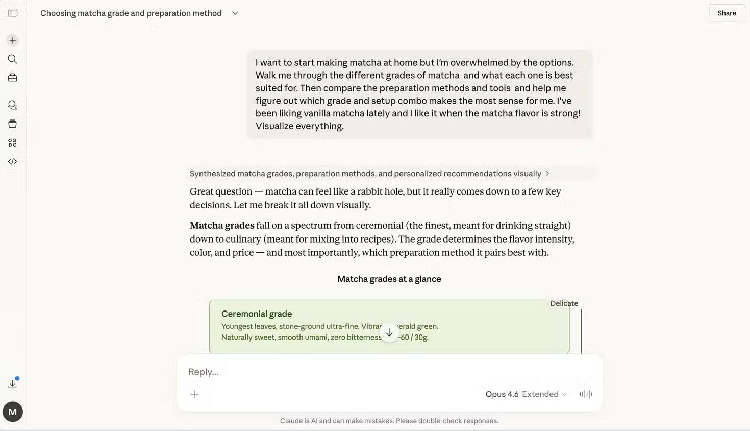
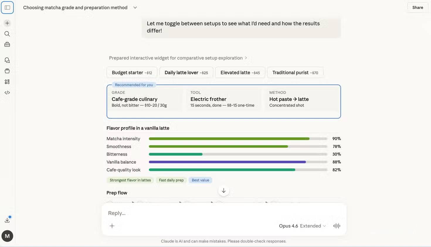
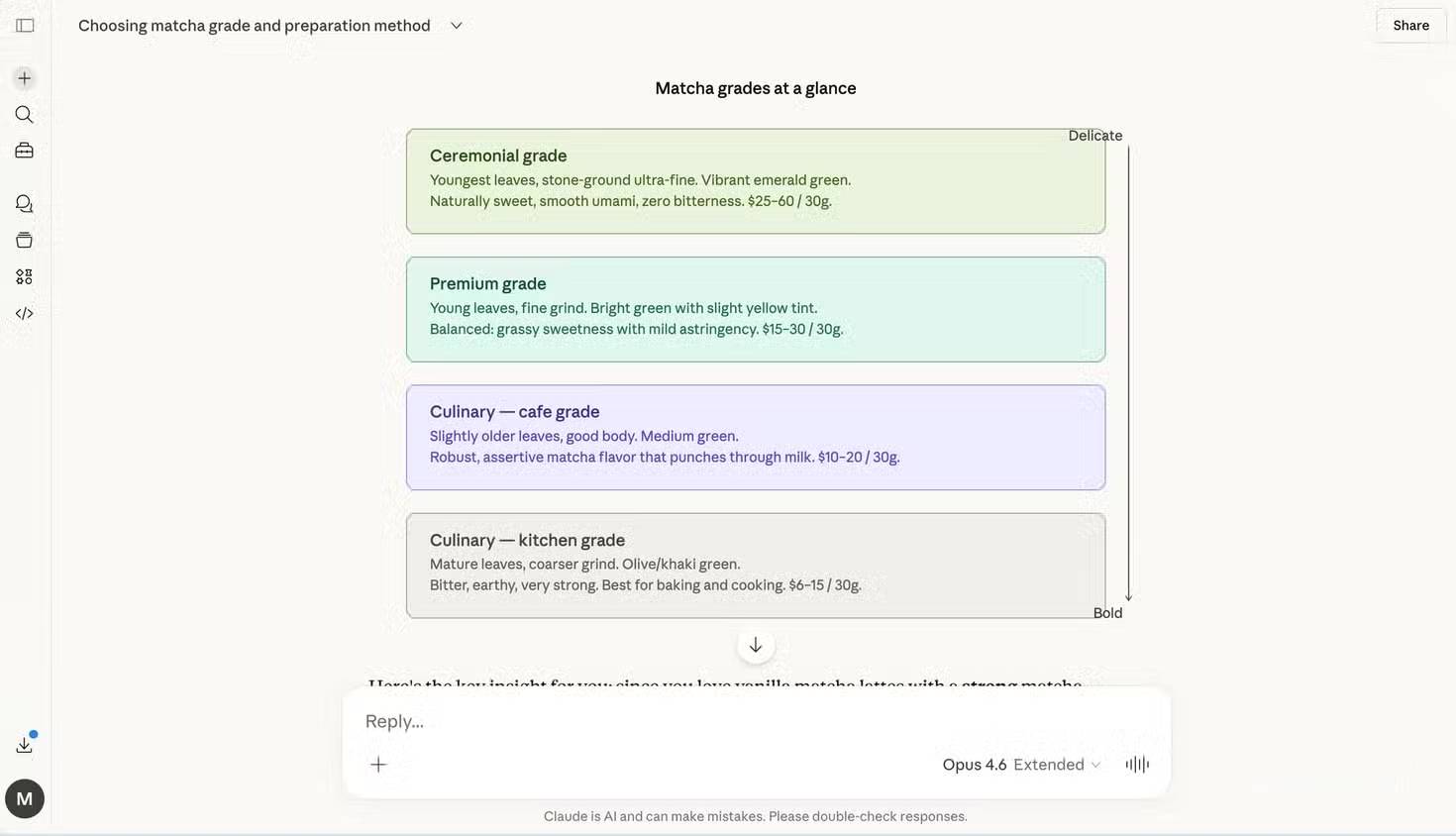
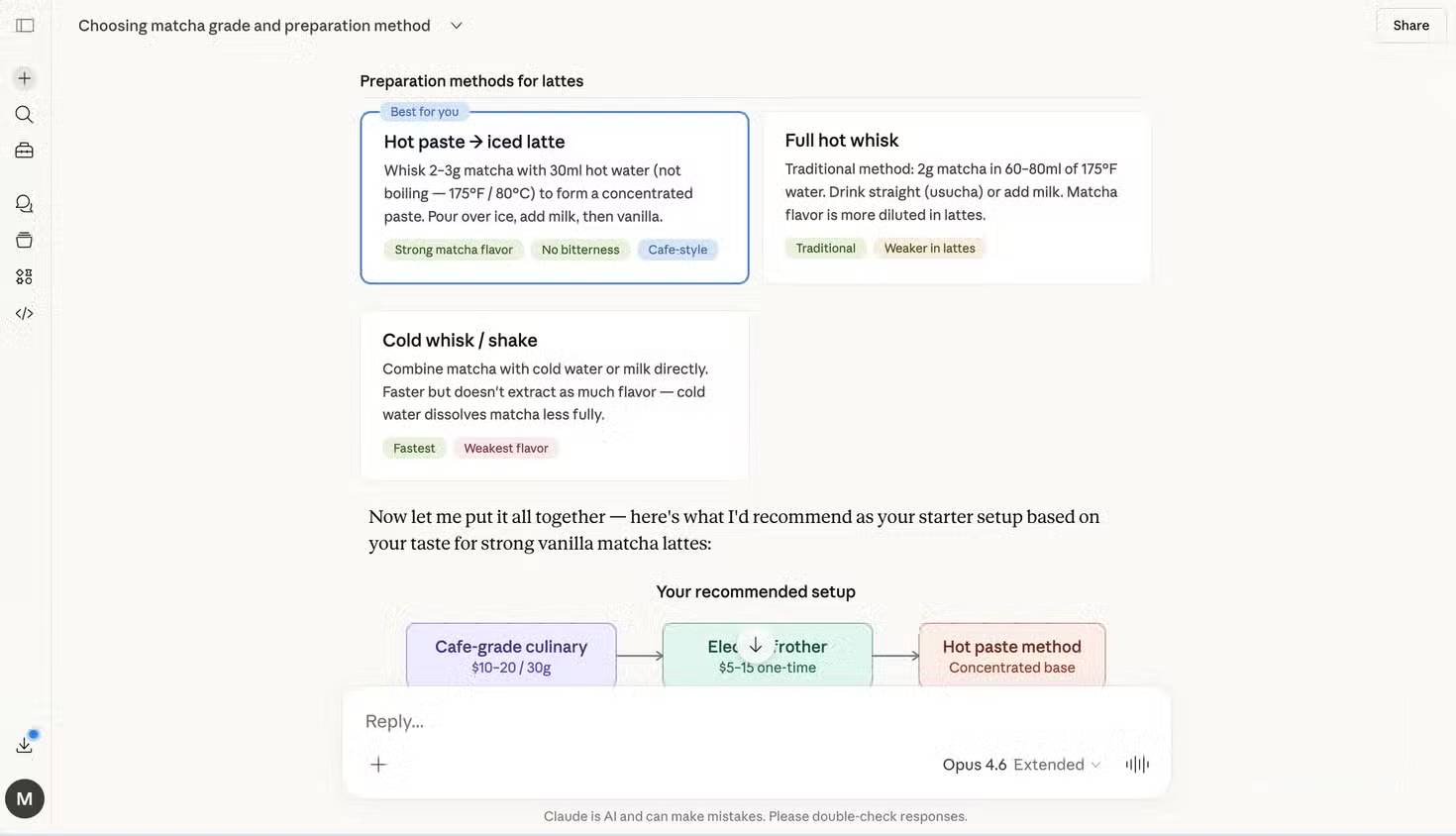
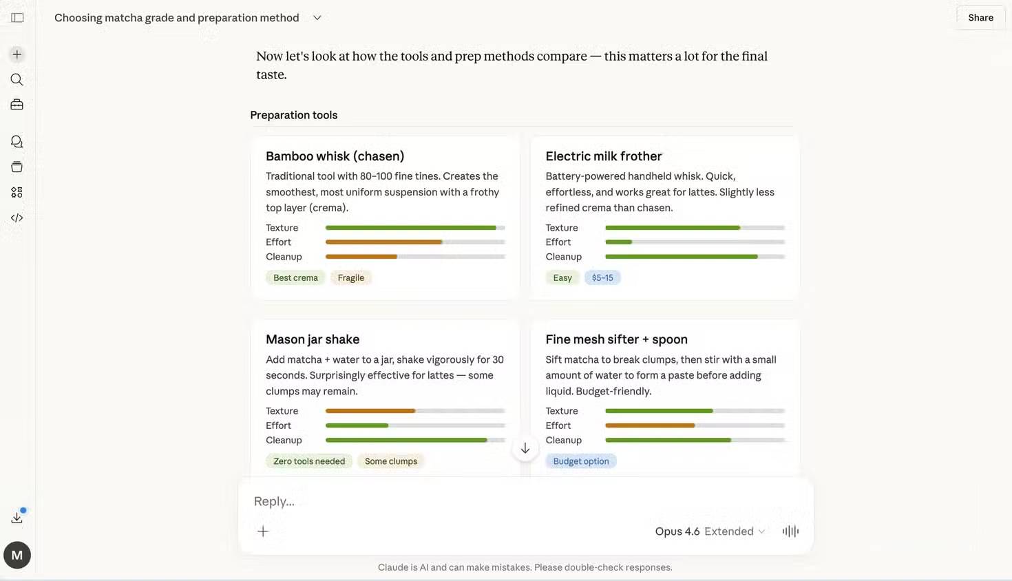
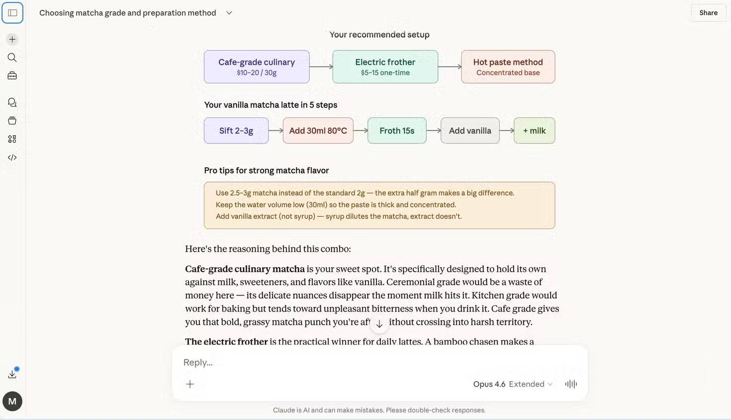
This type of visual helps organize choices, but it should not be treated as an authoritative source for product prices, nutrition, food-safety guidance, or claims about matcha grades. Ask for sources and verify time-sensitive information independently.
Good uses for Interactive Visuals
- Cause and effect: change an input and watch the outcome update.
- Systems: trace a request through components or states.
- Comparisons: apply the same criteria to several options.
- Sequences: step through a process, timeline, or algorithm.
- Quantities: explore a formula with sliders and units.
- Spatial ideas: label parts and show how they relate.
Plain prose is still better for a simple fact, short instruction, or idea with no meaningful visual structure. Interaction should serve the explanation, not decorate it.
How to improve a weak result
- If it is too busy, ask for one concept and fewer controls.
- If labels are vague, provide the exact vocabulary and units.
- If the visual is static, specify which values should be adjustable.
- If the interaction is confusing, ask for a reset control and visible current values.
- If colors carry meaning, request text labels and patterns as well.
- If the result is wrong, state the failing input and expected output rather than asking for a general improvement.
Accuracy, privacy, and accessibility
Interactive output can be confidently presented and still be wrong. Verify calculations, logic, citations, historical dates, prices, scientific claims, and safety instructions. For a model or simulation, inspect the assumptions and valid ranges before drawing conclusions.
Do not provide private records or confidential workplace data merely to obtain a visual. If you upload a file, make sure you are authorized to process it with the service.
A useful visual should also work for more than one way of perceiving information. Ask for readable contrast, keyboard-operable controls, text labels, a concise explanation beside the graphic, and a table or textual summary of key values.
Prompt template
Create an interactive [diagram/chart/model] for [audience].
Goal: help the reader understand [concept].
Show: [required elements].
Controls: let the reader change [inputs and ranges].
When an input changes: update [outputs].
Use these terms and units: [list].
Include: labels, reset control, keyboard access, and a text summary.
Do not invent data; mark assumptions and cite the source for supplied values.
Interactive Visuals are valuable because they can make an explanation testable. The reader is not limited to accepting a diagram at a glance; they can change inputs, challenge the model, and compare the behavior with a trusted source.
Related Articles
 Claude AI User Guide: a Comprehensive Guide for 20268 minutes read
 Making Whiteboard Lessons More Engaging Through Conversation with Claude7 minutes read
 How to Use the Connectors Feature in Claude AI12 minutes read
 Reasons Why the Claude Code Should Be Replaced by the Codex8 minutes read
 What Is the Claude Code: Clear Explanation7 minutes read
 Claude API: How to Get the Key and Use the API: Explained19 minutes read
Reader Comments 0
Sign in with email or Google to join the discussion.