Microsoft has revealed the new Windows 10 interface, inviting you to view and comment
The new user interface (UI) is said to be dedicated to celebrating the 1 billion Windows 10 milestone.
Microsoft's product manager, Panos Panay, recently shared concise images of a new user interface (UI) that is supposed to be dedicated to celebrating the 1 billion regular Windows 10 milestone worldwide. The world that this 5-year-old operating system just achieved a while ago. So what's so special about this new user interface?
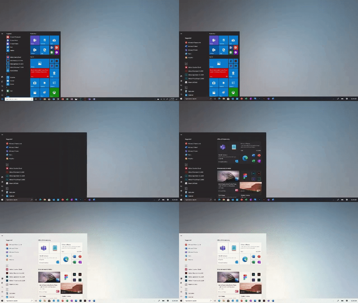
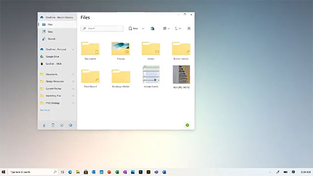
The posted images show a completely different design, bringing a more modern direction of File Explorer interface, context menu, Microsoft Photos application, Calculator and especially the Start menu.
Video "restaurant" new Windows 10 interface
More information on the new interface of Win 10

As you can see in the animation above, Microsoft has redesigned the Start menu interface, with the subject being large squares, each containing a static application icon according to the new Fluent Design with a blurred background. , highlighting application icons. In addition, the new Start menu interface will bring harmony with both dark and light background themes, ensuring the user 's visual and interactive capabilities.
In general, the changes adopted by Microsoft on the new design are responsible for making the interface look more modern by removing cluttered and unnecessary UI components. Microsoft recently started rolling out a series of new application icons for Windows 10 in the Fluent Design style, and the future Start menu will also use those new icons.

Another major change is the redesigned interface of File Explorer, which is intuitive and simplified to the maximum. Of course this design will still follow the Fluent Design style that Microsoft has actively promoted recently.
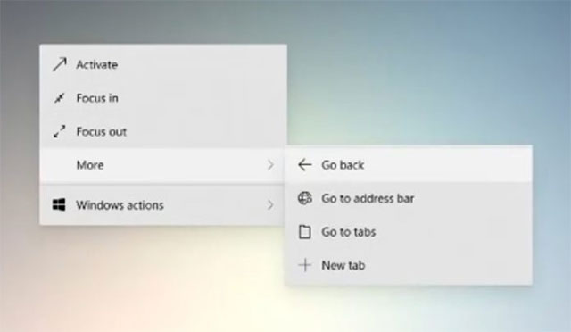
More noticeably, Microsoft is also tweaking the interface for the context menu (context menu) - a seemingly small factor but in fact frequently used by users, as you can see in the image below:

For a long time, Windows 10 has no major changes in the interface to interact with users. Microsoft will certainly have to modernize its operating system to remain competitive in the ever-changing world of personal computing devices.
- Top best Facebook comment photos
- Microsoft revealed Windows 8 boot speed
- How to Insert a Comment Box in Word, PowerPoint, and Excel
- Microsoft revealed the new interface of Start Menu on Windows 10
- Facebook began inviting users to use the new interface
- 9 free interface packages from Microsoft, please download


 Instructions for changing language interface on Kaspersky Lab security programs
  Overview of the Forefront TMG 2010 management interface
  How to access VMware ESXi hidden interface
  How to change the Microsoft Office interface
  How to turn off the delete confirmation dialog in Outlook
  Why do some websites with extremely 'bad' interfaces like Reddit and Wikipedia 'live so long'?