Make your Canva designs stand out with these simple tips!
Canva is a great tool to help your projects stand out, and there are a few simple things you can try to make your designs really stand out.
Here are some top suggestions to try if you want to add something special.
1. Search for specific templates
Many people like to use templates as a starting point for their designs. Having something to work from makes it easier to think creatively and is also useful if you want guidelines to follow.
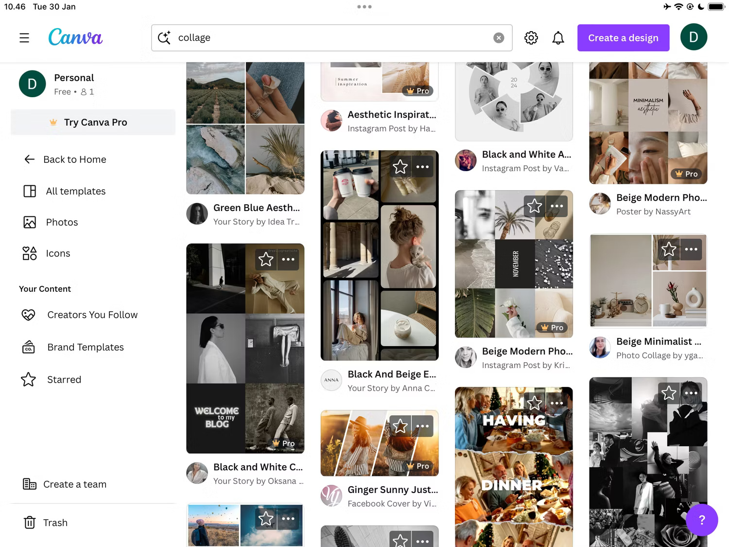
You can use specific templates in Canva for Pinterest posts, Instagram Stories, YouTube thumbnails, and more. Even if you don't upgrade to Canva Pro, you'll still find plenty of free templates worth using and customizing.

You'll find plenty of templates on the Canva homepage, and you can also search for some within the app. You can even create and publish your own templates in Canva if you want to experiment.
2. Incorporate subtle animations
While they should be used sparingly, animations can add another dimension to your designs. You can customize text in a variety of ways, such as making it slide across the screen from left to right (or top to bottom). You can also make text scroll and merge — along with adding a variety of other effects.

You can also add motion effects like rotation. To access each of these effects, select the text box and go to Animate . Here, you can add any effects you think will make your design stand out.
3. Testing
When learning any creative discipline or software, you need to follow general rules and guidelines more closely. Doing so will help you learn the basics faster. But beyond that, experimentation is how you truly become a master.
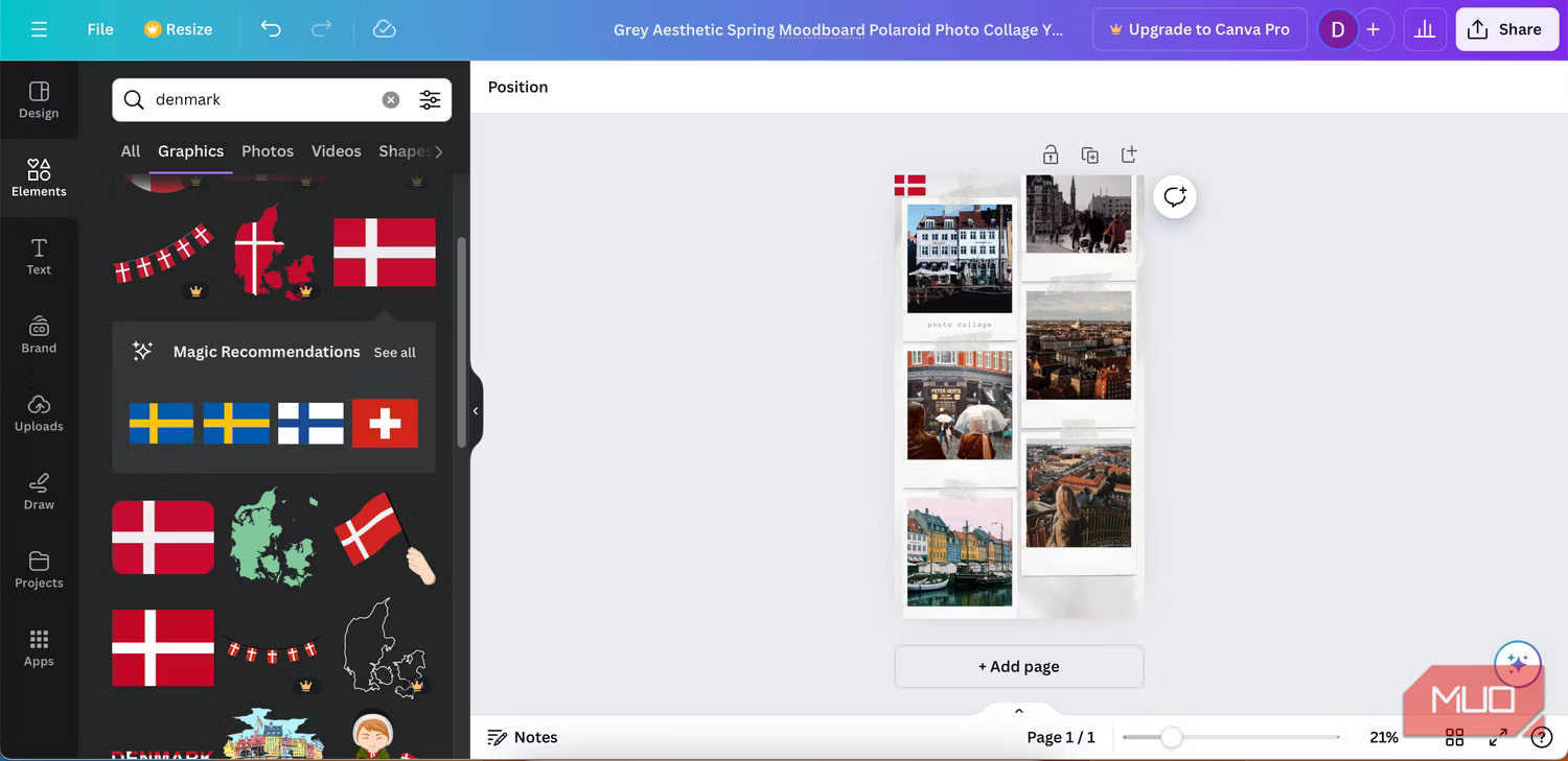
You can experiment with a number of features within the Canva app. For example, you can use contrasting colors if you want to highlight certain aspects of your design. You can also experiment with the size of text in your headings, subheadings, and body text.

You should also try different shapes. You can also remix templates by removing elements you don't like (and adding others). Consider reading these tips for getting the most out of Canva if you're not sure where to start.
4. Choose high resolution images
Creating high-quality designs can be unnecessarily difficult without the basics. And if you're using images in your Canva designs, it's important to use the best resolution possible. The best way to do this is to use as little compression as possible (and ideally no compression at all).
Another good idea is to not crop your images beforehand. If you're using Adobe Lightroom or another editing software, you'll also want to choose the highest quality export format. That way, you'll have an easier time keeping everything sharp.
5. Use the right dimensions in Canva
Another way to make your Canva designs look great is to use the right dimensions. No matter where you use your content, you'll need to resize it to fit that platform. This is true even if you're not using social media; for example, a resume should fit on a single sheet of A4 paper.
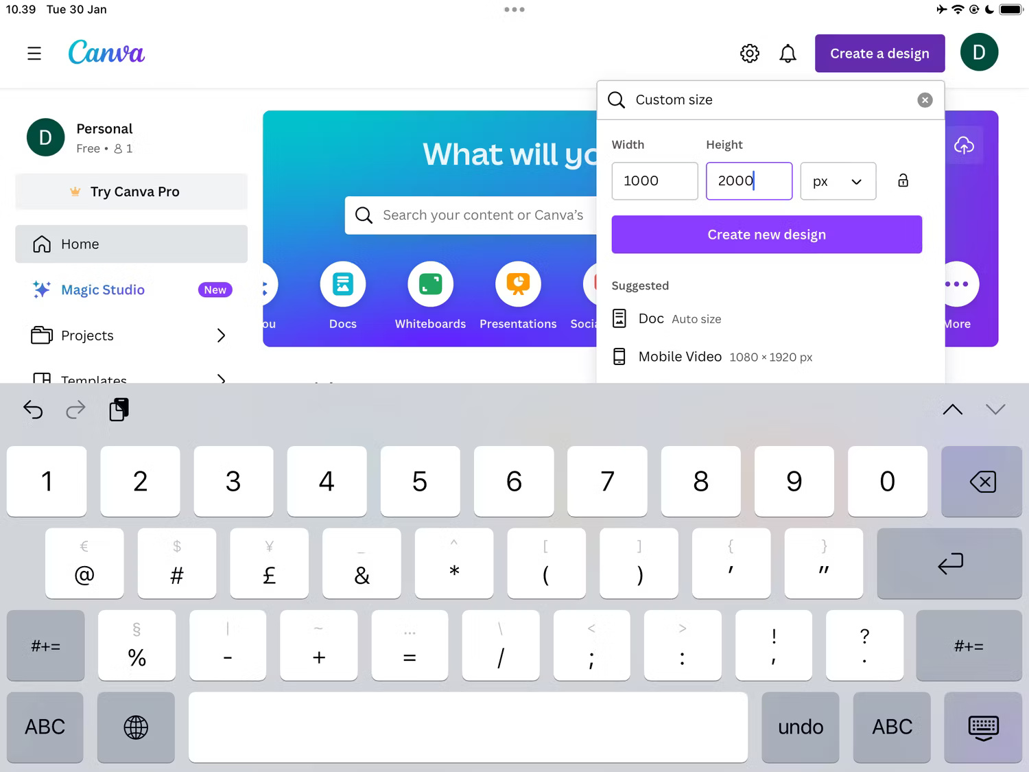
You can use default sizes for a variety of platforms in the Canva app, including Instagram Stories, Facebook posts, and Snapchat snaps. The easiest way to do this is to search for them on the home page.

If there is a default size that doesn't appear as a pre-designed template, you can also create your own custom size. For example, if you need to create blog images, you can change the size based on the size of each website you publish.
Discover more
CanvaShare by
Isabella HumphreyYou should read it
- Instructions for creating QR codes on Canva
- 8 Best Alternatives to Canva
- What is Kittl? What's the difference compared to Canva?
- 10 things you can create with Canva
- How to design iPhone logos and cards with Canva
- The Quiet Details That Make a Sports Betting Platform Feel Reliable
- Instructions on creating toy set images with ChatGPT AI
- How are AI agents changing the journalism industry?
- Why not listen to podcasts at 2x speed?
- Why TikTok Live Video Is Ruining the App!
- The biggest downsides to switching to eSIM