How to optimize content for mobile websites
In order for your website to be fully mobile optimized, you need to change both the web design and the content displayed on the web..
Of course, a website optimized for mobile devices will have to design according to its own standards, compatible with smartphones, tablets . But if only that, it is not enough.
In this article, we will give you ways to optimize content on a mobile website so that your page is fully compatible with mobile devices. This is very important because the percentage of users accessing the web on mobile devices is increasing gradually while the number of people accessing the web on computers is decreasing.
Now, invite you and TipsMake to start learning how to optimize content for mobile websites.
Understand how people read content on mobile devices
The screenshot below shows you how people read content on mobile devices:
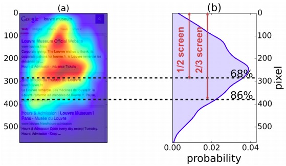
As you can see, in photo (b) the mobile user reads the content in a more dispersed fashion than the yellow triangle or the F-shaped sharp focus on the computer. Obviously the way users read content on mobile devices is different from the way they read on desktop.

How people read content on the computer, golden triangle pattern

The way people read content on computers, the F-pattern
Users on a computer may be attracted to content placed in the top left part of a web page. However, on mobile devices, users are not completely focused on the content located on the left side of the screen. They will look more at that area but the focus is more dispersed.
So, basically there are no most important areas, no content that needs to be optimized first. Instead, all content on a mobile website needs to be optimized.
Now, invite you and TipsMake to explore some ways to make your content easy to read, understand and remember for readers on mobile devices.
Appetizers, snacks and main courses
Traffic on your mobile website, like web traffic for your computer, is made up of all kinds of users with different types of content reading. Whether a user scans, reads every word or scans and reads each word are counted in traffic.
Recipe approaching appetizers, snacks and main courses will help limit the appeal of all kinds of readers.
Appetizers: The title of the article.
In your content, the appetizer is the headline. Its job is to capture the interest of the readers, even the most impatient, and motivate them to read your article.
For the article you are reading, its title is "How to optimize content for mobile website", a clear title that tells you exactly what is in the article.
Snack: Summary of the post (or possibly the conclusion of the article)
In your post, a snack is a summary or review of the main point of the content. This summary tells the reader what the post is about. You have to make sure that even if you read only the summary, readers will know what you are talking about in the article.
Like this article, the snack is an introduction to a mobile-compatible website that needs to be compatible with both content and design. In the introduction, TipsMake also mentioned the importance of optimizing content for a mobile website.
In addition to a normal summary, you can also use a table of contents summary.
Meal: All your posts
At last we come to the main meal, which is all your content in its fullest, original form.
The job of the title and the abstract is to get readers to your content. The appetizer, snack and main course approach recipe makes it easy for you to do just that.
In fact, the recipe approaches an appetizer, snack, and main course like an inverted pyramid style. This type of writing presents the details that are most important to the reader and then to the minor details.
Chunk Technique: Break up your content for easy reading
Because the mobile device has a small screen size, it will be very uncomfortable if you let a wall of text hit the user's face. To make it easier for users to read, you must reformat the content structure.
The better your post structure is optimized, the more readable it will be. Chunk is an effective technique that helps you to improve the structure of your posts and make your content optimized for mobile devices.
Users often read content on mobile devices in short spare time such as waiting for the train, so you have to make the content on your mobile website easiest to read. Chunk is a great way to make your content more "digestible".
In simple terms, Chunk is a method of presenting related content in small pieces. You need to create meaningful, visually different content units that contribute to the overall context of the overall post.
Example: You can see the two pictures below, one is a full text paragraph and the other is divided into separate sections. I'm sure if you were asked to choose one of the two to read, you would choose the text in the second photo.
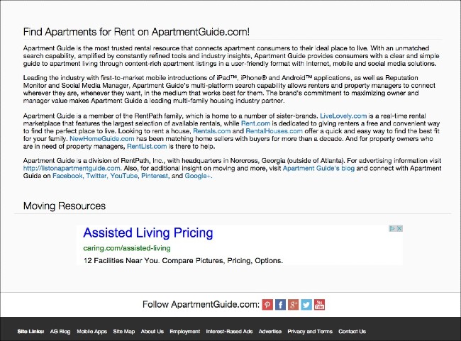
On such a bad computer, you can imagine how bad it would be on mobile web
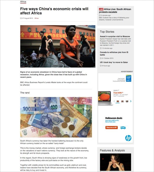
And this is a segmented article, very well presented, guaranteed to be easy to read on mobile devices
You can use the following tools to segment your content:
- Use short passages
- Use a space
- Use subheadings
- Use the content summary box
- Picture
- List / bullets (like what you are reading right now)
- Style (bold, italic)
Try to write the shortest title possible
According to many statistics, short headlines about 6 words are most clicked on mobile websites. Short titles of less than 5 words are also highly appreciated by analysts for their ability to evoke emotions.
One reason that short titles get clicked more (and be appreciated) is because it doesn't have line breaks on smartphones. In addition, the short title will ensure users read the entire title, not miss the word due to line breaks.
Studies show that when mobile users surf the web, they only notice the first 3 words and the last 3 words of a title. So, even when scanning, users will always read through if the title of your article is only 6 words.
This part seems a bit difficult for the Vietnamese language. However, try to keep the title as short as possible or at least put your important keywords in the first 3 words and the last 3 words of the title.
Write short passages
Try to write short paragraphs that make it easier for users to read. However, pay attention to both the brevity and maintain the appeal. Many people who try to write short have turned their content into bland things.
According to writer Marcia Riefer Johnston, brevity means minimalism. You must write how to both meet the user's needs and fulfill your purpose. Provide enough information for users, not redundant, not lacking, not around.
Use short, simple words
The more words you use and the more simple words you use, the smoother the reading experience on your mobile website will be.
A lot of people make the mistake of trying to use complex words, local words, foreign languages or uncommon words in their articles. This makes it difficult for readers to consume content.
Today, even advanced readers prefer easy words, short words instead of long, complex words. Why? Because short, easy to understand, easy to read words help them read and understand the content faster.
Replace verbose phrases with simple words
Lengthy phrases are even worse than complex, long words. Not only do they take longer for the reader to read, but also create long, complex sentences.
The long sentences cause the reader to ponder their meaning in mind. This ruined their reading experience. It is especially annoying for those who read content on their mobile device during lunch break or the evening after a meal.
Here is a list of some of the most used long phrases and workarounds:
- with the option of> by
- until then> until
- at this time> present
- in fact because> because
- with the exception of> except
- in this case> if
- in the near future> soon
- as a means to> order
How to optimize images
Images related to the content (screenshots / graphics .) add visual appeal to the content. And as you have seen in the content segmentation example, images are a great means of separating content in order to enhance the reading experience on mobile devices.
Users pay much attention to the image and content located right below
If you are using images such as graphs and charts, pay attention to how users can see and understand all the data. Photos also need to be optimized in size and size for a clear display but still load quickly.
Besides, you should also provide the most valuable information right after a photo. Eye-tracking studies show that users pay a lot of attention to images and content directly below them.
Use white space wisely
White space plays an important role in web page formatting, both on your desktop and on your mobile device. On mobile, the use of smart whitespace is very important.
Users will be motivated to read a fairly long article if you set the title, description clearly and the content is divided into coherent sections. If you are clever, white space can help motivate your readers.
If using white space effectively, you can not only break up content, but also lead users to the parts that matter most.
Basically, spaces are created by pressing the Enter key and using short paragraphs. In addition, the subheading, bullets, numbered lists are also factors that create whitespace.
White spaces create gaps in the content. Interruptions will make users feel down, curious, so they will continue reading. Naturally, the whitespace helps the user's eyes to relax.
Preview mobile content before publishing
Before publishing an article, preview it on your mobile website as a user. Try to see if your eyes have time to rest between paragraphs. Reading the text aloud also helps you spot spelling or semantic errors.
If you find your paragraphs too long, make them shorter. Or simply add a space in the middle of the paragraph.
Conclude
More and more people are reading and consuming content on mobile devices. Therefore, optimizing web and web content for mobile devices is very important.
With just a few simple tweaks, slight adjustments to writing and formatting, you can dramatically improve the user's reading experience on your mobile website. Moreover, the above adjustments also make your site more attractive, more reliable, and more worthy to visit with users.
Good luck!
 Micah Soto