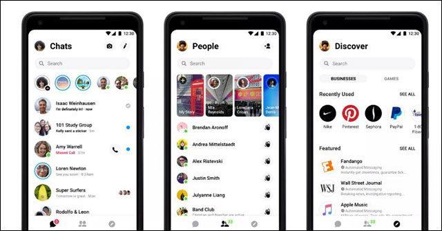
Facebook Messenger has a new minimalist interface
Simple but effective.
Facebook has just released a redesigned Messenger version, to bring the minimalist and focus on the chat interface for users.After years of trying to expand to grow revenue, target bots, games, payments and many other tools, now Facebook has brought Messenger back with its most basic feature - chat.
Support tools are still on the application but will mostly be hidden but if you want, you can ignore it easily.The new Messenger application is still aimed at business purposes, but overall it is welcome to return to the most important, popular feature of the application.
'Messenger is very powerful,' said David Breger, Messenger product manager.'But if you look at something like this, I don't think you'll call it' simple ',' That's what Breger said about the previous version of the app with 9 tabs added gradually over 5 years. by.
If you regularly use Messenger, you will notice how complicated this application is.From the gaming tab, working to active people, groups, call history . The button to open the chat becomes a tiny box near the search bar, and the most important place is for the capture button. /video.
Messenger also has a version of Stories named Day on the top of the chat list.Every time you share a personal image, Messenger will suggest you post it to the public.Finally Day was also removed because of overlapping with Facebook Stories.

The new interface has only 3 tabs left with the most important features
When launched, Messenger is just a simple tool for Facebook users to chat with each other while using Facebook on a computer.In 2014, Messenger split into a private mobile application, run by former PayPal president David Marcus.Facebook realized the great success when the Chinese WeChat application became an electronic wallet and identification tool, so they also wanted to imitate.
'We developed many features but Messenger is no longer as simple as when we started our journey,' said Stan Chudnovky, Messenger takeover after Marcus moved to Facebook's blockchain division.
Although users have complained about the overwhelming feature, this application still has more than 1.3 billion users per month.After the survey, 70% of users said that the most important thing with chat application is simplicity, Facebook decided to focus more.
The new application submitted by Facebook before the May event only has 3 tabs.The photo / video capture button is replaced by a small camera icon next to the new messaging icon.The central tab is still a list of users, showing active people with small numbers above.The other tab is Discover to play games or find jobs.
In addition to changing the general interface, the private interface when chat also changes, you can change the gradient color to change color when scrolling down, along with new actions to call (swipe to the right of the name of the person. want to callIn the next few months, Messenger will also have Dark Mode.
See more:
- Facebook Messenger tested the feature of retrieving sent messages
- The interface of Messenger messages is converted to a square and this is a fix
- You should not ignore the group chat tricks on Facebook Messenger
- Facebook refreshes Messenger with a minimalist interface, adding Dark Mode, running faster
- Facebook Messenger has a new minimalist design, Dark Mode and Stories highlights
- The interface of Messenger messages is converted to a square and this is a fix
- How to simplify the Facebook interface on Chrome
- Facebook Messenger has been updated with the new interface
- How to use Friendly for Facebook to merge Facebook with Messenger


 How to send music, MP3 songs through Messenger to listen
  How to send HD images on Facebook Messenger
  How to send videos via Facebook Messenger
  How to create snowfall effect on Facebook Messenger
  Instructions to set wallpaper for Messenger
  How to login to multiple accounts on Facebook Messenger