8 professional email signature tips
Don't miss the opportunity to advertise personal images by creating professional email signatures because this is a way to communicate with customers very effectively.
According to calculations, an average of an office employee sends 40 emails a day - the equivalent of each person having 40 opportunities to "market" themselves "and businesses in each individual email that he or she sends to others. Every day is the same.
However, many people are not interested in creating signatures. They let the opportunity to show who they are, connect with people and promote their image easily. In fact, some people don't even care about that anymore.
Do you know the signature is a place for customers to find the information they need - maybe about you, your organization or something related to you?
However, having a signature is not enough. Because, it is not simply to name and add some relevant information such as phone numbers or home addresses. Professional email signatures also give you many great benefits that if you do not have the investment, you can not take advantage. In addition, it should be noted that if you try to cram information, the signature will not "pro" at all, even making customers feel like you are deliberately "spam".
Here are a few professional email signature tips for your reference.
1. Use simple, consistent colors
The ability to recognize the most effective when it has consistency and email signature is also needed. Adding colors to the signature will make this area more prominent, however, make sure to add only one or two other colors and use the dark color for the text.
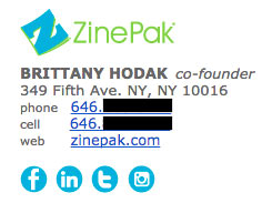
Use subtle highlights to match your logo and organization name. In the email signature of Brittany Hodak, you can see the icons of the blue social networks similar to the ZinePak logo.
2. Use the hierarchy in design
A good design must show the information on an easy-to-understand and most recognizable layout. Because email signatures are a list of key information about how you should use hierarchy (top-down design method) to attract the reader's eye to what you want them to read first is a very interesting way.

Use a large font for your name to increase the reader's attention, and select important information that needs to be bold and highlighted by color like the above signature.
3. Create Call To Action button (and update regularly)
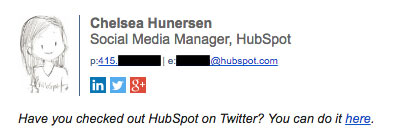
One of the smallest things you can add to that signature is the Call To Action button (CTA). CTA should be simple, updated regularly, not too wild and harmonious with email style, making them more like postscript than "dragging" users to buy goods. When business goals change, CTA also needs to make changes accordingly. As the example below, Chelsea Hunersen changed CTA when her media channel changed (from Twitter to Slack).

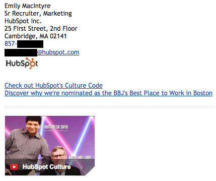
Video links need to be really prominent because some Email Client like Gmail will display the thumbnail of the video just below the signature.
4. Add social icons to the signature
Social networking accounts are a very important part because it will encourage users to access your account and discover what you care about. This is why adding links to these media channels is not to be overlooked, not only to reinforce your personal brand but also to help people find new ways to link. contact and follow you.
In addition, this action also helps increase traffic for online content if you use links to such content. Therefore, if you add icons to your signature, make sure to update your Profile on these channels regularly and always make your "wall" appealing to content that is spread.

Why should I use the icon instead of the link as usual? Because the icons are more recognizable and they are also more prominent than the rest of the text. According to a study by Neoman Studios , people only take about 150 milliseconds to process an icon and 100 milliseconds to decipher its meaning. This is really a super fast process. In addition, using the icon also saves space to add other information.

Also, if you have multiple social network accounts, you should only add up to about 8 icons to the signature. Focus on channels that are likely to be useful for your personal branding or business benefits.
5. Links must be trackable
Add some links to your email signature, including the CTA button and social network icon. However, does anyone really click on them?
To understand whether signature links really attract click-and-click actions, you have to make these links trackable - just like when you use internal links. email. Also, sometimes you should change the signature format or CTA button to increase the number of Clicks.
6. Create distance
Although adding too much information to the signature is not a good idea, however, you can also create a "partition" as the signature below to make it simpler and still ensure full transmission. the desired content.

This is useful when you want to divide different types of information such as name and contact information, logo, CTA button or disclaimer (statement not responsible).
7. Add the country code to the phone number

If you have foreign partners, customers, colleagues or friends, it's important to add country codes to the contact numbers.
8. Signature design must be mobile friendly
According to an analysis conducted by Litmus surveying more than 1 billion different email openings, 56% of these emails were opened on phones only in April 2016. This number increased by 8% over the same period last year. The more people reading emails on the phone, the more careful you need to be when writing emails, including creating signatures.

The most important thing if you want to create a friendly signature with mobile experiences is that it must be easy to read and access ; Make sure the font size is large enough for easy reading on devices with small screens, and the links and buttons must be the same.
Finally, after designing a signature as desired, check its harmony on the different Email Client. For example, Microsoft Outlook does not recognize the background image while others do not load the image by default.


 How to insert signatures into PDF files using Foxit Reader
  How to sign a document with GIMP
  What is a disk signature? Fix disk signature conflict error
  How to create a signature on Yandex Mail
  How to check the authenticity of Linux software with digital signatures
  How to create a beautiful online signature